3D Metamorphosis Animation
3D Metamorphosis Animation Read More »
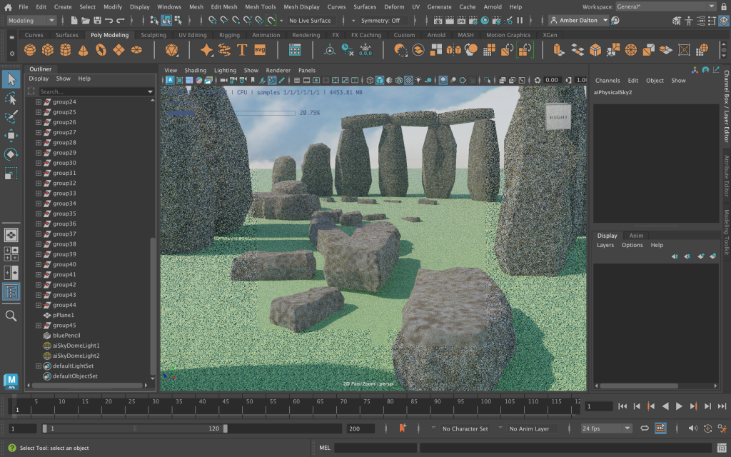
Introduction This design portfolio blog post will explore how Edward Tufte’s five theories were implemented into the final 3D metamorphosis animation. A series of screenshots will communicate each stage of the design development process across Autodesk Maya, Photoshop, Illustrator and Premier Pro. 3D Design Development in Autodesk Maya The final design development process can be seen below and consists of a series of screenshots, communicating the overall final animation construction. Image planes were used as references to the original Stonehenge, this aided with the placement and shapes of the rocks. Henge Brand Design in Adobe Illustrator and Adobe Photoshop The below screenshots show the development of the animation purpose. A new crisp brand, handcrafted in Salisbury, with the flavour of Swiss cheese. Arnold Rendering and Lighting Implementation of Edward Tufte’s Theories The theories that have been put into practice throughout the final design include, Use of Colour Edward Tufte’s colour theory has been applied to the final animation of Stonehenge and relates to his statement that ‘Nature’s colours are familiar and coherent, possessing a widely accepted harmony to the human eye.’ (Tufte. E.R, 1990). This theory applies to the animation as it projects all aspects of natural colours and nature throughout, which provides familiarity to all viewers. The colours chosen for the animation also convey logical information, using realistic colours close to the real Stonehenge. Comparison of Small Multiples Edward Tufte’s comparison of small multiples can be seen throughout Stonehenge’s rocks and throughout the final animation. The rocks are all different shapes and vary in size, although similar none are the same. This adds depth and realism to the overall design. Narrative over Space and Time Narrative over space and time is demonstrated throughout the Stonehenge animation. The overall animation purpose is revealed as time goes on, the camera flyby reveals the narrative of the new crisp brand and where it is made. Layering and Separation Edward Tufte’s layering and separation theory is demonstrated throughout the animation but is heavily seen in the final packaging design inspired by the existing brand, Tyrrells. Saturated spots of the yellow flowers in the photograph not only make use of his colour theory but also help communicate the flavour of the crisps whilst the rest of the image is in greyscale. Animation Reflection The Stonehenge animation can be viewed in the final Design Portfolio blog post. Reflecting on the final metamorphosis animation, changes were made to the original narrative plan. The ending scene was changed from crisps falling to a zoom-out to frame the crisp packet, advertising the brand and packaging. Moreover, when animating the animation through keyframes I came across a design fault, which can be seen when Stonehenge transitions into Swiss cheese. One of the rocks disappears and I couldn’t find an explanation as to why this was happening. I tried multiple times to restore the rock through keyframing although couldn’t find a solution, this is something I would focus on fixing if I were to do it again and had more time. I would also change the texture settings of the Swiss cheese to have a rougher appearance as it is too shiny. If I were to redo the animation in the future I believe the skills I have learnt creating this piece would aid me in creating smoother transitions as the animation transforms. References Atchabao, N. (2015) Download free cheese seamless vector for free, Vecteezy. Available at: https://www.vecteezy.com/vector-art/94524-free-cheese-seamless-vector (Accessed: 21 May 2023). Newsroom. (2021). TYRRELLS ‘TYRRELLBLY TYRRELLBLY TASTY’ Campaign Back On TV At Easter With £1M Investment – FAB News. [online] FAB News. Available at: https://fabnews.live/tyrrells-tyrrellbly-tyrrellbly-tasty-campaign-back-on-tv-at-easter-with-1m-investment/ [Accessed 28 Mar. 2023]. Tufte. E.R. 1990. Envisioning Information. Cheshire, Connecticut: Graphics Press. (p. 91).
Introduction This design portfolio blog post will explore Edward Tufte’s five design theories and demonstrate how the theories will be put into practice throughout the final 3D metamorphosis animation. Edward Tufte’s Five Theories The five theories that will be put into practice include, Use of Colour The use of colour is an extremely important part of all visual design. Colour can be used to tell a story, create an atmosphere and/or cause a reaction in a viewer. Edward Tufte used colour throughout his career to convey logical information in an organized manner, colour was not used for artistic purposes. This theory is evident throughout the map design below (Figure 1 and Figure 2). Colour is used to show the high and low points of land and deep and shallow points of the ocean through lighter and deeper natural colours. This theory will be used to logically represent where natural shadows from the sun, form on the 3D metamorphosis animation of Stonehenge. (Tufte. E.R. 1990). Comparison of Small Multiples The visualization concept of small multiples was introduced by Edward Tufte. He described them as ‘Illustrations of postage-stamp size are indexed by category or a label, sequenced over time like the frames of a movie, or ordered by a quantitative variable not used in the single image itself.’ (Tufte. E.R. 1990). The concept of small multiples can be applied to the final 3D metamorphosis animation of Stonehenge as there a multiple similar shapes seen throughout the formation of rocks. The rocks can also be logically organized as there is a loose pattern to the overall layout. Therefore similar shapes can be distinguished throughout the formation, including sizing and shape with limited variables. Narrative over Space and Time The narrative of space and time can be seen throughout almost all animations and other media projections. The narrative is the story of events, for instance, past, present, and future. Narrative time refers to the time it takes to tell the story, for example how long it takes viewers to understand Tufte’s graphs. Narrative space could refer to a real place such as space, or a theoretical place. The narrative of space and time could also refer to visual design, the layout of information, and how it is consumed such as a bus timetable. (Harry Hagan, O. 2021). The narrative of space and time may be used in the final animation to communicate movements and atmospheres of each scene overtime. Layering and Separation Layering and separation are the art of simplicity, removing unnecessary visuals from a design can aid the viewer’s focus on what’s truly important. This can be seen in the image below, ‘Note the effectiveness and elegance of small spots of intense, saturated colour for carrying information – a design secret of classical cartography.’ (Tufte. E.R, 1990). The layering and separation theory may be used in the final animation to create focus surrounding the main message of new brand communication. Macrocosm Macrocosm can be described as the whole of a complex structure, such as the universe. Tufte, used this concept to communicate principles of thought throughout his graphs. ‘It is worth mentioning that when principles of design replicate principles of thought, the act of arranging information becomes an act of insight’ (Tufte, 1942) (Silva, A. 2022). This can be seen in graphs that communicate the effects of an event over time, such as graphs communicating the effects of the Covid-19 pandemic on a worldwide basis over time. Macrocosm may be used in the final design to express the effects of Stonehenge’s conspiracy’s over time. References Editors, A. (2016) The adorable side of Andy Warhol: See 10 of the pop master’s little-known pet portraits, Artspace. Available at: https://www.artspace.com/magazine/art_101/book_report/phaidon-andy-warhol-animal-portraits-53996 (Accessed: 14 May 2023). Harry Hagan, O. (2021) §3. narrative time and narrative space, Elements of Biblical Narrative. Available at: https://pressbooks.palni.org/biblicalnarrative/chapter/3-narrative-time-and-space/ (Accessed: 14 May 2023). Silva, A. (2022) Tufte (envisioning information) micro-macrocosm – Aury Silva. Available at: https://www.aurysilva.co.uk/design/tufte-envisioning-information-micro-macrocosm/ (Accessed: 15 May 2023). Small multiple (2023) Wikipedia. Available at: https://en.wikipedia.org/wiki/Small_multiple (Accessed: 14 May 2023). Thatcher (2017) Narratives of time and space comments. Available at: https://cms633.github.io/Spring-2017/commentary/narratives-of-time-and-space-comments.html (Accessed: 14 May 2023). Tufte, E. (2022) Global weather requires global maps,not boring local non-news on Brooklyn Car Parking Difficulties Beautiful Reporting, Financial Times Steven Bernard + emiliya mychasuk note byline with name of Cartographer!#DDJ #dataviz #graphicdesign #maps https://t.co/cyzs5xnm5o pic.twitter.com/jpkrfbkvbj, Twitter. Available at: https://twitter.com/EdwardTufte/status/1606970997395128321 (Accessed: 14 May 2023). Tufte. E.R. 1990. Envisioning Information. Cheshire, Connecticut: Graphics Press. (p. 91). Tufte. E.R., 1990. Envisioning Information. Cheshire, Connecticut: Graphics Press. (p. 63) Tufte. E.R., 1990. Envisioning Information. Cheshire, Connecticut: Graphics Press. (p. 43).
Visual Design Treatment Read More »
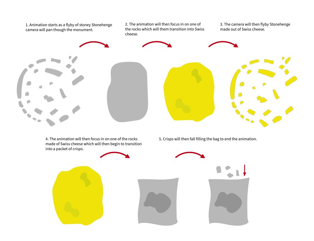
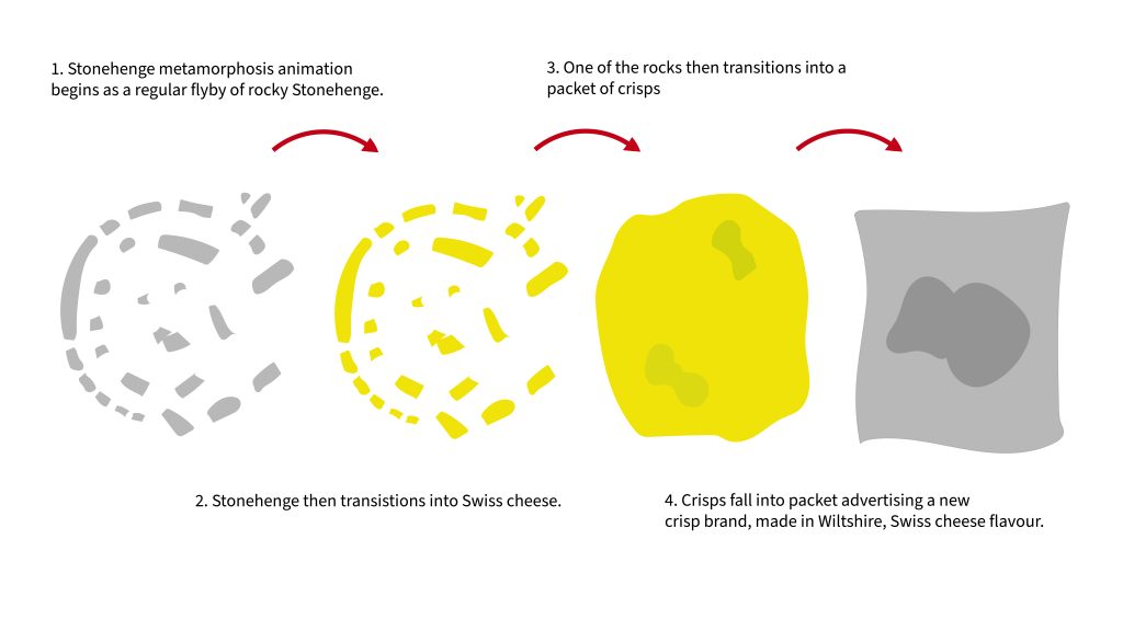
Introduction This design portfolio blog post aims to develop a storyboard for the 3D metamorphosis animation flyby of Stonehenge made of Swiss cheese, advertising a new crisp brand. The storyboard must convey the overall message of the animation and communicate keyframes and significant manipulations throughout the animation. Developing a storyboard for the final 3D animation will ensure a clear visual plan is available when it comes to producing the final outcome. Animation Storyboard The storyboard below communicates when significant changes will take place throughout the animation. These key frames are important for ensuring the final animations purpose is communicated in an orderly manner. Each significant change is an aspect of the metamorphosis element throughout the final design. As seen in the storyboard above the animation begins as a flyby of rocky Stonehenge. This design choice was made to communicate where the new crisp brand will be produced. The animation will then see its first metamorphosis transition where rocky Stonehenge will begin to change into Swiss cheese, communicating the mature flavours of the new crisp brand. The final metamorphosis aspect of the animation will see a Swiss cheese rock turn into a crisp packet, communicating the final purpose of the animation. The final scene will see crisps fall, filling the bag. The above storyboard communicates the flyby angles of the animation, which will aid in the production of the final animation. Both of the storyboards above use Edward Tufte’s theory of layering and separation, ‘to direct attention towards the information at hand’ (Tufte. E.R. 1990). The above Tyrrells crisp adverts both show good use of camera direction and metamorphosis elements, which have inspired directional elements in the final animation. The metamorphosis camera will start high and pan the whole of Stonehenge before zooming in to show each metamorphosis transition. References Glenday, J. (2017) Tyrrells crisps fabulously Curly Social Film, YouTube. Available at: https://www.youtube.com/watch?v=wz7W-Fi7CXw (Accessed: 17 May 2023). Official , T. (2017) Tyrrells crisps – very important potatoes, YouTube. Available at: https://www.youtube.com/watch?v=erdMJw93SJM (Accessed: 17 May 2023). Tufte. E.R., 1990. Envisioning Information. Cheshire, Connecticut: Graphics Press. (p. 63).
Animation Storyboard Read More »
Introduction This design portfolio blog post aims to develop a conceptual metamorphosis 3D animation idea that fits the design brief, (Create a flyby of Stonehenge that is made of Swiss cheese). Secondary research will provide me with inspiration to design a purposeful 3D animation, gathering different imagery of Stonehenge and Swiss cheese will provide me with an understanding of how to layout my 3D designs and give me an insight into different lighting techniques and textures. Following secondary research development of a specific animation purpose will be determined along with the metamorphosis element. Stonehenge Research Stonehenge is a prehistoric monument located on Salisbury Plain, Wiltshire, England. The monument is an archaeological site, made up of large stones, with no definite evidence of its purpose. The site has many assumed purposes such as a calendar, religious worship site, cemetery and many more. It is believed that Stonehenge was built in six different stages between 3000 and 1520 BCE, which adds to the overall concept of the metamorphosis animation. As Stonehenge grew and changed over the years. (Pearson, M.P. 2023). Swiss Cheese Research Swiss cheese is inspired by Emmental cheese, originating in Switzerland. Emmental cheese can be distinguished by its pale-yellow colour and holey appearance. The cheese is noted to be slightly hard which holds its shape at high temperatures well. This will bode well when remodelling the cheese in Maya to form Stonehenge. (Hallal, F. 2022). Developing Animation Purpose When developing an animation purpose for the metamorphosis of Stonehenge and Swiss cheese, the mind map below provides evidence of potential and initial ideas. The chosen purpose is to advertise a new crisp brand inspired by Swiss cheese, made in the Salisbury Plain, Wiltshire. This concept combines Stonehenge and Swiss cheese and opens new possibilities for the metamorphosis animation. Stonehenge will be used to represent the origin of the crisp brand and Swiss cheese will communicate the inspired flavour. The overall brand will have a mature and elegant appearance, complementing the mature flavours of the cheese. Below are some images which inspired the animation idea. Conceptual Metamorphosis Idea As seen in the diagram below a conceptual metamorphosis idea surrounding the Stonehenge and Swiss cheese crisp brand has been developed to form what will be a captivating 3D animation. The concept follows regular Stonehenge at the beginning, which transforms into Swiss cheese. The Swiss cheese Stonehenge concept will then transform into a packet of crisps where Stonehenge-shaped crisps will fall, filling the bag. The camera angle will follow the animation transformations in a flyby manner, zooming into certain aspects to help communicate the overall concept. Following on from this post, an animation storyboard will be developed to communicate each keyframe and camera position to help form the basis of the flyby animation. Reference list Barton, A.-L. (n.d.). Picnic time at Stonehenge with #Guinness – Want more could you want?! Original 1954 advert. | Picnic time, Vintage beer, Guinness. [online] Pinterest. Available at: https://www.pinterest.co.uk/pin/297870962849083406/ [Accessed 28 Mar. 2023]. Hallal, F. (2022) Swiss cheese: Nutrients, benefits, downsides, and more, Healthline. Available at: https://www.healthline.com/nutrition/is-swiss-cheese-healthy (Accessed: 13 May 2023). HeritageDaily – Archaeology News. (n.d.). New study on how Stonehenge may have served as an ancient solar calendar. [online] Available at: https://www.heritagedaily.com/2022/03/new-study-on-how-stonehenge-may-have-served-as-an-ancient-solar-calendar/142954 [Accessed 28 Mar. 2023]. Kestler-D’Amours, J. (2015) How did swiss cheese get its holes? scientists know, thestar.com. Toronto Star. Available at: https://www.thestar.com/news/world/2015/05/29/how-did-swiss-cheese-get-its-holes-scientists-know.html (Accessed: April 23, 2023). Meier, J. (2019) Why does swiss cheese have holes?, The Spruce Eats. The Spruce Eats. Available at: https://www.thespruceeats.com/why-does-swiss-cheese-have-holes-591200 (Accessed: April 23, 2023). Newsroom (2021). TYRRELLS ‘TYRRELLBLY TYRRELLBLY TASTY’ Campaign Back On TV At Easter With £1M Investment – FAB News. [online] FAB News. Available at: https://fabnews.live/tyrrells-tyrrellbly-tyrrellbly-tasty-campaign-back-on-tv-at-easter-with-1m-investment/ [Accessed 28 Mar. 2023]. Novak, S. (2022). Stonehenge May Be an Ancient Solar Calendar. [online] Discover Magazine. Available at: https://www.discovermagazine.com/planet-earth/stonehenge-may-be-an-ancient-solar-calendar [Accessed 28 Mar. 2023]. Pearson, M.P. (2023) Stonehenge, Encyclopædia Britannica. Available at: https://www.britannica.com/topic/Stonehenge (Accessed: 13 May 2023). sueism1 (n.d.). Kraft Swiss Cheese Ad 1957 | Vintage food posters, Vintage sweets, Vintage advertising art. [online] Pinterest. Available at: https://www.pinterest.co.uk/pin/310537336790234153/ [Accessed 28 Mar. 2023]. Trex, E. (2016) How 8 famous cheeses got their names, Mental Floss. Mental Floss. Available at: https://www.mentalfloss.com/article/26792/how-8-famous-cheeses-got-their-names (Accessed: April 23, 2023). Unsplash (2020). Photo by Hulki Okan Tabak on Unsplash. [online] unsplash.com. Available at: https://unsplash.com/photos/gcTYKP1UVcw [Accessed 28 Mar. 2023]. Unsplash (2021). Photo by Robert Anderson on Unsplash. [online] unsplash.com. Available at: https://unsplash.com/photos/Rt6GY40Ll64 [Accessed 28 Mar. 2023].
Conceptual Design Idea (Metamorphosis) and Research Read More »
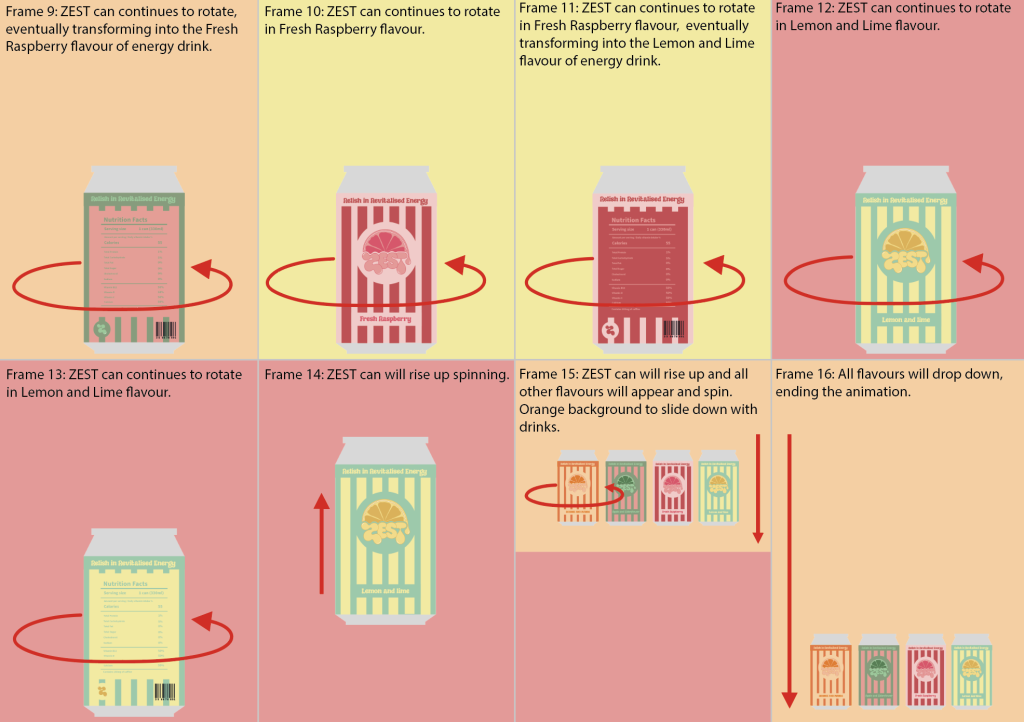
Introduction This development blog aims to develop a conceptual stop-motion animation storyboard for the energy drink brand ZEST. The animation must compliment the energy drink and bring the flavours and packaging to life, demonstrating the consistent energy release through a series of conceptual transitions. It is important to consider how fast the animation moves through the frames and how long potential aspects of text will be displayed. Moreover, this ensures the target audience will be able to keep up with the animation, especially if their sight is impaired. Secondary Research Researching current soft drink animations has provided inspiration for the final stop-motion animation. The first sparkling water advertisement demonstrates snappy and exciting transitions between frames communicating the texture and flavour of the drink. The second Innocent smoothie animation has aspects of stop motion that communicate different flavours. The jagged movements between frames help connect the brand name to the animation, resulting in a youthful outcome. Adding variations influenced by the advertisements has helped develop a refreshing storyboard communicating the ZEST energy drink for over 60s. Initial Animation Storyboard Producing rough sketches of potential animations helped to discover new transitions that could be used in the final animation. Developing Storyboard I chose to develop the second animation in illustrator to bring the cans to life, which helped communicate the different transitions. After developing the initial storyboard, I decided to try different coloured backgrounds that could potentially be used in the final animation. This assisted in finding the best background to lift each flavour off the page and pop. After deciding on the best background colour, I added it to the developing storyboard to communicate when the background colours would change and in what manner. Final Storyboard The final storyboard combines aspects of the initial and rejected animation designs. The concept behind the animation is that the energy drink raises up at the beginning, which signifies waking up in the morning. Linking to the logo which combines the idea of the sunrise and zestful energy. The drink raising also links to the goal of the energy drink, which is to provide the consumer with a consistent energy boost throughout their day. The energy drink will then rotate and transition into other flavours before falling back down to signify going to bed, to end the animation all flavours will drop down from the top of the screen. Substance Stager and Animate Rejected Designs The first initial sketch was disregarded after developing it in illustrator I found the ending to be too abrupt. This was altered in the final storyboard design above. References Medienquadrat. (2020) Product commercial – innocent smoothie plus, YouTube. YouTube. Available at: https://www.youtube.com/watch?v=RSfIwuEnNKU (Accessed: March 20, 2023). Parenteau, T. (2022) AHA sparkling water commercial, YouTube. YouTube. Available at: https://www.youtube.com/watch?v=HB-CCqfpCaU (Accessed: March 20, 2023).
Conceptual Energy Drink Animation Storyboard Read More »
Introduction This development blog aims to demonstrate working as a part of a team to develop a short stop-motion animation using artist mannequins. Completing this task will provide me with an understanding of how stop-motion animation is produced and how to work productively as part of a design team. Stop-Motion Animation I formed a group with Lucy, Ellie, and Caroline. We initially brainstormed a few ideas encompassing that stop-motion animation and discussed our roles within the team. Caroline was assigned to take the photographs, Ellie and Lucy moved the mannequins in each shot, and I put the animation together in Animate. The final animation shows two artist mannequins dancing and then playfully exiting and re-entering the frame at the end. We experimented with different poses throughout the animation, such as dancing and having the arms of the mannequins around each other. We also played around with having the mannequins pop up from behind the table, making the final animation for interesting. Group Reflection Reflecting on our group experience, I believe we worked well together. We all missed the initial lecture, which meant we had to figure out a way to get together and produce the animation for the assignment in our own time. Therefore, communication was extremely important to make sure we were all on the same page. Lucy and I organised the group and asked if anyone else who missed the lecture would like to join us. Lucy then booked a room in the library where we all got together to make the animation. Once we had figured out our plan for the animation, Caroline began to lead the team, whilst she took photographs of the mannequins. Caroline’s guidance ensured we moved the mannequins to the right spot and made changes to each frame. Once we had finished taking the photos, we discussed how we wanted the final video to look, and any adjustments that needed to be made to the images, such as cropping ourselves out of the images to make the final animation look sleeker. Finally, I began to put the animation together in Adobe Animate. I found the software easy to use when imputing the images and putting them together. I made sure to adjust the settings to 12fps, ensuring that the animation was 10 seconds long and had 120 images. This provided me with an idea of how the final stop-motion animation will look for the energy drink brand ZEST. Inputting the individual images and dragging them to the stage was a tedious experience. Improvements To improve our stop-motion animation next time, we need to make sure the mannequin’s hands stay in contact throughout the dancing motion. As you can see in the video above, they come apart a few times, this is where attention to detail was missed in our group. To improve further, music should be added to bring the animation to life, which could also be used to determine the mood of the dance and form an atmosphere for the viewer.
Stop Motion Teamworking Evidence Read More »
Introduction This development blog aims to develop packaging for the energy drink ZEST. The packaging must compliment the logo, whilst communicating the overall goal of the drink and its nutritional information. The packaging must cater towards the target audience of over 60s. Therefore, it is important to factor in the manufacturing design of the bottle or can. Ensuring it is easy to open and accessible for those who may suffer from rheumatic diseases such as arthritis. Reviewing the mind map from the first development blog it was noted that design inspiration could be taken from subcultures from the target audiences youth. This design choice will expectantly create happy nostalgic feelings, motivating the consumer to purchase the product. Secondary Research The above research explores three different subcultures, Mod, Punk, and New Romantics. These subcultures were of heavy influence throughout the target audiences’ youth. Design inspiration has been influenced by the colours and patterns seen throughout the above designs. The retro advertisements and images above show valuable examples of previous packaging designs from large and influential brands, that have inspired the final design for ZEST. Taking inspiration from the above designs, stripes will be incorporated into the final design. As discussed, the manufacturing of the ZEST packaging must be considered to ensure accessibility is accounted for. As featured above cans and glass bottles have been favoured packaging for soft drinks for decades, looking into the advantages and disadvantages of these packaging designs will clarify which one is right for the target audience. When choosing the correct packaging it is important to consider, portability, freshness, accessibility, and durability. Furthermore, the portability of a can is much more stress-free than carrying around a glass bottle. The first reason being it may smash and the second being it may be too heavy for over 60s to carry around all day. A can will keep the energy drink fresher for longer as sunlight cannot penetrate the packaging, making it warm and damaging the overall flavour of the drink. Although, when considering accessibility, a bottle may be a more conscious choice when thinking about the symptoms of rheumatic disease. A bottle may be easier to open and gives the consumer the choice to not finish the whole drink in one sitting. Finally thinking about durability, a can is the superior choice between the two as it is easy to carry around and will not smash when dropped. In conclusion, a can will be the chosen packaging for ZEST. Design Development Final Packaging Design I decided to take design inspiration from the Mod subculture as the research presented a more uplifting and energising colour palette compared to Punk and New Romantics. The final refinements made to the energy drink packaging included reversing the colours of the icons on the back of the Orange and Mango and Lemon and Lime cans so that the stipe orientations all match. I also adjusted the nutrition label slightly by adding more information, including where the drink would be made and potential warnings. The final adjustment was adding a white background to the barcode to ensure it would be readable when scanned. Adobe Dimensions Substance Stager Rejected Designs References Figure 1 – T. et al. (2021) 100 vintage 1960s supermarkets & Old-Fashioned Grocery Stores, Click Americana. Available at: https://clickamericana.com/topics/food-drink/vintage-1960s-supermarkets-old-fashioned-grocery-stores (Accessed: March 17, 2023). Figure 2 –New upload: Chris Parker: 80s punk fashion, punk, punk outfits (2023) Pinterest. Available at: https://www.pinterest.co.uk/pin/698339485993586871/ (Accessed: March 17, 2023). Figure 3 – Boy George Illuminati masonic checkerboard: Stile gypsy, Punk, Moda Uomo (2023) Pinterest. Available at: https://www.pinterest.co.uk/pin/698339485993586880/ (Accessed: March 17, 2023). Figure 4 – R/vintageads – coca-cola AD (1960’s) (no date) reddit. Available at: https://www.reddit.com/r/vintageads/comments/dua4bj/cocacola_ad_1960s/ (Accessed: March 17, 2023). Figure 5 – Baker, R. (2015) Nineteen Classic Vintage Lucozade ads from the 1950s, Flashbak. Available at: https://flashbak.com/nineteen-classic-vintage-lucozade-ads-from-the-1950s-41029/ (Accessed: March 17, 2023). Figure 6 – Noticias de marketing, Publicidad y marcas (2023) Marketing Directo. Available at: https://www.marketingdirecto.com/ (Accessed: March 17, 2023). Figure 7 – Fuckyeahvintage-Retro (2011) Fuckyeahvintage-Retro, Tumblr. Available at: https://fuckyeahvintage-retro.tumblr.com/post/11881478403/soda-cans-produced-between-1950s-1970s (Accessed: March 17, 2023). Figure 8 – Log into Facebook (no date) Facebook. Available at: https://www.facebook.com/dailyfeed70snostalgia/photos/when-lucozade-came-in-bottles-like-this/1272681579597053/?_rdr (Accessed: March 17, 2023).
Energy Drink Package Design Read More »
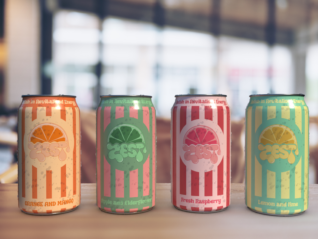
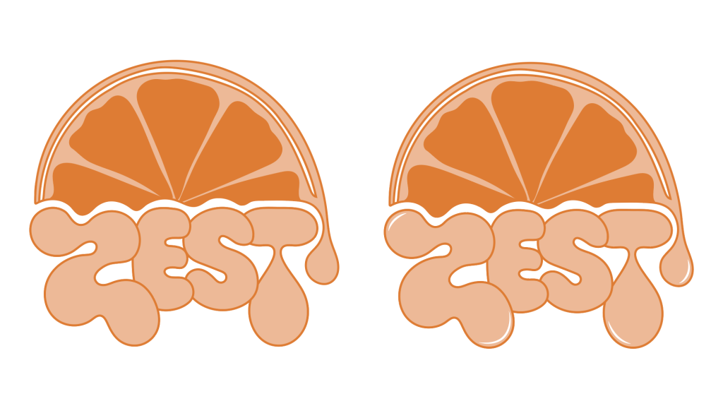
Introduction This development blog aims to develop a conceptual logo design for the new energy drink brand ZEST. Achieving a logo that signifies vitality and captivates individuals over the age of 60 will positively fulfil a gap in the already existing energy drink market. ZEST aims to encourage individuals who may suffer from age-related health issues such as Rheumatic disease that restricts movement and dampens everyday activities to relish in revitalised energy. Researching current brands and analysing their overall message helps to accomplish this goal. Brand Research The verdict regarding existing logo designs encapsulates the lack of mature design. Most energy drink logos are aimed at the younger generation of fitness fanatics. This is proven by the overall message some of the above products convey. Powerful, youthful designs are utilised to sell the idea of the pure energy and endurance that comes with the consumption of these drinks. However, the lack of consideration for the older generation is magnified by the fact that there’s little evidence of energy drinks specifically designed for people over 60. Nutricia and Ensure are complete nutritional drinks for people who may have deficiencies or medical issues regarding the absorption of vital nutrients and are the closest thing to a mature energy drink. The logos appear sterile and medical, clearly signifying to others that individuals who drink these energy drinks may suffer from health issues. Through branding, ZEST aims to abolish this connection and inspire and revitalise individuals, regardless of health issues and without displaying 60+. It is important to consider that the target audience may not be looking for a pre-workout buzz but more of a steady release of consistent energy throughout their day. Design Development ZEST is the chosen brand name and represents a great energy and enthusiasm for life. Therefore, fitting with the brands primary goal of inspiring those over 60 to relish in revitalised energy. The first step taken to establish the final logo design involved sketching any initial ideas that came to mind when thinking about the word zest and its meaning. After sketching, I imported the best design into Adobe Illustrator and began manipulating it until I achieved a smooth and professional design. Manipulating the design in this way ensured for an original outcome. After developing the original branding for ZEST, I experimented with colour and outlines to ensure the logo popped. The colour orange was chosen to represent the orange and mango flavour of the energy drink. The logo and icons will change colour to represent different flavours of the drink. Incorporating an orange into the design was intentional, this design choice conceptualises the overall logo. Representing a sunrise and the zest of an orange. The subtle sunrise reference expresses new beginnings to the consumer and the dripping orange refers to the freshness of the overall product. Finally, I developed brand icons that subtly represent the brand. These were developed using aspects from the final logo design and will be used for branding across a range of ZEST products. Final Logo Design The logo and icons will change colour to represent different flavours of the energy drink. Orange and Mango Apple and Elderflower Fresh Raspberry Lemon and Lime Rejected Design The rejected designs below show the development of the first energy drink brand design ZEAL. The design was rejected as it doesn’t conceptually communicate the brand goals. References Figure 1 (RedBull) – Download Red Bull Energy Drink Vector (SVG) logo (no date) Worldvectorlogo. Available at: https://worldvectorlogo.com/logo/redbullenergydrink (Accessed: March 23, 2023). Figure 1 (NOS) – Nos (drink) (2023) Wikipedia. Wikimedia Foundation. Available at: https://en.wikipedia.org/wiki/NOS_%28drink%29 (Accessed: March 23, 2023). Figure 1 (Monster) – Monster Energy | Energy Drinks, coffee, tea and juice (no date). Available at: https://www.monsterenergy.com/ (Accessed: March 23, 2023). Figure 1 (Grenade) – Marketing (2023) Grenade® Range and energy drink, Columbus Drinks. Available at: https://columbus-drinks.com/en/grenade-en/ (Accessed: March 23, 2023). Figure 1 (Nutrica) – Ensure (no date) Quà Tặng Mẹ. Available at: https://quatangme.com/en/brands/ensure/ (Accessed: March 23, 2023). Figure 1 (Ensure) – Nutritional supplements for malnutrition: Nutricia Fortisip (2021) Nutricia. Available at: https://nutricia.com.au/fortisip/ (Accessed: March 23, 2023).
Conceptual Energy Drink Brand Logo Read More »