RP6 – Social Media Channels

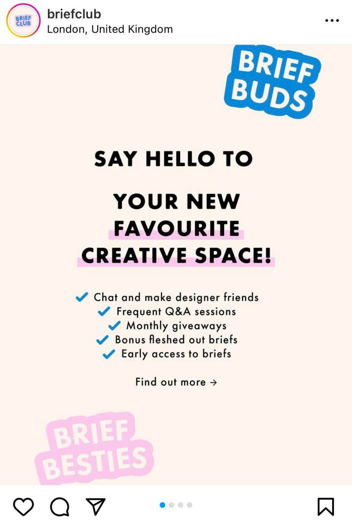
EvolveYou EvolveYou is a global fitness community app that empowers women through health and fitness.  The core message established when viewing the campaign is that the brand is trying to expand its community by making the EvolveYou app more accessible across a range of platforms. The brand is partnering with Samsung Health to obtain this goal and hosting a fitness event at its store to encourage the public to get involved in the fitness community. The target audience for EvolveYou is women that want to feel empowered. The target audience for Samsung Health is much broader, with an all-inclusive audience. Combining the two different health apps will help broaden EvolveYou’s audience, therefore achieving the brand’s goal of growth.  The comments on the social media campaign reflect positive feedback towards the two brands combined. The comments reinforce the brand’s overall goal of empowering women, with individuals showing gratitude towards the brand and their employees.  Yiannimize Yiannimize is a popular company that offers a range of services from vehicle wrapping, to vehicle conversions and much more.  The core message established when viewing the campaign is that the brand is trying to promote and sell its newest vehicle cleaning products, in partnership with Halfords. The brand is showing gratitude to the buyers by mentioning them in the post description.  Yiannimize target audience involves people with a lot of money and high-end vehicles, including footballers, actors, and businesses.  The comments on the social media campaign are negative towards the brand and the products on offer. The audience slates the company for not producing products aimed at buyers’ need to protect and keep car wraps looking fresh.  Brief Club The Brief Club is a creative company that provides graphic designers with the opportunity to join a wholesome community, practice their skills, enhance their portfolios, and win prizes, through the completion of fake design briefs.  The core message established when viewing the campaign is that the brand is promoting its creative service and online subscription. The brand expresses its individuality and approachability with a lightweight design with typography conveying a welcoming message to the audience. The target audience for Brief Club appears to be focused on women. Although there is no message indicating this, the overall brand design and comment section suggests this.  The comments on the social media campaign are positive, the users are showing gratitude and excitement for what is to come from the brand and providing the brand with positive feedback.  References Brief Club. 2022. [online] Available at: https://www.instagram.com/briefclub/. [Accessed 23 November 2022]. EvolveYou. 2022. [Online] Available at: https://www.instagram.com/evolveyou/. [Accessed 23 November 2022].  Yiannimize. 2022. [Online] Available at: https://www.instagram.com/yiannimize/. [Accessed 23 November 2022]. 

RP6 – Social Media Channels Read More »

RP5 – Breaking the Rules

Brutalist Website – Studio Push The Studio Push website stands out from other websites because of its interactivity and innovative design. The website brings a playful twist to the audience by adding an interactive element. The twist of clicking to add an image is unseen on other websites. The audience can almost create a collage of their own whilst viewing editorial fashion photography from the studio. The website is trying to convey the message of using inventive coding to blur the line between graphic and type design, this reinforces the fact that type is an art of its own and can be combined with imagery to communicate and connect with the audience. The brutalist-style website is raw and simplistic and prioritises the function of clicking to add imagery over aesthetics. The website doesn’t make use of conventional grids or frames, but the user can create their own grid of images in a random configuration on the page. The interactive activity draws the audience in, encouraging them to make multiple collages. This can lead to more creative exposure and a higher ranking on the internet as more time is spent on the site. Studio Push uses minimal text to communicate the means behind its brutalist website but also uses it as part of the overall design and graphical experience. The chrome lettering is placed on a continuous loop contrasting the imagery in a futuristic manner, this adds movement to the overall website keeping it visually interesting. Imagery is used in a creative way which the user has full control over. The user can add as many images as they want to the page but cannot take them away. The webpage can be reset by pressing the Studio-Push button which changes form when hovered over. The Studio Push website is highly responsive when used on mobile. The mobile website responds just the same as the desktop website, which adds to the overall innovative experience. The user can add images to the page viewing the studio photography whilst creating visually pleasing collages. Brutalist Website – Ellen Allien The website Ellen Allien presents one of the most iconic techno and dance music artists in a visionary manner, with the use of futuristic elements and design. Ellen Allien stands out as a brutalist website because of the overall layout, typefaces, and delivery of animation. Upon arrival to the website, the user is greeted with a visually displeasing animation of imagery which flashes with the use of psychedelic colours. The delivery of animation is uneasy on the eyes almost encouraging the user to leave the site, but this design choice reflects the artist in a niche and creative manner, suiting the website’s topic. The website makes use of a two-column grid, one side displaying imagery and the other displaying information about each image. The grid is distorted and made less conventional and neat by the addition of mono-spaced typography almost overlapping the imagery. The way that typography, images, and columns have been arranged solidifies the brutalist design behind the website.  The typefaces are used to reflect the techno music, with the use of mono-spaced and blocky typography the musician is seen as futuristic and space-aged.  The Ellen Allien website slightly changes composition when visited on a mobile device. The loud animation used to reflect the artist’s music on the desktop version is non-existent on the mobile version which takes away from the overall feel of the techno website. Instead, the user is greeted with an innovative self-portrait of the techno musician. The responsiveness of the rest of the website has changed from a two-column grid to a one-column scrollable grid. The composition of the grid ensures all the information is visible without completely distorting the website.  Brutalist Website – Toilet Paper The Toilet Paper magazine was co-created by Italian artist Maurizio Cattelan and photographer Pierpaolo Ferrari. The website presents a range of collage work, with basic messages surrounding the topics of love and greed. The artists use wordplay, animation, bright colours, and surreal imagery to communicate their messages. The website is brutalist and different from regular eCommerce websites, the imagery is fun and placed randomly in a continuous flow of imaginative artwork.  The brutalist website uses colour in a complementary fashion, the bright colours draw the audience in and make for a visually pleasing experience. Imagery is used in a creative way, collaged throughout the website. The photography communicates strong messages to the audience, with some being uncomfortable to view, such as the image of the bird having its wings cut off.  The overall responsiveness of the website changes significantly when viewed on mobile. The mobile version lacks the creativity seen on the desktop version. The collage view of the artist’s work is completely removed from the mobile website taking away from the innovative structure of the artwork. Instead, the audience is presented with an abundance of different links communicated through imagery. Each link takes the audience to different social media pages, merchandise shops or collage builders used to make phone screen savers. Although the mobile website lacks the creativity of the desktop website, it serves a different purpose of promoting other platforms the artists utilise.  References Brutalist Websites. 2022. Brutalist Websites. [ONLINE] Available at: https://brutalistwebsites.com. [Accessed 04 November 2022]. Ellen Allien – Official Web Page. 2022. Ellen Allien – Official Web Page. [ONLINE] Available at: https://ellenallien.de/. [Accessed 04 November 2022]. Studio Push. 2022. Studio Push – International Graphic Design Studio. [ONLINE] Available at: https://studio-push.com/. [Accessed 04 November 2022]. Toiletpaper Magazine. 2022. Toiletpaper Magazine. [ONLINE] Available at: https://www.toiletpapermagazine.org/. [Accessed 04 November 2022].

RP5 – Breaking the Rules Read More »

RP4 – Visual Responsive Websites

The first responsive website I decided to explore is Pinterest, the comparison between the website and app is similar but the two layout breaks have some differences. The website on a desktop is visually pleasing as it shows aesthetically attractive imagery tailored towards the viewer. The website has a simple but effective layout providing the viewer with a familiar display, which contrasts with a considerable number of grids and frames. The menu is a lengthy bar situated across the top of the screen, easily located by the viewer. It clearly displays aspects of the menu such as a search bar, home page, and other useful options. The rest of the website is a continuous flow of creativity and visual imagery.  The responsive app/website layout on mobile is slightly different from the website on a desktop. The menu has changed significantly from the way it is communicated on the desktop version of the website, this is condensed into smaller menus that are situated at the top and bottom of the screen. The overall menu situation has changed coming from a desktop to a mobile, these changes are seen by examining the menu options, not only have the menu icons changed but the layout and text configuration has too. This is apparent when looking at the menu options available on the desktop such as Home, Today, and Create and comparing them to the mobile options Browse and Watch. This differential menu configuration may be confusing through the layout break to viewers going from the website on a desktop to the website/app on a mobile. The rest of the mobile layout is similar to the desktop website as the imagery flows in the same way, it has just been resized to fit on the differing layout break losing out on viewing multiple imageries in one swipe.  The second responsive website I decided to explore is the fashion and lifestyle magazine i-D, the desktop website differs slightly from the mobile website. The desktop website makes use of a simple layout, with a dropdown menu in the top left and an option to change the language in the top right-hand corner. The rest of the website on arrival displays imagery from the newest article. The desktop website is simple but communicates stories to the viewer in a creative way.  The responsive website changes slightly when visited from a mobile device. The layout is only slightly disrupted from the desktop, with the rearrangement of the magazine logo which is now situated between the menu options at the top of the page. The layout break slightly improves the use of space as the article imagery doesn’t take up the whole screen when resized to fit the mobile. Viewing the website on mobile, the viewer is greeted with imagery and part of the article below, this communicates to the reader they must scroll down to read more. The imagery has slightly changed from the original desktop version by cropping one of the images out completely. The final responsive website I decided to explore is Nike. The desktop website and mobile layout break differ significantly. Upon arrival, at the desktop website, the viewer is greeted with a jampacked vision of what Nike have to offer. There is a clear menu at the top with directly linked icons of other brands Nike have partnered with such as Jordans and Converse. There are also clear ways of how to find nearby shops and navigational menus for the website itself.  The responsive website changed when visiting the website on mobile. The large and in charge menu option at the top of the desktop version is condensed down significantly into an orderly hamburger drop-down menu. The layout break also involves the depletion of links to other partnering brands above the Nike branding as seen on the desktop version. Instead, they’re incorporated into the drop-down menu. Another difference in the layout break that stands out is that the imagery position has changed, instead of having an image carousel dedicated to the promotion of their app, there is only the Air Force 1 promotion. The original branding imagery promotion for the Air Force 1 has also lost a lot of imagery when resized to fit the mobile site. The resized image doesn’t show the Air Force 1 which takes away from their promotion.  The layout break from desktop to mobile could be enhanced by incorporating the app promotion on the mobile version, this is because more people will be inclined to download the app on their phones rather than on their desktops.   References i-d.vice.com. (n.d.). i-D. [online] Available at: https://i-d.vice.com/en. Nike (2019). Nike. Just Do It. [online] Nike.com. Available at: https://www.nike.com/gb/.‌ Pinterest (2019). Pinterest (United Kingdom). [online] Pinterest. Available at: https://www.pinterest.co.uk.‌ ‌ ‌

RP4 – Visual Responsive Websites Read More »

RP3 – Narrative Sequences

The first narrative sequence I decided to explore is a scene from the sitcom Broad City. The narrated sequential scenes demonstrate the response to an unwarranted comment from a stranger on the street. The dynamic scenes have been filmed to communicate to the viewer that the man in the background is muttering an uncalled-for comment at the women casually strolling down the street. The scene is amplified by the man slightly turning towards the woman with a look of disrespect, diverting the focus from the extras in the background utilized to create an atmosphere. The technique becomes more apparent throughout scene two as the three begin to interact. The final scene in the sequence shows the women responding without words, exaggerating their smiles humorously and childishly. The response signifies the message they’re trying to portray, indicating the man as unjustified, malicious, and childish.  The second narrative sequence I decided to explore is a series of illustrative scenes establishing a relatable morning routine. The lengthy sequences show a range of highly developed illustrations communicating the mundane tasks humans characteristically perform daily. The scenes portray a sense of sleepiness as they progress through the stages of getting ready for work without the need for narration. The highly detailed illustrations communicate the message clearly to the viewers in an artistic style.  The final narrative sequence I decided to explore is a short comedic storyboard expressing the avoidance of a serious topic in a happy-go-lucky and relatable way. The first scene shows a deflated woman expressing her feelings to a frog. The unrealistic approach brings personality and uniqueness to the story. The second scene demonstrates her response to the matter, in a realistic way of escaping our own thoughts. The woman feels as though making drastic changes to her appearance will make her feel like a new woman, therefore diminishing her real feelings of depression. Scenes three and four communicate the frog’s response to her theory in an honest manner. The illustrations and colours throughout the sequence communicate the message in a light-hearted fashion. The sequence I designed is a light-hearted play on the phrase ‘digging a hole to China’. I decided to use this phrase in the context of a dog hiding a bone in a field. The first scene is capturing the dog and the initial thought of needing to hide the bone. This is a simple introduction to the following scenes. The second scene illustrates the dog’s thoughts when digging a shallow hole in the ground with the play on the established phrase. The final scene communicates the outcome of the dog hiding the bone. The bone is still visible, exaggerating the phrase with contradiction in a humorous manner, using a final thought bubble. References 17+ Abbi and Ilana Friendship Quotes: TV shows funny, Broad City, Broad City quotes (2019) Pinterest. Available at: https://www.pinterest.co.uk/pin/737675613948323662/ (Accessed: October 20, 2022).  Pinterest. (n.d.). My Little Comics About Daily Life | Storyboard illustration, Storyboard drawing, Comic illustration. [online] Available at: https://www.pinterest.co.uk/pin/698339485989773221/ [Accessed 20 Oct. 2022].‌ Pinterest. (n.d.). Pin on Cartoon Inspirations. [online] Available at: https://www.pinterest.co.uk/pin/698339485989768521/ [Accessed 20 Oct. 2022].‌

RP3 – Narrative Sequences Read More »

RP2 – Multichannel UX

Costa Coffee Website Upon arrival at the Costa Coffee website, the users are greeted with their first multichannel user experience, imagery promoting the external rewards app’s existence, and a link to a sign-up/login page (Figures 1 and 2). The imagery immediately communicates to the user that costa is knowledgeable regarding the multichannel promotion of the services on offer whilst also representing Costa as a forward-thinking company. Furthermore, as the user progresses through the website, it becomes apparent that Costa Coffee also offer a range of physical multichannel user experiences, including the costa delivery service utilizing external delivery conveniences such as Uber and Just Eat (Figures 3 and 4). Finally, the success of the physical rewards card is another multichannel example (Figure 5). The Costa card gives users options and is highly successful with the older generation, who do not necessarily have access to the internet. The physical card also can be utilised as a safety net when collecting points without an internet connection, ensuring users never miss out on gaining points towards their rewards. Costa Coffee App The onboarding sequence assists the users in the navigation of the Costa app. Throughout the onboarding sequence, there are hints and links to multichannel experiences, for example, Costa gifting (Figure 8). Promoting the gifting element puts the power of multichannel straight into the users’ hands by allowing them to share their points with their friends; this creates an online channel through multiple phones and accounts. Finally, multichannel UX is demonstrated on the app with the option to receive push notifications from Costa through email, mobile and post; all of the options link to external channels (Figures 9 and 10). Moreover, the possibility of turning this feature on/off provides the user with a choice to receive notifications or not, helping them create the best online experience for them. Costa Coffee Store Visit Arriving at Costa, there were visible links and promotions to online multichannel experiences such as the Costa rewards app. The advertisements were consistently displayed throughout the store walk-through right to the point of the user leaving the store. Moreover, this is a successful way of enticing the user to download the app and receive rewards. Physical Costa cards were available to customers in-store with onboarding sequences communicating how to use the card and download the app. Improvements An opportunity for improvement throughout the multichannel experiences on offer at Costa would be the addition of QR codes throughout the promotional material in-store. Adding a QR code that takes the user straight to the app download would make it easier for someone wanting to download the app in the queue quickly before being served. Moreover, this eliminated the time it takes to load and search through the app store or equivalent, taking the pressure of acting quickly off the customer. Multichannel Campaign Suggestions A suggestion for a new multichannel user experience would be the addition of social media account promotion material online and in-store. For example, each individual store could have an official Instagram account where customers could interact with their favourite stores, creating a safe online community atmosphere, and helping the whole costa experience become even more personal, relatable and forward-thinking.

RP2 – Multichannel UX Read More »

RP1 – Grids and Frames

Examples of grids and frames used structurally and to communicate visually in everyday settings. The use of grids and frames is demonstrated throughout the visual design of the David Bowie magazine (Figure 1 – 6). The purposeful placement of images and text draw the reader in and take them on a clear visual journey ensuring they’re captivated by the content. The magazine makes use of a variety of different columns, which capture different types of text and imagery. The inconsistency of the shape, size and layout of the grids and frames provides the reader with a sense of liberation and release from the ridged structures found in other examples of reading material. Moreover, this interprets a sense of freedom and encapsulates the essence of David Bowie and his influential presence. The artist has used a grid format to create a separation between illustrations (Figure 7). Without the occurrence of the grid, the page would be overwhelming and crowded, taking away from the intricate details in each piece of artwork. The film and polaroid photography use a simple three-column grid with individual frames that tell viewers a series of intimate visual stories (Figure 8 – 10). The placement of columns on the page is scattered, providing a sense of realism and personality in a visually pleasing manner. Expanding on the use of grids and frames through the presentation of photography, the example of a scrapbook still uses the basic structure of columns with a more personalised approach (Figure 11). Grids and frames are also apparent in architecture, ensuring buildings are structurally safe and visually striking. For example, various grids and frames are used in the architectural images in and around Hull (Figure 12 – 19). Moreover, grids are used in public instalments such as bus stops, phone boxes and shelters. For example, the grids used in the phone box image are used for structural and visual purposes, as the frames hold the windows in place and make a pattern (Figure 20). Finally, grids and frames are used in everyday systems such as drains and road markings (Figure 21 – 23). Moreover, instead of being used in structures or visual design, they have functional purposes such as guiding road users and draining rainwater from the roads ensuring they don’t flood. References Derrick, R. and Muir, R., 2012. Unseen Vogue. London: Little, Brown. Mojo The Collectors Series, 2022. Bowie Essentials. (36).

RP1 – Grids and Frames Read More »

Scroll to Top