RP4 – Visual Responsive Websites

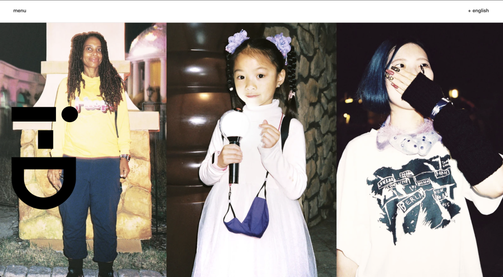
The first responsive website I decided to explore is Pinterest, the comparison between the website and app is similar but the two layout breaks have some differences. The website on a desktop is visually pleasing as it shows aesthetically attractive imagery tailored towards the viewer. The website has a simple but effective layout providing the viewer with a familiar display, which contrasts with a considerable number of grids and frames. The menu is a lengthy bar situated across the top of the screen, easily located by the viewer. It clearly displays aspects of the menu such as a search bar, home page, and other useful options. The rest of the website is a continuous flow of creativity and visual imagery.  The responsive app/website layout on mobile is slightly different from the website on a desktop. The menu has changed significantly from the way it is communicated on the desktop version of the website, this is condensed into smaller menus that are situated at the top and bottom of the screen. The overall menu situation has changed coming from a desktop to a mobile, these changes are seen by examining the menu options, not only have the menu icons changed but the layout and text configuration has too. This is apparent when looking at the menu options available on the desktop such as Home, Today, and Create and comparing them to the mobile options Browse and Watch. This differential menu configuration may be confusing through the layout break to viewers going from the website on a desktop to the website/app on a mobile. The rest of the mobile layout is similar to the desktop website as the imagery flows in the same way, it has just been resized to fit on the differing layout break losing out on viewing multiple imageries in one swipe.  The second responsive website I decided to explore is the fashion and lifestyle magazine i-D, the desktop website differs slightly from the mobile website. The desktop website makes use of a simple layout, with a dropdown menu in the top left and an option to change the language in the top right-hand corner. The rest of the website on arrival displays imagery from the newest article. The desktop website is simple but communicates stories to the viewer in a creative way.  The responsive website changes slightly when visited from a mobile device. The layout is only slightly disrupted from the desktop, with the rearrangement of the magazine logo which is now situated between the menu options at the top of the page. The layout break slightly improves the use of space as the article imagery doesn’t take up the whole screen when resized to fit the mobile. Viewing the website on mobile, the viewer is greeted with imagery and part of the article below, this communicates to the reader they must scroll down to read more. The imagery has slightly changed from the original desktop version by cropping one of the images out completely. The final responsive website I decided to explore is Nike. The desktop website and mobile layout break differ significantly. Upon arrival, at the desktop website, the viewer is greeted with a jampacked vision of what Nike have to offer. There is a clear menu at the top with directly linked icons of other brands Nike have partnered with such as Jordans and Converse. There are also clear ways of how to find nearby shops and navigational menus for the website itself.  The responsive website changed when visiting the website on mobile. The large and in charge menu option at the top of the desktop version is condensed down significantly into an orderly hamburger drop-down menu. The layout break also involves the depletion of links to other partnering brands above the Nike branding as seen on the desktop version. Instead, they’re incorporated into the drop-down menu. Another difference in the layout break that stands out is that the imagery position has changed, instead of having an image carousel dedicated to the promotion of their app, there is only the Air Force 1 promotion. The original branding imagery promotion for the Air Force 1 has also lost a lot of imagery when resized to fit the mobile site. The resized image doesn’t show the Air Force 1 which takes away from their promotion.  The layout break from desktop to mobile could be enhanced by incorporating the app promotion on the mobile version, this is because more people will be inclined to download the app on their phones rather than on their desktops.   References i-d.vice.com. (n.d.). i-D. [online] Available at: https://i-d.vice.com/en. Nike (2019). Nike. Just Do It. [online] Nike.com. Available at: https://www.nike.com/gb/.‌ Pinterest (2019). Pinterest (United Kingdom). [online] Pinterest. Available at: https://www.pinterest.co.uk.‌ ‌ ‌

RP4 – Visual Responsive Websites Read More »

Dev Blog 6 – Interactive Elements within Elementor

Introduction  Making webpages interactive on WordPress, using the HTML plug-in on Elementor.  Individual Task 1  The first task was to follow a series of instructions which involved adding an HTML widget to an Elementor webpage and pasting the code provided. The code translated into a heading which I tested in another browser to ensure the HTML worked.  Individual Task 2  The second task was to add HTML to another widget which makes use of CSS animation. I used BB Edit and pasted in the CSS code and HTML ensuring the code was in the correct order. I then copied the code into the HTML widget and ensured to test that it worked in another browser.  Individual Task 3  The third task was to independently explore Codepen and look for other HTML codes to explore in Elementor. I found a hover asset which could be used for multiple examples on a webpage such as a heading or a call-to-action design. I followed the previous instructions on how to install the HTML into Elementor and used BB Edit to translate the code. I tested the hover asset worked in a new browser. The HTML code worked but it was stylised by the Elementor website so didn’t communicate in the same way as seen on the Codepen preview.  Google Experiments  The final exercise was to explore Google Experiments and choose five examples of visual design which could be used in web design. The Spirit Link to The Spirit on Google Experiments – https://experiments.withgoogle.com/the-spirit The creative design of the Spirit is a WebGL experience using the noise derivatives and curl noise to create a smoky look and feel. The fun design could potentially work in web design as well as game design. The Spirit could be used as an accessible curser, the user could utilise the design by changing the size of the output which could enhance the user experience by being fun to use but also large enough to see if the users’ vision is impaired. Sodar Link to Sodar on Google Experiments – https://experiments.withgoogle.com/sodar Sodar is a social distancing tool used for protection during the Covid-19 outbreak. The user can visually see what the recommended 2 metres distance looks like using a website on their phone. The design could be utilised in other aspects of web design such as virtual tours, measuring tools and directional maps. The virtual reality aspect of the design would make virtual tours more exciting, for example, a virtual reality tour of a gym may entice the user to join the club in the hope the gym offers even more exciting endeavours inside.  Hip-Hop Poetry Bot Link to Hip Hop Poetry Bot – https://experiments.withgoogle.com/hip-hop-poetry-bot The Hip-Hop Poetry Bot web design inspired me, the stylised project could be used for promotional marketing in a range of industries. The design emulates a static tv, this could be used as a transitional phase in promotional advertisements.  Weird Cuts Link to Weird Cuts – https://experiments.withgoogle.com/weird-cuts Weird Cuts is a collage-based app that invites users to experiment with photography. The design concept could be used in a brutalist style on an interactive website. The brutalist website could potentially be based around photography or other art media with captions layered over the top and other illustrations in a hectic, unorganised way to make the website stand out from others that follow design principles. Glitch Link to Glitch on Google Experiments – https://experiments.withgoogle.com/glitch Glitch uses glitch effects to create exciting imagery that appears to move in a cyber-style manner, the designs could be used to promote tech brands but also make other promotions and website designs look grittier and more urban. 

Dev Blog 6 – Interactive Elements within Elementor Read More »

RP3 – Narrative Sequences

The first narrative sequence I decided to explore is a scene from the sitcom Broad City. The narrated sequential scenes demonstrate the response to an unwarranted comment from a stranger on the street. The dynamic scenes have been filmed to communicate to the viewer that the man in the background is muttering an uncalled-for comment at the women casually strolling down the street. The scene is amplified by the man slightly turning towards the woman with a look of disrespect, diverting the focus from the extras in the background utilized to create an atmosphere. The technique becomes more apparent throughout scene two as the three begin to interact. The final scene in the sequence shows the women responding without words, exaggerating their smiles humorously and childishly. The response signifies the message they’re trying to portray, indicating the man as unjustified, malicious, and childish.  The second narrative sequence I decided to explore is a series of illustrative scenes establishing a relatable morning routine. The lengthy sequences show a range of highly developed illustrations communicating the mundane tasks humans characteristically perform daily. The scenes portray a sense of sleepiness as they progress through the stages of getting ready for work without the need for narration. The highly detailed illustrations communicate the message clearly to the viewers in an artistic style.  The final narrative sequence I decided to explore is a short comedic storyboard expressing the avoidance of a serious topic in a happy-go-lucky and relatable way. The first scene shows a deflated woman expressing her feelings to a frog. The unrealistic approach brings personality and uniqueness to the story. The second scene demonstrates her response to the matter, in a realistic way of escaping our own thoughts. The woman feels as though making drastic changes to her appearance will make her feel like a new woman, therefore diminishing her real feelings of depression. Scenes three and four communicate the frog’s response to her theory in an honest manner. The illustrations and colours throughout the sequence communicate the message in a light-hearted fashion. The sequence I designed is a light-hearted play on the phrase ‘digging a hole to China’. I decided to use this phrase in the context of a dog hiding a bone in a field. The first scene is capturing the dog and the initial thought of needing to hide the bone. This is a simple introduction to the following scenes. The second scene illustrates the dog’s thoughts when digging a shallow hole in the ground with the play on the established phrase. The final scene communicates the outcome of the dog hiding the bone. The bone is still visible, exaggerating the phrase with contradiction in a humorous manner, using a final thought bubble. References 17+ Abbi and Ilana Friendship Quotes: TV shows funny, Broad City, Broad City quotes (2019) Pinterest. Available at: https://www.pinterest.co.uk/pin/737675613948323662/ (Accessed: October 20, 2022).  Pinterest. (n.d.). My Little Comics About Daily Life | Storyboard illustration, Storyboard drawing, Comic illustration. [online] Available at: https://www.pinterest.co.uk/pin/698339485989773221/ [Accessed 20 Oct. 2022].‌ Pinterest. (n.d.). Pin on Cartoon Inspirations. [online] Available at: https://www.pinterest.co.uk/pin/698339485989768521/ [Accessed 20 Oct. 2022].‌

RP3 – Narrative Sequences Read More »

Dev Blog 5 – Onboarding Greeting Cards

Introduction  The brief for this group project was to design an onboarding sequence in our sketchbooks for a greeting card business. We were given a timeframe outlined by the steps below.  Step 1 – Brain-shower concepts (10 minutes). Step 2 – Decide on the best concept (3 minutes). Step 3 – Agree on the target audience (2 minutes). Step 4 – Work individually on an onboarding draft (sketchbook) (45 minutes). Step 5 – Compile the best ideas into one idea. Step 6.- Present to the class. Group Reflection  I formed a group with Abbie and Lucy and we first brain showered as many unique greeting card ideas as possible to ensure we had enough concepts to choose from as a group. It became apparent early in the brain-showering task that Abbie should take the lead position as creative director as she had the most original and interesting ideas. Moreover, the concept we decided to develop further was the offensive greetings card business originally thought of by Abbie; this concept had the most potential when discussing the types of cards the business would have on offer. Such as death countdowns and rewards for being the most unreasonable you can be, distinguished as the Karen awards range. We also found a strong link with the unusual milestones cards as a comedic addon to the range.  After deciding on the niche, we began to think of a suitable target audience. We concluded after much contemplation that the card ranges would be suitable for all ages, excluding young children. Moreover, as a group, we imagined people sending these cards to friends and family as a practical joke for birthdays and other occasions with the option of sending them completely anonymously to add to the whole ‘mean’ experience.  After developing our concept and discussing target audiences and branding, we separately started developing potential onboarding sequences for the business’s website/app in our sketchbooks. When designing our onboarding sequences, we halted production as we struggled to think of original ideas. After discussing our own setbacks, we all chipped in and helped each other come up with a simple but effective idea.  Furthermore, we compiled our best ideas and developed a mock-up of each onboarding sequence on XD; this solidified our ideas.  Individual Design Development I quickly designed a mock-up of my onboarding sequence in my sketchbook before using XD to create a more defined version of the mock-up. My contribution focused on introducing the website/app to the user with a clear approach. The first onboarding screen makes use of an interactive slider which the user can slide across declaring how horrible they think they are. Once they have set how horrible they are using the slider the website would recommend cards based on their confession. The second screen guarantees the user understands that the cards may be offensive. The final screen encourages them to be as mean as possible to add to the overall experience.  Padlet link: https://padlet.com/ljmagowan2020/k398449umhasstfc  Conclusion  In conclusion, regarding the group mechanics, I feel we worked well together when coming up with a range of ideas. We all had an equal voice and having a creative director solidified our relationships and how we communicated. Moreover, next time I feel we should concentrate on coming up with more volume when discussing original onboarding strategies to give our group even more depth when designing. 

Dev Blog 5 – Onboarding Greeting Cards Read More »

Dev Blog 4 – Email Marketing – Mailchimp and Royal Addons

Introduction  Upon completing the User Experience presentation, we were tasked with setting up an email marketing strategy for our WordPress blogs. The marketing strategy consists of a subscription option/pop-up to entice users to sign up for a mailing list which can be used to market campaigns and items without having to be online and active on the site. This way of marketing is practical when creating a personalized experience for the audience, sending out relevant advertisements and information based on their individual preferences straight to their email and expanding on multichannel user experience elements.  Individual Task  Step 1 – The first step to set up the pop-up mailing list subscription was registering for an account with MailChimp; this is an online space to store and monitor all the email activity gained from the pop-up on the WordPress blog (Figure 1). Step 2 – The next step was installing the Royal Addon plug-in on WordPress; this plug-in provides additional widgets, making creating a pop-up from a template easier (Figure 2)   Step 3 – Creating the pop-up was a simple process utilizing tools and widgets from the Royal Addon plug-in through the Elementor website design add-on. The available tools made it easy to install an image and embed a link, as seen in the image below (Figure 3) Step 4 – After creating the simple pop-up for future email capture, I had to connect my API key from the MailChimp account to ensure it was synchronized with the WordPress blog; this is important for control over the user signing up for the mailing list (Figure 4) Once the API key was connected and the pop-up was posted to the word press account, it became apparent that something had gone wrong in the process, as the pop-up wasn’t showing up on the live site and only as a separate page on the blog (Figure 5). I later concluded that this mishap occurred because I didn’t set the preferences of which pages the pop-up would be displayed. After correctly delegating the pages for the pop-up, the mailing list subscription pop-up worked across the live site (Figure 6) Finally, I tested the pop-up by subscribing to the mailing list myself; the pop-up gave me positive feedback, letting me know it had worked (Figure 7). Next, I checked my Mailchimp account to ensure the site had synced the sign-up. My email was then on display in the audience section of my MailChimp account, solidifying the set-up of both accounts and that the pop-up was working (Figure 8). Conclusion  In conclusion, setting up the pop-up on my WordPress account was simple and allowed me to explore new tools and widgets that may become useful when creating my portfolio website. Finally, if I did this activity again, I would team up with someone and ask them to subscribe through their own server to test the pop-up abilities further.

Dev Blog 4 – Email Marketing – Mailchimp and Royal Addons Read More »

Dev Blog 3 – Website Setup – HTML and Control Panels

Introduction  The group project was assigned to help us better understand our website setup, how servers work and HTML. Individual Task  The first task was to build our own index page using HTML from W3Schools; this was straightforward with the help of online resources. Predominantly I explored cPanel and the file management system before actively completing the task; this ensured I had an initial understanding of where the files I create will be saved. After gaining an understanding of cPanel, I began to create new HTML for my webpage. How to add headings and paragraphs became clearer as I started to understand the layout of an HTML page and what each block meant. I decided to create a team page named UoH Graphic Design which will display my group’s web pages. At first, I felt overwhelmed by the task as the HTML code was completely new to me, but with further investigation, I started to become familiar with coding and I enjoyed building a webpage.  Group Reflection  I was grouped with Abbie and Lucy, and our task was to set up an individual group page with links to our personal pages attached using HTML with the help of W3Schools. Our group struggled with this task as none of us had ever worked with web design in this way; we used our communication skills to help each other along the process, learning new things whilst becoming overwhelmed by the limited time we had to utilise in class. Moreover, as we didn’t have much confidence in that task, our leadership skills were sacrificed due to the confusion between learning new HTML and keeping up with each other. I feel we could have improved our experience as a group by assigning a team leader to ensure we were all on the same page. However, we came out with a successful web page combining all our original index pages with links.  Conclusion  In conclusion, I feel our group was proactive in learning from each other as we progressed. Moreover, this brought us together and ensured we worked closely as a team. We could have improved our original work with CSS style guides, adding columns, grids, and images, although we didn’t have enough time to execute this and gain valuable knowledge at the same time. However, working together has helped us build character and a positive relationship which will be highly beneficial when working on more challenging tasks in the future. 

Dev Blog 3 – Website Setup – HTML and Control Panels Read More »

RP2 – Multichannel UX

Costa Coffee Website Upon arrival at the Costa Coffee website, the users are greeted with their first multichannel user experience, imagery promoting the external rewards app’s existence, and a link to a sign-up/login page (Figures 1 and 2). The imagery immediately communicates to the user that costa is knowledgeable regarding the multichannel promotion of the services on offer whilst also representing Costa as a forward-thinking company. Furthermore, as the user progresses through the website, it becomes apparent that Costa Coffee also offer a range of physical multichannel user experiences, including the costa delivery service utilizing external delivery conveniences such as Uber and Just Eat (Figures 3 and 4). Finally, the success of the physical rewards card is another multichannel example (Figure 5). The Costa card gives users options and is highly successful with the older generation, who do not necessarily have access to the internet. The physical card also can be utilised as a safety net when collecting points without an internet connection, ensuring users never miss out on gaining points towards their rewards. Costa Coffee App The onboarding sequence assists the users in the navigation of the Costa app. Throughout the onboarding sequence, there are hints and links to multichannel experiences, for example, Costa gifting (Figure 8). Promoting the gifting element puts the power of multichannel straight into the users’ hands by allowing them to share their points with their friends; this creates an online channel through multiple phones and accounts. Finally, multichannel UX is demonstrated on the app with the option to receive push notifications from Costa through email, mobile and post; all of the options link to external channels (Figures 9 and 10). Moreover, the possibility of turning this feature on/off provides the user with a choice to receive notifications or not, helping them create the best online experience for them. Costa Coffee Store Visit Arriving at Costa, there were visible links and promotions to online multichannel experiences such as the Costa rewards app. The advertisements were consistently displayed throughout the store walk-through right to the point of the user leaving the store. Moreover, this is a successful way of enticing the user to download the app and receive rewards. Physical Costa cards were available to customers in-store with onboarding sequences communicating how to use the card and download the app. Improvements An opportunity for improvement throughout the multichannel experiences on offer at Costa would be the addition of QR codes throughout the promotional material in-store. Adding a QR code that takes the user straight to the app download would make it easier for someone wanting to download the app in the queue quickly before being served. Moreover, this eliminated the time it takes to load and search through the app store or equivalent, taking the pressure of acting quickly off the customer. Multichannel Campaign Suggestions A suggestion for a new multichannel user experience would be the addition of social media account promotion material online and in-store. For example, each individual store could have an official Instagram account where customers could interact with their favourite stores, creating a safe online community atmosphere, and helping the whole costa experience become even more personal, relatable and forward-thinking.

RP2 – Multichannel UX Read More »

Dev Blog 2 – Birdhouse

Introduction  The brief for this task was to design a concept surrounding the idea of birdhouses in groups, thinking outside of the box, and testing our compatibilities working as a creative team.   Group Reflection  Primarily, I formed a group of three with Abbie and Sydney, and we began to brain shower initial thoughts and ideas surrounding the birdhouse concept. Upon reflection, I believe we struggled initially to discuss ideas and get them down on the page. However, this was due to being distracted and off-topic. We were prompt to recognise this flaw within our team and decided to evaluate whether we needed a creative director to ensure we stayed focused on the task. We decided against having a creative director because none of us felt confident enough to lead the team. We agreed as a team to ensure we only conversed on the birdhouse task and stayed focused entirely on the concepts at hand. Overall, after facing our initial struggle I felt we had valuable ideas surrounding the brief. If we stayed focused on the brief from the beginning, we could have applied more depth to our starting points and linked our designs to one another. In the future, I will be proactive in ensuring my group is focused and that everyone feels they can speak up about their ideas, diminishing any discomfort the group may feel. Individual Design Process Once my group finished the brain-showering portion of this project we decided to choose one concept each and design a campaign surrounding the idea.  I initially thought of the word ‘bird’ as English slang for women which led me to design Birds of Advice. Originally, I decided to focus on the idea of the ‘birdhouse’ becoming a safe space for women to take refuge from domestic abuse. Although after contemplating the concept becoming too heavy, I decided to focus the narrative on an overall sexual health clinic solely for women. After developing the concept for Birds of Advice, I started to think of ways to communicate the message through a series of visual leaflets. I decided to incorporate discreet light-hearted messages in the leaflet designs by adding comical sayings which could be associated with sexual health and actual birds in keeping with the overall theme.   The Concept – Birds of Advice, a sexual health clinic for women.  Target Audience – Women of all ages.  Promotion – Leaflet design.  Conclusion  In conclusion, I feel my team worked well together to generate ideas but could have made an extra effort to stay focused throughout the brain-showering process. In addition, I believe our time management let us down when designing our chosen concepts, which led to most of the work needing to be completed outside of the university. This made it hard to interact and be readily available to give each other feedback. 

Dev Blog 2 – Birdhouse Read More »

Dev Blog 1 – Water not Suger Campaign

Introduction  The brief for the group activity was to design a campaign in two hours that aims to persuade preschool children between the ages of 3 – 5 to drink water over sugary drinks. Group Reflection  Initially, we composed our group of four and discussed who should take the lead position of creative director; we concluded that Ellie and I would take joint responsibility for leading the team and ensuring everybody’s voice was heard. Next, we evaluated the concept and brainstormed as many ideas as possible to ensure we had a broad range of topics to explore that contributed towards the campaigning brief. The group was proactive throughout brainstorming, reinforcing our previous personality tests’ results and suggesting that we are all team workers, helping us function well without anyone feeling left out of the conversation. After the brainstorming portion of the activity was over, we decided as a group to delegate the most fitting task to each teammate, ensuring that the work was evenly spread, considering everyone’s strengths and weaknesses. I was given the task of designing a board game.  We then decided on a target audience and brand identity, considering colours and typography to ensure the branding of all our designs was consistent throughout. We struggled when deciding on a name for our concept but ended up deciding on ‘Aquakids’. The name clearly communicates the branding, persuading preschool children to drink more water. Upon reflection, I feel the group worked well together without any significant setbacks; we all had an equal voice and communicated well, ensuring there were no inconsistencies throughout the time working together. Logo Design Figures 3 to 9 show the evolution of how the Aquakids logo developed over time; as a team, we discussed the different logos designed by Ellie and me. We concluded by combining elements from both designs to create a well-rounded logo which clearly represents the brand identity. Individual Design Process  My contribution to the campaign brief was to design a board game children could play to make drinking water more fun. I used illustrator to communicate the design, ensuring the branding was consistent with the group’s choices. Throughout the design process, I asked for feedback from the group to ensure we were all on the same page about the design and so I could get constructive feedback following design choices. Figures 10 to 19 are images of the board game ‘Save the Polar Bears by Aquakids’.  The thought process behind the Save the Polar Bears board game was to inspire children to drink more water while briefly educating them on the climate crisis; this brings more educational depth to the game and links well with the water theme.The rules of the game are simple; the children spin the wheel, and depending on which direction the spinner lands on, they either ‘freeze’ the ice by drinking water and connecting a magnet to the game board or they melt the ice by removing a magnet from the game board and spinning again. The game will continue until all the ice is ‘frozen’, and the polar bears are saved. Upon completion of the board game, the children will be awarded a sticker for drinking their water. Moreover, this encourages them to earn stickers for their charts, gaining them prizes once they have completed their charts for the week.  Rejected Design  The snakes and ladders inspired board game ended up becoming a rejected design through a group re-evaluation after hearing feedback from the class. The original game idea was scrapped due to it not communicating the whole purpose of the campaign efficiently and potentially being too tricky for younger children to understand. However, as discussed above, the concept led to new ideas of including an educational factor in the new board game design.

Dev Blog 1 – Water not Suger Campaign Read More »

RP1 – Grids and Frames

Examples of grids and frames used structurally and to communicate visually in everyday settings. The use of grids and frames is demonstrated throughout the visual design of the David Bowie magazine (Figure 1 – 6). The purposeful placement of images and text draw the reader in and take them on a clear visual journey ensuring they’re captivated by the content. The magazine makes use of a variety of different columns, which capture different types of text and imagery. The inconsistency of the shape, size and layout of the grids and frames provides the reader with a sense of liberation and release from the ridged structures found in other examples of reading material. Moreover, this interprets a sense of freedom and encapsulates the essence of David Bowie and his influential presence. The artist has used a grid format to create a separation between illustrations (Figure 7). Without the occurrence of the grid, the page would be overwhelming and crowded, taking away from the intricate details in each piece of artwork. The film and polaroid photography use a simple three-column grid with individual frames that tell viewers a series of intimate visual stories (Figure 8 – 10). The placement of columns on the page is scattered, providing a sense of realism and personality in a visually pleasing manner. Expanding on the use of grids and frames through the presentation of photography, the example of a scrapbook still uses the basic structure of columns with a more personalised approach (Figure 11). Grids and frames are also apparent in architecture, ensuring buildings are structurally safe and visually striking. For example, various grids and frames are used in the architectural images in and around Hull (Figure 12 – 19). Moreover, grids are used in public instalments such as bus stops, phone boxes and shelters. For example, the grids used in the phone box image are used for structural and visual purposes, as the frames hold the windows in place and make a pattern (Figure 20). Finally, grids and frames are used in everyday systems such as drains and road markings (Figure 21 – 23). Moreover, instead of being used in structures or visual design, they have functional purposes such as guiding road users and draining rainwater from the roads ensuring they don’t flood. References Derrick, R. and Muir, R., 2012. Unseen Vogue. London: Little, Brown. Mojo The Collectors Series, 2022. Bowie Essentials. (36).

RP1 – Grids and Frames Read More »

Scroll to Top