EX2 – Web and Graphic Design | Elementor Plugin

The first task was to explore Elementor and discover the tools that can be used to make a website fully customisable. I first experimented with colours, I tried to build a complementary colour pallet with the tools available on Elementor. I changed the colours on my website in the site settings menu and played around with them until I found a palette that could potentially be used in my campaigning portfolio. I then decided to explore different typography options, I wanted to find fonts which could be used across a wide range of projects. The two fonts I found on Google Fonts are bold and highly legible with characteristics I could potentially utilise throughout my portfolio website. I changed my font in site settings to Staatliches as it has an urban feel to it, which I would like to interpret in my portfolio piece.  Next, I used images from previous posts to explore the image settings on Elementor. I used an image from a climate protest and decided to change the size and composition of the image on the page. I then discovered that I could make image carousels which could be useful in later projects. There are many options when creating the image carousels, such as size, number of images, and navigational options which help make the carousel fully customisable.  Finally, I decided to explore different widgets such as ratings and countdowns. The countdown widget could be useful when planning events or counting the days until a specific launch or product release.  The second task was to create a mood board exploring ideas which could be used in the campaigning portfolio project. The main aim of creating the mood board was to come up with a specific colour pallet and typography options for use throughout the website. This was difficult as I was still unsure of what message I wanted to convey in the final portfolio website. I created my mood board using illustrator and photoshop. 

EX2 – Web and Graphic Design | Elementor Plugin Read More »

RP2 – Multichannel UX

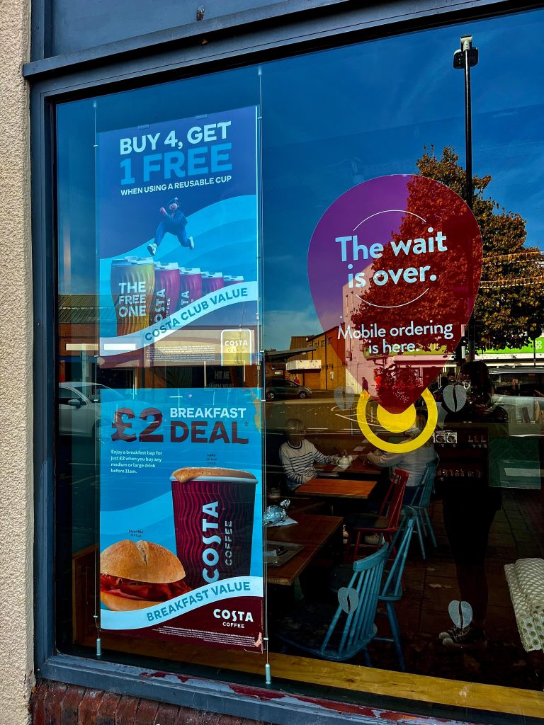
Costa Coffee Website Upon arrival at the Costa Coffee website, the users are greeted with their first multichannel user experience, imagery promoting the external rewards app’s existence, and a link to a sign-up/login page (Figures 1 and 2). The imagery immediately communicates to the user that costa is knowledgeable regarding the multichannel promotion of the services on offer whilst also representing Costa as a forward-thinking company. Furthermore, as the user progresses through the website, it becomes apparent that Costa Coffee also offer a range of physical multichannel user experiences, including the costa delivery service utilizing external delivery conveniences such as Uber and Just Eat (Figures 3 and 4). Finally, the success of the physical rewards card is another multichannel example (Figure 5). The Costa card gives users options and is highly successful with the older generation, who do not necessarily have access to the internet. The physical card also can be utilised as a safety net when collecting points without an internet connection, ensuring users never miss out on gaining points towards their rewards. Costa Coffee App The onboarding sequence assists the users in the navigation of the Costa app. Throughout the onboarding sequence, there are hints and links to multichannel experiences, for example, Costa gifting (Figure 8). Promoting the gifting element puts the power of multichannel straight into the users’ hands by allowing them to share their points with their friends; this creates an online channel through multiple phones and accounts. Finally, multichannel UX is demonstrated on the app with the option to receive push notifications from Costa through email, mobile and post; all of the options link to external channels (Figures 9 and 10). Moreover, the possibility of turning this feature on/off provides the user with a choice to receive notifications or not, helping them create the best online experience for them. Costa Coffee Store Visit Arriving at Costa, there were visible links and promotions to online multichannel experiences such as the Costa rewards app. The advertisements were consistently displayed throughout the store walk-through right to the point of the user leaving the store. Moreover, this is a successful way of enticing the user to download the app and receive rewards. Physical Costa cards were available to customers in-store with onboarding sequences communicating how to use the card and download the app. Improvements An opportunity for improvement throughout the multichannel experiences on offer at Costa would be the addition of QR codes throughout the promotional material in-store. Adding a QR code that takes the user straight to the app download would make it easier for someone wanting to download the app in the queue quickly before being served. Moreover, this eliminated the time it takes to load and search through the app store or equivalent, taking the pressure of acting quickly off the customer. Multichannel Campaign Suggestions A suggestion for a new multichannel user experience would be the addition of social media account promotion material online and in-store. For example, each individual store could have an official Instagram account where customers could interact with their favourite stores, creating a safe online community atmosphere, and helping the whole costa experience become even more personal, relatable and forward-thinking.

RP2 – Multichannel UX Read More »

Dev Blog 2 – Birdhouse

Introduction  The brief for this task was to design a concept surrounding the idea of birdhouses in groups, thinking outside of the box, and testing our compatibilities working as a creative team.   Group Reflection  Primarily, I formed a group of three with Abbie and Sydney, and we began to brain shower initial thoughts and ideas surrounding the birdhouse concept. Upon reflection, I believe we struggled initially to discuss ideas and get them down on the page. However, this was due to being distracted and off-topic. We were prompt to recognise this flaw within our team and decided to evaluate whether we needed a creative director to ensure we stayed focused on the task. We decided against having a creative director because none of us felt confident enough to lead the team. We agreed as a team to ensure we only conversed on the birdhouse task and stayed focused entirely on the concepts at hand. Overall, after facing our initial struggle I felt we had valuable ideas surrounding the brief. If we stayed focused on the brief from the beginning, we could have applied more depth to our starting points and linked our designs to one another. In the future, I will be proactive in ensuring my group is focused and that everyone feels they can speak up about their ideas, diminishing any discomfort the group may feel. Individual Design Process Once my group finished the brain-showering portion of this project we decided to choose one concept each and design a campaign surrounding the idea.  I initially thought of the word ‘bird’ as English slang for women which led me to design Birds of Advice. Originally, I decided to focus on the idea of the ‘birdhouse’ becoming a safe space for women to take refuge from domestic abuse. Although after contemplating the concept becoming too heavy, I decided to focus the narrative on an overall sexual health clinic solely for women. After developing the concept for Birds of Advice, I started to think of ways to communicate the message through a series of visual leaflets. I decided to incorporate discreet light-hearted messages in the leaflet designs by adding comical sayings which could be associated with sexual health and actual birds in keeping with the overall theme.   The Concept – Birds of Advice, a sexual health clinic for women.  Target Audience – Women of all ages.  Promotion – Leaflet design.  Conclusion  In conclusion, I feel my team worked well together to generate ideas but could have made an extra effort to stay focused throughout the brain-showering process. In addition, I believe our time management let us down when designing our chosen concepts, which led to most of the work needing to be completed outside of the university. This made it hard to interact and be readily available to give each other feedback. 

Dev Blog 2 – Birdhouse Read More »

Dev Blog 1 – Water not Suger Campaign

Introduction  The brief for the group activity was to design a campaign in two hours that aims to persuade preschool children between the ages of 3 – 5 to drink water over sugary drinks. Group Reflection  Initially, we composed our group of four and discussed who should take the lead position of creative director; we concluded that Ellie and I would take joint responsibility for leading the team and ensuring everybody’s voice was heard. Next, we evaluated the concept and brainstormed as many ideas as possible to ensure we had a broad range of topics to explore that contributed towards the campaigning brief. The group was proactive throughout brainstorming, reinforcing our previous personality tests’ results and suggesting that we are all team workers, helping us function well without anyone feeling left out of the conversation. After the brainstorming portion of the activity was over, we decided as a group to delegate the most fitting task to each teammate, ensuring that the work was evenly spread, considering everyone’s strengths and weaknesses. I was given the task of designing a board game.  We then decided on a target audience and brand identity, considering colours and typography to ensure the branding of all our designs was consistent throughout. We struggled when deciding on a name for our concept but ended up deciding on ‘Aquakids’. The name clearly communicates the branding, persuading preschool children to drink more water. Upon reflection, I feel the group worked well together without any significant setbacks; we all had an equal voice and communicated well, ensuring there were no inconsistencies throughout the time working together. Logo Design Figures 3 to 9 show the evolution of how the Aquakids logo developed over time; as a team, we discussed the different logos designed by Ellie and me. We concluded by combining elements from both designs to create a well-rounded logo which clearly represents the brand identity. Individual Design Process  My contribution to the campaign brief was to design a board game children could play to make drinking water more fun. I used illustrator to communicate the design, ensuring the branding was consistent with the group’s choices. Throughout the design process, I asked for feedback from the group to ensure we were all on the same page about the design and so I could get constructive feedback following design choices. Figures 10 to 19 are images of the board game ‘Save the Polar Bears by Aquakids’.  The thought process behind the Save the Polar Bears board game was to inspire children to drink more water while briefly educating them on the climate crisis; this brings more educational depth to the game and links well with the water theme.The rules of the game are simple; the children spin the wheel, and depending on which direction the spinner lands on, they either ‘freeze’ the ice by drinking water and connecting a magnet to the game board or they melt the ice by removing a magnet from the game board and spinning again. The game will continue until all the ice is ‘frozen’, and the polar bears are saved. Upon completion of the board game, the children will be awarded a sticker for drinking their water. Moreover, this encourages them to earn stickers for their charts, gaining them prizes once they have completed their charts for the week.  Rejected Design  The snakes and ladders inspired board game ended up becoming a rejected design through a group re-evaluation after hearing feedback from the class. The original game idea was scrapped due to it not communicating the whole purpose of the campaign efficiently and potentially being too tricky for younger children to understand. However, as discussed above, the concept led to new ideas of including an educational factor in the new board game design.

Dev Blog 1 – Water not Suger Campaign Read More »

RP1 – Grids and Frames

Examples of grids and frames used structurally and to communicate visually in everyday settings. The use of grids and frames is demonstrated throughout the visual design of the David Bowie magazine (Figure 1 – 6). The purposeful placement of images and text draw the reader in and take them on a clear visual journey ensuring they’re captivated by the content. The magazine makes use of a variety of different columns, which capture different types of text and imagery. The inconsistency of the shape, size and layout of the grids and frames provides the reader with a sense of liberation and release from the ridged structures found in other examples of reading material. Moreover, this interprets a sense of freedom and encapsulates the essence of David Bowie and his influential presence. The artist has used a grid format to create a separation between illustrations (Figure 7). Without the occurrence of the grid, the page would be overwhelming and crowded, taking away from the intricate details in each piece of artwork. The film and polaroid photography use a simple three-column grid with individual frames that tell viewers a series of intimate visual stories (Figure 8 – 10). The placement of columns on the page is scattered, providing a sense of realism and personality in a visually pleasing manner. Expanding on the use of grids and frames through the presentation of photography, the example of a scrapbook still uses the basic structure of columns with a more personalised approach (Figure 11). Grids and frames are also apparent in architecture, ensuring buildings are structurally safe and visually striking. For example, various grids and frames are used in the architectural images in and around Hull (Figure 12 – 19). Moreover, grids are used in public instalments such as bus stops, phone boxes and shelters. For example, the grids used in the phone box image are used for structural and visual purposes, as the frames hold the windows in place and make a pattern (Figure 20). Finally, grids and frames are used in everyday systems such as drains and road markings (Figure 21 – 23). Moreover, instead of being used in structures or visual design, they have functional purposes such as guiding road users and draining rainwater from the roads ensuring they don’t flood. References Derrick, R. and Muir, R., 2012. Unseen Vogue. London: Little, Brown. Mojo The Collectors Series, 2022. Bowie Essentials. (36).

RP1 – Grids and Frames Read More »

Collage Maker UX Narrated Video

Collage Maker Narrated Video Collage Maker XD link https://xd.adobe.com/view/efd063f3-95d6-4a87-88db-1ccf4f64e638-ba83/?fullscreen&hints=off References Cristianacouceiro.com. 2022. cristiana couceiro. [online] Available at: <https://cristianacouceiro.com> [Accessed 10 April 2022]. Ecletti.com. 2022. Kitsch | Ecletti. [online] Available at: <https://ecletti.com/articles/kitsch.html> [Accessed 30 April 2022]. Fesechko.art. 2022. Kitsch – “A second hand experience”. [online] Available at: <https://fesechko.art/2019/08/18/kitsch/> [Accessed 30 April 2022]. Messy Nessy Chic. 2022. The Groundbreaking Kitsch Cowboy Art of George Quaintance. [online] Available at: <https://www.messynessychic.com/2018/06/06/the-groundbreaking-kitsch-cowboy-art-of-george-quaintance/> [Accessed 30 April 2022]. Saatchi Art. 2022. The Kitsch Kittens Painting. [online] Available at: <https://www.saatchiart.com/art/Painting-The-Kitsch-Kittens/1079502/4197920/view> [Accessed 30 April 2022]. Soviet Art. 2022. Interpreting USSR kitsch Soviet artist Arkady Petrov – Soviet Art. [online] Available at: <https://soviet-art.ru/interpreting-ussr-kitsch-soviet-artist-arkady-petrov/> [Accessed 30 April 2022]. Unsplash.com. 2022. Beautiful Free Images & Pictures | Unsplash. [online] Available at: <https://unsplash.com> [Accessed 1 May 2022]. Zaha-hadid.com. 2022. Archive – Zaha Hadid Architects. [online] Available at: <https://www.zaha-hadid.com/archive> [Accessed 27 April 2022].

Collage Maker UX Narrated Video Read More »

Kitsch

Oxford Art Dictionary refers to kitsch as “Art, objects, or design considered to be in poor taste because of excessive garishness or sentimentality, but sometimes appreciated in an ironic or knowing way.” (kitsch, 2022) Below are examples of kitsch. Kitsch Art Kitsch Ornaments Kitsch Animation XD https://xd.adobe.com/view/04d5c940-024a-4de2-b171-dc7bed71a549-5186/ References Bennett, M. and Bennett, M., 2022. The Problem of Kitsch – Confluence. [online] Confluence.gallatin.nyu.edu. Available at: <https://confluence.gallatin.nyu.edu/context/first-year-writing-seminar/the-problem-of-kitsch> [Accessed 10 April 2022]. Danbury Mint. 2022. Betty Boop™ 90th Anniversary Sculpture. [online] Available at: <https://www.danburymint.com/figurines/betty-boop/betty-boop™-90th-anniversary-sculpture/6105-0019.html> [Accessed 10 April 2022]. Ecletti.com. 2022. Kitsch | Ecletti. [online] Available at: <https://ecletti.com/articles/kitsch.html> [Accessed 30 April 2022]. En.wikipedia.org. 2022. File:A Friend in Need 1903 C.M.Coolidge.jpg – Wikipedia. [online] Available at: <https://en.wikipedia.org/wiki/File:A_Friend_in_Need_1903_C.M.Coolidge.jpg> [Accessed 28 April 2022]. Fesechko.art. 2022. Kitsch – “A second hand experience”. [online] Available at: <https://fesechko.art/2019/08/18/kitsch/> [Accessed 30 April 2022]. Messy Nessy Chic. 2022. The Groundbreaking Kitsch Cowboy Art of George Quaintance. [online] Available at: <https://www.messynessychic.com/2018/06/06/the-groundbreaking-kitsch-cowboy-art-of-george-quaintance/> [Accessed 30 April 2022]. Npr.org. 2022. NPR Cookie Consent and Choices. [online] Available at: <https://www.npr.org/2018/03/22/595194000/the-fast-and-the-furry-us-wes-andersons-masterful-isle-of-dogs?t=1649595866840> [Accessed 10 April 2022]. Orr, C., 2022. The Beauty and Sadness of ‘Isle of Dogs’. [online] The Atlantic. Available at: <https://www.theatlantic.com/entertainment/archive/2018/03/isle-of-dogs-review/556292/> [Accessed 10 April 2022]. Oxford Reference. 2022. kitsch. [online] Available at: <https://www.oxfordreference.com/view/10.1093/oi/authority.20110803100039343> [Accessed 7 May 2022]. Saatchi Art. 2022. The Kitsch Kittens Painting. [online] Available at: <https://www.saatchiart.com/art/Painting-The-Kitsch-Kittens/1079502/4197920/view> [Accessed 30 April 2022]. Soviet Art. 2022. Interpreting USSR kitsch Soviet artist Arkady Petrov – Soviet Art. [online] Available at: <https://soviet-art.ru/interpreting-ussr-kitsch-soviet-artist-arkady-petrov/> [Accessed 30 April 2022]. the Guardian. 2022. Isle of Dogs review – a canine tale of strange beauty. [online] Available at: <https://www.theguardian.com/film/2018/apr/01/isle-of-dogs-review-wes-anderson> [Accessed 10 April 2022].

Kitsch Read More »

Minimalism

Minimalism can be seen throughout all aspects of life including architecture, fashion, art, music, media and modern design. Minimalism is used to describe simplicity, the art movement started post World War 11 and encouraged people to consume less with a less is more mindset. Minimalist Architecture Minimalist architecture focuses on clean lines, shapes and colours, without decoration promoting the bare construction of the building itself. Minimalist Interior Design Minimalism in interior design uses natural earthy tones to draw the outside in, creating a clean and natural environment. Minimalist Art Minimalist XD Boards https://xd.adobe.com/view/5d4e9275-6f60-4508-8a8b-e5ebf969d01d-081d/ Minimalist Animation https://xd.adobe.com/view/d3284dbb-9bf2-432d-9e71-5cb805d70bfa-867b/ References CommUNITY. 2022. Astrid Stavro, Pentagram — CommUNITY. [online] Available at: <https://communitysfdw.com/astrid-stavro> [Accessed 27 April 2022]. 2022. [online] Available at: <https://www.tate.org.uk/art/artworks/riley-blaze-p05083> [Accessed 28 April 2022]. See, G., 2022. Famous Minimalist Art That Defined the Genre | The Artling. [online] The Artling. Available at: <https://theartling.com/en/artzine/famous-minimalist-art/> [Accessed 28 April 2022]. The Artling. 2022. Minimalism 101: The Only Minimalist Art Guide You Will Need | The Artling. [online] Available at: <https://theartling.com/en/artzine/minimalism-art-guide/> [Accessed 28 April 2022]. Behance.net. 2022. Behance. [online] Available at: <https://www.behance.net/gallery/18127543/Visages> [Accessed 28 April 2022]. ttps://www.pinterest.co.uk/search/pins/?q=scandinavian%20interior&rs=rs&eq=&etslf=4783&term_meta[]=scandinavian%7Crecentsearch%7C0&term_meta[]=interior%7Crecentsearch%7C0> [Accessed 29 April 2022]. 2022. [online] Available at: <https://www.dezeen.com/2016/12/19/five-minimal-houses-residential-architecture-alberto-campo-baeza/> [Accessed 27 April 2022]. 2022. [online] Available at: <https://www.dezeen.com/2018/07/02/alvaro-siza-capela-do-monte-chapel-minimalist-architecture-algarve/> [Accessed 27 April 2022]. 2022. [online] Available at: <https://www.dezeen.com/2020/02/05/jewel-apollo-architects-associates-architecture-japanese-houses/> [Accessed 27 April 2022]. 2022. [online] Available at: <https://www.dezeen.com/2022/02/13/felipe-escudero-spaceship-house-central-magnolia-tree/> [Accessed 27 April 2022].

Minimalism Read More »

Scroll to Top