RP5 – Breaking the Rules

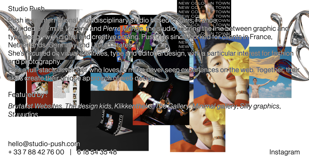
Brutalist Website – Studio Push The Studio Push website stands out from other websites because of its interactivity and innovative design. The website brings a playful twist to the audience by adding an interactive element. The twist of clicking to add an image is unseen on other websites. The audience can almost create a collage of their own whilst viewing editorial fashion photography from the studio. The website is trying to convey the message of using inventive coding to blur the line between graphic and type design, this reinforces the fact that type is an art of its own and can be combined with imagery to communicate and connect with the audience. The brutalist-style website is raw and simplistic and prioritises the function of clicking to add imagery over aesthetics. The website doesn’t make use of conventional grids or frames, but the user can create their own grid of images in a random configuration on the page. The interactive activity draws the audience in, encouraging them to make multiple collages. This can lead to more creative exposure and a higher ranking on the internet as more time is spent on the site. Studio Push uses minimal text to communicate the means behind its brutalist website but also uses it as part of the overall design and graphical experience. The chrome lettering is placed on a continuous loop contrasting the imagery in a futuristic manner, this adds movement to the overall website keeping it visually interesting. Imagery is used in a creative way which the user has full control over. The user can add as many images as they want to the page but cannot take them away. The webpage can be reset by pressing the Studio-Push button which changes form when hovered over. The Studio Push website is highly responsive when used on mobile. The mobile website responds just the same as the desktop website, which adds to the overall innovative experience. The user can add images to the page viewing the studio photography whilst creating visually pleasing collages. Brutalist Website – Ellen Allien The website Ellen Allien presents one of the most iconic techno and dance music artists in a visionary manner, with the use of futuristic elements and design. Ellen Allien stands out as a brutalist website because of the overall layout, typefaces, and delivery of animation. Upon arrival to the website, the user is greeted with a visually displeasing animation of imagery which flashes with the use of psychedelic colours. The delivery of animation is uneasy on the eyes almost encouraging the user to leave the site, but this design choice reflects the artist in a niche and creative manner, suiting the website’s topic. The website makes use of a two-column grid, one side displaying imagery and the other displaying information about each image. The grid is distorted and made less conventional and neat by the addition of mono-spaced typography almost overlapping the imagery. The way that typography, images, and columns have been arranged solidifies the brutalist design behind the website.  The typefaces are used to reflect the techno music, with the use of mono-spaced and blocky typography the musician is seen as futuristic and space-aged.  The Ellen Allien website slightly changes composition when visited on a mobile device. The loud animation used to reflect the artist’s music on the desktop version is non-existent on the mobile version which takes away from the overall feel of the techno website. Instead, the user is greeted with an innovative self-portrait of the techno musician. The responsiveness of the rest of the website has changed from a two-column grid to a one-column scrollable grid. The composition of the grid ensures all the information is visible without completely distorting the website.  Brutalist Website – Toilet Paper The Toilet Paper magazine was co-created by Italian artist Maurizio Cattelan and photographer Pierpaolo Ferrari. The website presents a range of collage work, with basic messages surrounding the topics of love and greed. The artists use wordplay, animation, bright colours, and surreal imagery to communicate their messages. The website is brutalist and different from regular eCommerce websites, the imagery is fun and placed randomly in a continuous flow of imaginative artwork.  The brutalist website uses colour in a complementary fashion, the bright colours draw the audience in and make for a visually pleasing experience. Imagery is used in a creative way, collaged throughout the website. The photography communicates strong messages to the audience, with some being uncomfortable to view, such as the image of the bird having its wings cut off.  The overall responsiveness of the website changes significantly when viewed on mobile. The mobile version lacks the creativity seen on the desktop version. The collage view of the artist’s work is completely removed from the mobile website taking away from the innovative structure of the artwork. Instead, the audience is presented with an abundance of different links communicated through imagery. Each link takes the audience to different social media pages, merchandise shops or collage builders used to make phone screen savers. Although the mobile website lacks the creativity of the desktop website, it serves a different purpose of promoting other platforms the artists utilise.  References Brutalist Websites. 2022. Brutalist Websites. [ONLINE] Available at: https://brutalistwebsites.com. [Accessed 04 November 2022]. Ellen Allien – Official Web Page. 2022. Ellen Allien – Official Web Page. [ONLINE] Available at: https://ellenallien.de/. [Accessed 04 November 2022]. Studio Push. 2022. Studio Push – International Graphic Design Studio. [ONLINE] Available at: https://studio-push.com/. [Accessed 04 November 2022]. Toiletpaper Magazine. 2022. Toiletpaper Magazine. [ONLINE] Available at: https://www.toiletpapermagazine.org/. [Accessed 04 November 2022].

RP5 – Breaking the Rules Read More »

Dev Blog 7 – Responsive Websites

Introduction  The tasks below involve exploring break points in web design using the Elementor plug-in on WordPress. Individual Task 1  The responsive mode on Elementor helps showcase web design on multiple screen sizes, aiding in responsive web design. Moreover, by exploring the widget options on Elementor I was able to practice adjusting the breakpoints of each device’s screen size. The plug-in offers a range of options for adjusting designs for each separate device, as seen in the images I was able to turn on/off certain design choices for each device. The option of hiding design aspects makes engaging different audiences on multiple devices easier. The option may come in useful when making a condensed website version for app design, ensuring the app only shows the most relevant information.  Adding a navigation menu through the Royal Add-on plugin I was able to adjust the style and arrangement of the menu options, as seen in the screenshots I could change the menu alignment and add a hamburger menu to the mobile and tablet screen size designs. The option to change aspects of the navigation menu is useful when making websites responsive on all devices. Furthermore, changing a full menu to a hamburger menu on a mobile/tablet screen saves space for important content, resulting in higher audience engagement. Individual Task 2  The next task is to design a responsive website for multiple screen sizes outlining the importance of becoming carbon-neutral, considering different UX at each breakpoint. Carbon Neutral Website Design for Desktop  The first design is for desktops, the aim of the desktop design is to spread awareness and educate users on why we should become carbon-neutral.  Carbon Neutral Website Design for Tablet  The second design is for tablets, the aim of the tablet design is to spread awareness and redirect people to the desktop or mobile site where they can find more information on the cause.   Carbon Neutral Website Design for Mobile  The third design is for mobile, the aim of the mobile site is to promote different carbon-neutral promotional and educational events.  Individual Reflection When designing the responsive website on the importance of becoming carbon neutral, I wanted each breakpoint to do something different. I decided the desktop website should be the main point of contact and the tablet and mobile app should be secondary to this. The website displays information on the importance of making a change and some statistics. The tablet app shows nothing more than a graphic animation of the earth spinning with a redirection purpose, directing the user to either view the mobile site or the desktop site. The mobile site design was intended for updates and news platforms where the user could find information on upcoming events such as meet-ups and protests. Reflecting on this task I feel the importance of becoming carbon-neutral was clearly and simply communicated to the audience through a range of different design outcomes. If I was to complete this task again I would work within a team to generate more ideas and broaden the scope of the project. If I was to be the art director I would delegate tasks to individuals and ensure each person designed something for each breakpoint, therefore sharing the workload and resulting in a larger outcome. References Planet: Earth – codepen.io (no date). Available at: https://codepen.io/sumitridhal/pen/QyoKrq (Accessed: October 27, 2022).  What is carbon neutrality and how can it be achieved by 2050? | News | European Parliament. 2022. What is carbon neutrality and how can it be achieved by 2050? | News | European Parliament. [ONLINE] Available at: https://www.europarl.europa.eu/news/en/headlines/society/20190926STO62270/what-is-carbon-neutrality-and-how-can-it-be-achieved-by-2050. [Accessed 10 November 2022]. Shutterstock. 2022. Home. [ONLINE] Available at: https://www.shutterstock.com. [Accessed 10 November 2022].

Dev Blog 7 – Responsive Websites Read More »

RP4 – Visual Responsive Websites

The first responsive website I decided to explore is Pinterest, the comparison between the website and app is similar but the two layout breaks have some differences. The website on a desktop is visually pleasing as it shows aesthetically attractive imagery tailored towards the viewer. The website has a simple but effective layout providing the viewer with a familiar display, which contrasts with a considerable number of grids and frames. The menu is a lengthy bar situated across the top of the screen, easily located by the viewer. It clearly displays aspects of the menu such as a search bar, home page, and other useful options. The rest of the website is a continuous flow of creativity and visual imagery.  The responsive app/website layout on mobile is slightly different from the website on a desktop. The menu has changed significantly from the way it is communicated on the desktop version of the website, this is condensed into smaller menus that are situated at the top and bottom of the screen. The overall menu situation has changed coming from a desktop to a mobile, these changes are seen by examining the menu options, not only have the menu icons changed but the layout and text configuration has too. This is apparent when looking at the menu options available on the desktop such as Home, Today, and Create and comparing them to the mobile options Browse and Watch. This differential menu configuration may be confusing through the layout break to viewers going from the website on a desktop to the website/app on a mobile. The rest of the mobile layout is similar to the desktop website as the imagery flows in the same way, it has just been resized to fit on the differing layout break losing out on viewing multiple imageries in one swipe.  The second responsive website I decided to explore is the fashion and lifestyle magazine i-D, the desktop website differs slightly from the mobile website. The desktop website makes use of a simple layout, with a dropdown menu in the top left and an option to change the language in the top right-hand corner. The rest of the website on arrival displays imagery from the newest article. The desktop website is simple but communicates stories to the viewer in a creative way.  The responsive website changes slightly when visited from a mobile device. The layout is only slightly disrupted from the desktop, with the rearrangement of the magazine logo which is now situated between the menu options at the top of the page. The layout break slightly improves the use of space as the article imagery doesn’t take up the whole screen when resized to fit the mobile. Viewing the website on mobile, the viewer is greeted with imagery and part of the article below, this communicates to the reader they must scroll down to read more. The imagery has slightly changed from the original desktop version by cropping one of the images out completely. The final responsive website I decided to explore is Nike. The desktop website and mobile layout break differ significantly. Upon arrival, at the desktop website, the viewer is greeted with a jampacked vision of what Nike have to offer. There is a clear menu at the top with directly linked icons of other brands Nike have partnered with such as Jordans and Converse. There are also clear ways of how to find nearby shops and navigational menus for the website itself.  The responsive website changed when visiting the website on mobile. The large and in charge menu option at the top of the desktop version is condensed down significantly into an orderly hamburger drop-down menu. The layout break also involves the depletion of links to other partnering brands above the Nike branding as seen on the desktop version. Instead, they’re incorporated into the drop-down menu. Another difference in the layout break that stands out is that the imagery position has changed, instead of having an image carousel dedicated to the promotion of their app, there is only the Air Force 1 promotion. The original branding imagery promotion for the Air Force 1 has also lost a lot of imagery when resized to fit the mobile site. The resized image doesn’t show the Air Force 1 which takes away from their promotion.  The layout break from desktop to mobile could be enhanced by incorporating the app promotion on the mobile version, this is because more people will be inclined to download the app on their phones rather than on their desktops.   References i-d.vice.com. (n.d.). i-D. [online] Available at: https://i-d.vice.com/en. Nike (2019). Nike. Just Do It. [online] Nike.com. Available at: https://www.nike.com/gb/.‌ Pinterest (2019). Pinterest (United Kingdom). [online] Pinterest. Available at: https://www.pinterest.co.uk.‌ ‌ ‌

RP4 – Visual Responsive Websites Read More »

Dev Blog 6 – Interactive Elements within Elementor

Introduction  Making webpages interactive on WordPress, using the HTML plug-in on Elementor.  Individual Task 1  The first task was to follow a series of instructions which involved adding an HTML widget to an Elementor webpage and pasting the code provided. The code translated into a heading which I tested in another browser to ensure the HTML worked.  Individual Task 2  The second task was to add HTML to another widget which makes use of CSS animation. I used BB Edit and pasted in the CSS code and HTML ensuring the code was in the correct order. I then copied the code into the HTML widget and ensured to test that it worked in another browser.  Individual Task 3  The third task was to independently explore Codepen and look for other HTML codes to explore in Elementor. I found a hover asset which could be used for multiple examples on a webpage such as a heading or a call-to-action design. I followed the previous instructions on how to install the HTML into Elementor and used BB Edit to translate the code. I tested the hover asset worked in a new browser. The HTML code worked but it was stylised by the Elementor website so didn’t communicate in the same way as seen on the Codepen preview.  Google Experiments  The final exercise was to explore Google Experiments and choose five examples of visual design which could be used in web design. The Spirit Link to The Spirit on Google Experiments – https://experiments.withgoogle.com/the-spirit The creative design of the Spirit is a WebGL experience using the noise derivatives and curl noise to create a smoky look and feel. The fun design could potentially work in web design as well as game design. The Spirit could be used as an accessible curser, the user could utilise the design by changing the size of the output which could enhance the user experience by being fun to use but also large enough to see if the users’ vision is impaired. Sodar Link to Sodar on Google Experiments – https://experiments.withgoogle.com/sodar Sodar is a social distancing tool used for protection during the Covid-19 outbreak. The user can visually see what the recommended 2 metres distance looks like using a website on their phone. The design could be utilised in other aspects of web design such as virtual tours, measuring tools and directional maps. The virtual reality aspect of the design would make virtual tours more exciting, for example, a virtual reality tour of a gym may entice the user to join the club in the hope the gym offers even more exciting endeavours inside.  Hip-Hop Poetry Bot Link to Hip Hop Poetry Bot – https://experiments.withgoogle.com/hip-hop-poetry-bot The Hip-Hop Poetry Bot web design inspired me, the stylised project could be used for promotional marketing in a range of industries. The design emulates a static tv, this could be used as a transitional phase in promotional advertisements.  Weird Cuts Link to Weird Cuts – https://experiments.withgoogle.com/weird-cuts Weird Cuts is a collage-based app that invites users to experiment with photography. The design concept could be used in a brutalist style on an interactive website. The brutalist website could potentially be based around photography or other art media with captions layered over the top and other illustrations in a hectic, unorganised way to make the website stand out from others that follow design principles. Glitch Link to Glitch on Google Experiments – https://experiments.withgoogle.com/glitch Glitch uses glitch effects to create exciting imagery that appears to move in a cyber-style manner, the designs could be used to promote tech brands but also make other promotions and website designs look grittier and more urban. 

Dev Blog 6 – Interactive Elements within Elementor Read More »

RP3 – Narrative Sequences

The first narrative sequence I decided to explore is a scene from the sitcom Broad City. The narrated sequential scenes demonstrate the response to an unwarranted comment from a stranger on the street. The dynamic scenes have been filmed to communicate to the viewer that the man in the background is muttering an uncalled-for comment at the women casually strolling down the street. The scene is amplified by the man slightly turning towards the woman with a look of disrespect, diverting the focus from the extras in the background utilized to create an atmosphere. The technique becomes more apparent throughout scene two as the three begin to interact. The final scene in the sequence shows the women responding without words, exaggerating their smiles humorously and childishly. The response signifies the message they’re trying to portray, indicating the man as unjustified, malicious, and childish.  The second narrative sequence I decided to explore is a series of illustrative scenes establishing a relatable morning routine. The lengthy sequences show a range of highly developed illustrations communicating the mundane tasks humans characteristically perform daily. The scenes portray a sense of sleepiness as they progress through the stages of getting ready for work without the need for narration. The highly detailed illustrations communicate the message clearly to the viewers in an artistic style.  The final narrative sequence I decided to explore is a short comedic storyboard expressing the avoidance of a serious topic in a happy-go-lucky and relatable way. The first scene shows a deflated woman expressing her feelings to a frog. The unrealistic approach brings personality and uniqueness to the story. The second scene demonstrates her response to the matter, in a realistic way of escaping our own thoughts. The woman feels as though making drastic changes to her appearance will make her feel like a new woman, therefore diminishing her real feelings of depression. Scenes three and four communicate the frog’s response to her theory in an honest manner. The illustrations and colours throughout the sequence communicate the message in a light-hearted fashion. The sequence I designed is a light-hearted play on the phrase ‘digging a hole to China’. I decided to use this phrase in the context of a dog hiding a bone in a field. The first scene is capturing the dog and the initial thought of needing to hide the bone. This is a simple introduction to the following scenes. The second scene illustrates the dog’s thoughts when digging a shallow hole in the ground with the play on the established phrase. The final scene communicates the outcome of the dog hiding the bone. The bone is still visible, exaggerating the phrase with contradiction in a humorous manner, using a final thought bubble. References 17+ Abbi and Ilana Friendship Quotes: TV shows funny, Broad City, Broad City quotes (2019) Pinterest. Available at: https://www.pinterest.co.uk/pin/737675613948323662/ (Accessed: October 20, 2022).  Pinterest. (n.d.). My Little Comics About Daily Life | Storyboard illustration, Storyboard drawing, Comic illustration. [online] Available at: https://www.pinterest.co.uk/pin/698339485989773221/ [Accessed 20 Oct. 2022].‌ Pinterest. (n.d.). Pin on Cartoon Inspirations. [online] Available at: https://www.pinterest.co.uk/pin/698339485989768521/ [Accessed 20 Oct. 2022].‌

RP3 – Narrative Sequences Read More »

Dev Blog 5 – Onboarding Greeting Cards

Introduction  The brief for this group project was to design an onboarding sequence in our sketchbooks for a greeting card business. We were given a timeframe outlined by the steps below.  Step 1 – Brain-shower concepts (10 minutes). Step 2 – Decide on the best concept (3 minutes). Step 3 – Agree on the target audience (2 minutes). Step 4 – Work individually on an onboarding draft (sketchbook) (45 minutes). Step 5 – Compile the best ideas into one idea. Step 6.- Present to the class. Group Reflection  I formed a group with Abbie and Lucy and we first brain showered as many unique greeting card ideas as possible to ensure we had enough concepts to choose from as a group. It became apparent early in the brain-showering task that Abbie should take the lead position as creative director as she had the most original and interesting ideas. Moreover, the concept we decided to develop further was the offensive greetings card business originally thought of by Abbie; this concept had the most potential when discussing the types of cards the business would have on offer. Such as death countdowns and rewards for being the most unreasonable you can be, distinguished as the Karen awards range. We also found a strong link with the unusual milestones cards as a comedic addon to the range.  After deciding on the niche, we began to think of a suitable target audience. We concluded after much contemplation that the card ranges would be suitable for all ages, excluding young children. Moreover, as a group, we imagined people sending these cards to friends and family as a practical joke for birthdays and other occasions with the option of sending them completely anonymously to add to the whole ‘mean’ experience.  After developing our concept and discussing target audiences and branding, we separately started developing potential onboarding sequences for the business’s website/app in our sketchbooks. When designing our onboarding sequences, we halted production as we struggled to think of original ideas. After discussing our own setbacks, we all chipped in and helped each other come up with a simple but effective idea.  Furthermore, we compiled our best ideas and developed a mock-up of each onboarding sequence on XD; this solidified our ideas.  Individual Design Development I quickly designed a mock-up of my onboarding sequence in my sketchbook before using XD to create a more defined version of the mock-up. My contribution focused on introducing the website/app to the user with a clear approach. The first onboarding screen makes use of an interactive slider which the user can slide across declaring how horrible they think they are. Once they have set how horrible they are using the slider the website would recommend cards based on their confession. The second screen guarantees the user understands that the cards may be offensive. The final screen encourages them to be as mean as possible to add to the overall experience.  Padlet link: https://padlet.com/ljmagowan2020/k398449umhasstfc  Conclusion  In conclusion, regarding the group mechanics, I feel we worked well together when coming up with a range of ideas. We all had an equal voice and having a creative director solidified our relationships and how we communicated. Moreover, next time I feel we should concentrate on coming up with more volume when discussing original onboarding strategies to give our group even more depth when designing. 

Dev Blog 5 – Onboarding Greeting Cards Read More »

Dev Blog 4 – Email Marketing – Mailchimp and Royal Addons

Introduction  Upon completing the User Experience presentation, we were tasked with setting up an email marketing strategy for our WordPress blogs. The marketing strategy consists of a subscription option/pop-up to entice users to sign up for a mailing list which can be used to market campaigns and items without having to be online and active on the site. This way of marketing is practical when creating a personalized experience for the audience, sending out relevant advertisements and information based on their individual preferences straight to their email and expanding on multichannel user experience elements.  Individual Task  Step 1 – The first step to set up the pop-up mailing list subscription was registering for an account with MailChimp; this is an online space to store and monitor all the email activity gained from the pop-up on the WordPress blog (Figure 1). Step 2 – The next step was installing the Royal Addon plug-in on WordPress; this plug-in provides additional widgets, making creating a pop-up from a template easier (Figure 2)   Step 3 – Creating the pop-up was a simple process utilizing tools and widgets from the Royal Addon plug-in through the Elementor website design add-on. The available tools made it easy to install an image and embed a link, as seen in the image below (Figure 3) Step 4 – After creating the simple pop-up for future email capture, I had to connect my API key from the MailChimp account to ensure it was synchronized with the WordPress blog; this is important for control over the user signing up for the mailing list (Figure 4) Once the API key was connected and the pop-up was posted to the word press account, it became apparent that something had gone wrong in the process, as the pop-up wasn’t showing up on the live site and only as a separate page on the blog (Figure 5). I later concluded that this mishap occurred because I didn’t set the preferences of which pages the pop-up would be displayed. After correctly delegating the pages for the pop-up, the mailing list subscription pop-up worked across the live site (Figure 6) Finally, I tested the pop-up by subscribing to the mailing list myself; the pop-up gave me positive feedback, letting me know it had worked (Figure 7). Next, I checked my Mailchimp account to ensure the site had synced the sign-up. My email was then on display in the audience section of my MailChimp account, solidifying the set-up of both accounts and that the pop-up was working (Figure 8). Conclusion  In conclusion, setting up the pop-up on my WordPress account was simple and allowed me to explore new tools and widgets that may become useful when creating my portfolio website. Finally, if I did this activity again, I would team up with someone and ask them to subscribe through their own server to test the pop-up abilities further.

Dev Blog 4 – Email Marketing – Mailchimp and Royal Addons Read More »

Dev Blog 3 – Website Setup – HTML and Control Panels

Introduction  The group project was assigned to help us better understand our website setup, how servers work and HTML. Individual Task  The first task was to build our own index page using HTML from W3Schools; this was straightforward with the help of online resources. Predominantly I explored cPanel and the file management system before actively completing the task; this ensured I had an initial understanding of where the files I create will be saved. After gaining an understanding of cPanel, I began to create new HTML for my webpage. How to add headings and paragraphs became clearer as I started to understand the layout of an HTML page and what each block meant. I decided to create a team page named UoH Graphic Design which will display my group’s web pages. At first, I felt overwhelmed by the task as the HTML code was completely new to me, but with further investigation, I started to become familiar with coding and I enjoyed building a webpage.  Group Reflection  I was grouped with Abbie and Lucy, and our task was to set up an individual group page with links to our personal pages attached using HTML with the help of W3Schools. Our group struggled with this task as none of us had ever worked with web design in this way; we used our communication skills to help each other along the process, learning new things whilst becoming overwhelmed by the limited time we had to utilise in class. Moreover, as we didn’t have much confidence in that task, our leadership skills were sacrificed due to the confusion between learning new HTML and keeping up with each other. I feel we could have improved our experience as a group by assigning a team leader to ensure we were all on the same page. However, we came out with a successful web page combining all our original index pages with links.  Conclusion  In conclusion, I feel our group was proactive in learning from each other as we progressed. Moreover, this brought us together and ensured we worked closely as a team. We could have improved our original work with CSS style guides, adding columns, grids, and images, although we didn’t have enough time to execute this and gain valuable knowledge at the same time. However, working together has helped us build character and a positive relationship which will be highly beneficial when working on more challenging tasks in the future. 

Dev Blog 3 – Website Setup – HTML and Control Panels Read More »

EX5 – Design Testing and Evaluating

The Participant The first task was to provide a designer with clear feedback on the usability of their WordPress website, using the live broadcasting software OBS. Designer Evaluation To complete the second task, we were instructed to create a list of eight website interactions to be carried out by a user to ensure a smooth user experience on our WordPress websites. I gave Ellie Ward the list of interactions below and asked her to test and evaluate my site.  The overall outcome of the user evaluation was a success. The user didn’t run into any major user experience issues and navigated the whole site well with no assistance. The points below are recommendations from the user to improve some aspects of the user experience.  Below are images and videos of changes I made to my WordPress website after the feedback from the user.  The first change I made to the site is the addition of a home button to the menu section, this change was made to make locating specific posts easier for the user. Although after consideration, I decided to remove the home button and instead insert a hover mode to the site title. Changing the hover colour of the site title prompts the user to click it, which I felt made the website look sleeker and more professional.  The second change I made to the site is the addition of a search bar located in the menu section. The addition of the search bar makes it much easier for the user to locate specific posts. The addition also makes it quicker for the user to navigate the website.   The final change I made to the site was ensuring that all images on every post are clickable and enlargeable. This ensures the user can see each image better without having to use the mouse or keyboard to manually zoom into each image, which can be particularly frustrating when the manual way of zooming takes the user out of the webpage.  Overall, I feel the user feedback helped me make my website a lot more user-friendly with the addition of these important features. 

EX5 – Design Testing and Evaluating Read More »

EX4 – Design for Live Broadcasting using Open Broadcasting Software

The video below was created using OBS a live broadcasting software, which can be used to capture both voice input and also screen capture. The video is a tutorial based around manipulating text in Adobe Illustrator by creating outlines and using shapes and the pen tool to make adobe fonts unique. The technique can be used in many circumstances such as logo and brand design. The branded animated logo was designed using Adobe After Effects.

EX4 – Design for Live Broadcasting using Open Broadcasting Software Read More »

Scroll to Top