Maya Animation and Lighting

Introduction This blog post aims to design and produce a space environment for the escape pod and an animated sequence in Maya. Space Environment Design Development The below images show the design development process of the space environment and lighting setup in Autodesk Maya. The environment was designed using flat planes and textures which were manipulated to form shapes that represented hills and lakes. The process of building the environment provided experience and valuable Maya knowledge which can be used when designing future Maya projects. After building the environment, lighting was added to bring the scene to life. The addition of the sky dome light made it easy to manipulate the lighting to frame the space pod in a space environment. Adjusting the lighting settings, I was able to manipulate the colour hues to form a blue tinted background.   Animation Storyboard The storyboard below shows the space escape pod flying across the environment and crashing down behind a hill. Final Rendered Animation Reflection Reflecting on this task and assignment, I have learned a lot about Autodesk Maya and 3D animation. The new knowledge will aid me when designing my final metamorphosis animation for my design portfolio. Throughout my blog posts there is evidence of when things went wrong and how I struggled with certain tasks such as applying a texture from Substance Painter onto my model, which when applied looked distorted. I had to change different settings to fix the problem. Being presented with these setbacks I have learnt how to resolve issues, that have made me more confident in my ability to design using the 3D software.

Maya Animation and Lighting Read More »

Maya Texturing and Concept Rendering

Introduction This blog post aims to create a custom texture for the space-based escape pod in Adobe Substance Painter. U.V Unwrapping in Maya Before I could create and apply textures to the escape pod it had to be U.V unwrapped. This process creates 2D unfolded versions of the pod which make it easier to apply colours and textures to the 3D model in Adobe Substance Painter. Below are images showing the process of U.V unwrapping using the automatic unwrap tool in Autodesk Maya. Once the model was unwrapped it displayed the 2D pieces in a composition which needed to be adjusted so that the pieces didn’t overlap. This was achieved by using the layout tool, which automatically finds the most logical layout composition. Once the U.V unwrapping process was complete I exported the file as an OBJ and imported it into Adobe Substance Painter. Model Texturing in Adobe Substance Painter The images below show the process of painting the 3D escape pod model in Adobe Substance Painter. I experimented with the interface and added different textures to the model. Once I had chosen the base texture of the model, I began to paint the surface using different brush techniques which produced different outcomes. I added rust and dints to the model to make it appear old and battered, which helped make the model look more realistic. Final Four Renders Reflection The U.V unwrapping and Substance Painting was difficult; it took me a long time to understand how U.V unwrapping works. I messed up a few times when trying to manually unwrap the model as I couldn’t understand how to cut certain edges and distinguish between the parts that needed to be separated. This led me to automatically unwrap the model for painting. Once I had to import the painted model back into Maya, I couldn’t understand why the model paint looked distorted when applied (as seen in Figure – 10). I later realised it was because I had ticked the automatic unwrapping box in Substance Painter. 

Maya Texturing and Concept Rendering Read More »

Maya Modelling

Introduction This blog post aims to develop a space-based escape pod in Maya, which demonstrates hard surface skills. The below research and initial sketches inspired the final escape pod design. Link to the Pinterest board – https://www.pinterest.co.uk/adalton1202/maya/ Initial Design Development of Space Pod in Maya Using the initial design sketches as a reference I began to construct the escape pod in Autodesk Maya. The images below show the progression of the first initial design development, from different perspectives. Developing this design, I became familiar with the software interface and learnt how to combine different shapes to create a finished design. The model shows an escape pod with two engines and lights around the bottom. Final Design Development of Space Pod in Maya The final design was developed using the initial sketches after the realisation of the first escape pod looked too much like a bin/buoy. The images below show the progression of the final modelling process. The final design was developed by manipulating different shapes and bringing them all together. The final model shows an escape pod with one engine and reinforcement details which would protect the pod in space. The final design will be U.V unwrapped and imported into Adobe Substance Painter where a custom colour and texture will be applied to bring the model to life. Reflection The Autodesk Maya modelling task provided me with an understanding of hard surface modelling techniques which will aid in the development of my design portfolio assignment. The software interface is advanced, and I found it difficult to get the hang of it at first. Although experimenting with different tools and techniques such as shape manipulation, I was able to understand the basics and design a space escape pod. 

Maya Modelling Read More »

Substance Stager

Introduction This blog post aims to sell a mystery box of Odd Socks using Adobe Substance Stager. The target audience includes anyone looking to purchase novelty gifts for any occasion, although the box is primarily aimed at young adults. Initial Design Sketches Development Process The development process is documented below and shows different stages throughout the design process and exportation. Adobe Substance Stager was used to showcase the mystery box, rendering 6 images and also experimenting with the turntable feature. Once rendering was finished, Premier Pro was used to put all the renders together to form an animated turntable shot. Product Renders The Odd Socks Mystery Box uses bright colours and bold typography to ensure it stands out on the shelf amongst other novelty gifts. The box is covered in mystery socks which communicates the overall goal of the product. Once the buyer opens the box they will be presented with three odd socks with fun designs. The reasoning behind the box of three is that it complements the concept of the odd socks, where the socks don’t come in pairs and the designs don’t match. Turntable Animation

Substance Stager Read More »

Animate

Introduction This blog post aims to develop a 15 – 30 second web-based infographic, advertising the new nightclub, The Block. The target audience for the nightclub is students and young adults. This will be communicated through the imagery and colours used throughout the online advert. Brand Design The conceptual logo was developed with the aim of incorporating a smiley face to appeal to the younger audience, the logo uses a youthful block typeface which has been manipulated to form a unique outcome. Animation Storyboard Animate Progression Animate was used to develop the online infographic the process can be seen in the screenshots below. The animation is based on a DJ deck which relates to the younger target audience and also provides an insight into the genres that will be on offer at the club. The tagline New Kids on the Block was used for advertising the club to new students whilst also incorporating the name of the venue. The DJ deck animation features a spinning turntable and flashing light to draw the audience in. The interactive elements are communicated through buttons on the deck which are highlighted in colour and with the brand icons. These buttons activate multiple pop-ups that display venue information. Final Animation Reflection The Animate activity provided me with an understanding of interactive animation. The process of making the interactivity work was difficult and tedious at times. Missing out on small details such as renaming the pop-ups and symbols resulted in the interactivity not working. I figured out that I was linking the wrong assets together as I didn’t take the time to rename each asset. Upon making amendments to each trigger I was able to link them to the correct asset and make the interactivity work.

Animate Read More »

Final Design  

Introduction This design portfolio blog post will explore how Edward Tufte’s five theories were implemented into the final 3D metamorphosis animation. A series of screenshots will communicate each stage of the design development process across Autodesk Maya, Photoshop, Illustrator and Premier Pro. 3D Design Development in Autodesk Maya The final design development process can be seen below and consists of a series of screenshots, communicating the overall final animation construction. Image planes were used as references to the original Stonehenge, this aided with the placement and shapes of the rocks. Henge Brand Design in Adobe Illustrator and Adobe Photoshop The below screenshots show the development of the animation purpose. A new crisp brand, handcrafted in Salisbury, with the flavour of Swiss cheese.   Arnold Rendering and Lighting Implementation of Edward Tufte’s Theories The theories that have been put into practice throughout the final design include, Use of Colour Edward Tufte’s colour theory has been applied to the final animation of Stonehenge and relates to his statement that ‘Nature’s colours are familiar and coherent, possessing a widely accepted harmony to the human eye.’ (Tufte. E.R, 1990). This theory applies to the animation as it projects all aspects of natural colours and nature throughout, which provides familiarity to all viewers. The colours chosen for the animation also convey logical information, using realistic colours close to the real Stonehenge. Comparison of Small Multiples Edward Tufte’s comparison of small multiples can be seen throughout Stonehenge’s rocks and throughout the final animation. The rocks are all different shapes and vary in size, although similar none are the same. This adds depth and realism to the overall design. Narrative over Space and Time Narrative over space and time is demonstrated throughout the Stonehenge animation. The overall animation purpose is revealed as time goes on, the camera flyby reveals the narrative of the new crisp brand and where it is made. Layering and Separation Edward Tufte’s layering and separation theory is demonstrated throughout the animation but is heavily seen in the final packaging design inspired by the existing brand, Tyrrells. Saturated spots of the yellow flowers in the photograph not only make use of his colour theory but also help communicate the flavour of the crisps whilst the rest of the image is in greyscale. Animation Reflection The Stonehenge animation can be viewed in the final Design Portfolio blog post. Reflecting on the final metamorphosis animation, changes were made to the original narrative plan. The ending scene was changed from crisps falling to a zoom-out to frame the crisp packet, advertising the brand and packaging. Moreover, when animating the animation through keyframes I came across a design fault, which can be seen when Stonehenge transitions into Swiss cheese. One of the rocks disappears and I couldn’t find an explanation as to why this was happening. I tried multiple times to restore the rock through keyframing although couldn’t find a solution, this is something I would focus on fixing if I were to do it again and had more time. I would also change the texture settings of the Swiss cheese to have a rougher appearance as it is too shiny. If I were to redo the animation in the future I believe the skills I have learnt creating this piece would aid me in creating smoother transitions as the animation transforms. References Atchabao, N. (2015) Download free cheese seamless vector for free, Vecteezy. Available at: https://www.vecteezy.com/vector-art/94524-free-cheese-seamless-vector (Accessed: 21 May 2023).  Newsroom. (2021). TYRRELLS ‘TYRRELLBLY TYRRELLBLY TASTY’ Campaign Back On TV At Easter With £1M Investment – FAB News. [online] FAB News. Available at: https://fabnews.live/tyrrells-tyrrellbly-tyrrellbly-tasty-campaign-back-on-tv-at-easter-with-1m-investment/ [Accessed 28 Mar. 2023].‌ Tufte. E.R. 1990. Envisioning Information. Cheshire, Connecticut: Graphics Press. (p. 91).

Final Design   Read More »

Visual Design Treatment

Introduction This design portfolio blog post will explore Edward Tufte’s five design theories and demonstrate how the theories will be put into practice throughout the final 3D metamorphosis animation. Edward Tufte’s Five Theories The five theories that will be put into practice include, Use of Colour The use of colour is an extremely important part of all visual design. Colour can be used to tell a story, create an atmosphere and/or cause a reaction in a viewer. Edward Tufte used colour throughout his career to convey logical information in an organized manner, colour was not used for artistic purposes. This theory is evident throughout the map design below (Figure 1 and Figure 2). Colour is used to show the high and low points of land and deep and shallow points of the ocean through lighter and deeper natural colours. This theory will be used to logically represent where natural shadows from the sun, form on the 3D metamorphosis animation of Stonehenge. (Tufte. E.R. 1990). Comparison of Small Multiples The visualization concept of small multiples was introduced by Edward Tufte. He described them as ‘Illustrations of postage-stamp size are indexed by category or a label, sequenced over time like the frames of a movie, or ordered by a quantitative variable not used in the single image itself.’ (Tufte. E.R. 1990). The concept of small multiples can be applied to the final 3D metamorphosis animation of Stonehenge as there a multiple similar shapes seen throughout the formation of rocks. The rocks can also be logically organized as there is a loose pattern to the overall layout. Therefore similar shapes can be distinguished throughout the formation, including sizing and shape with limited variables. Narrative over Space and Time The narrative of space and time can be seen throughout almost all animations and other media projections. The narrative is the story of events, for instance, past, present, and future. Narrative time refers to the time it takes to tell the story, for example how long it takes viewers to understand Tufte’s graphs. Narrative space could refer to a real place such as space, or a theoretical place. The narrative of space and time could also refer to visual design, the layout of information, and how it is consumed such as a bus timetable. (Harry Hagan, O. 2021). The narrative of space and time may be used in the final animation to communicate movements and atmospheres of each scene overtime. Layering and Separation Layering and separation are the art of simplicity, removing unnecessary visuals from a design can aid the viewer’s focus on what’s truly important. This can be seen in the image below, ‘Note the effectiveness and elegance of small spots of intense, saturated colour for carrying information – a design secret of classical cartography.’ (Tufte. E.R, 1990). The layering and separation theory may be used in the final animation to create focus surrounding the main message of new brand communication. Macrocosm Macrocosm can be described as the whole of a complex structure, such as the universe. Tufte, used this concept to communicate principles of thought throughout his graphs. ‘It is worth mentioning that when principles of design replicate principles of thought, the act of arranging information becomes an act of insight’ (Tufte, 1942) (Silva, A. 2022). This can be seen in graphs that communicate the effects of an event over time, such as graphs communicating the effects of the Covid-19 pandemic on a worldwide basis over time. Macrocosm may be used in the final design to express the effects of Stonehenge’s conspiracy’s over time. References Editors, A. (2016) The adorable side of Andy Warhol: See 10 of the pop master’s little-known pet portraits, Artspace. Available at: https://www.artspace.com/magazine/art_101/book_report/phaidon-andy-warhol-animal-portraits-53996 (Accessed: 14 May 2023).  Harry Hagan, O. (2021) §3. narrative time and narrative space, Elements of Biblical Narrative. Available at: https://pressbooks.palni.org/biblicalnarrative/chapter/3-narrative-time-and-space/ (Accessed: 14 May 2023).  Silva, A. (2022) Tufte (envisioning information) micro-macrocosm – Aury Silva. Available at: https://www.aurysilva.co.uk/design/tufte-envisioning-information-micro-macrocosm/ (Accessed: 15 May 2023). Small multiple (2023) Wikipedia. Available at: https://en.wikipedia.org/wiki/Small_multiple (Accessed: 14 May 2023).  Thatcher (2017) Narratives of time and space comments. Available at: https://cms633.github.io/Spring-2017/commentary/narratives-of-time-and-space-comments.html (Accessed: 14 May 2023).  Tufte, E. (2022) Global weather requires global maps,not boring local non-news on Brooklyn Car Parking Difficulties Beautiful Reporting, Financial Times Steven Bernard + emiliya mychasuk note byline with name of Cartographer!#DDJ #dataviz #graphicdesign #maps https://t.co/cyzs5xnm5o pic.twitter.com/jpkrfbkvbj, Twitter. Available at: https://twitter.com/EdwardTufte/status/1606970997395128321 (Accessed: 14 May 2023).  Tufte. E.R. 1990. Envisioning Information. Cheshire, Connecticut: Graphics Press. (p. 91). Tufte. E.R., 1990. Envisioning Information. Cheshire, Connecticut: Graphics Press. (p. 63) Tufte. E.R., 1990. Envisioning Information. Cheshire, Connecticut: Graphics Press. (p. 43).

Visual Design Treatment Read More »

Animation Storyboard

Introduction This design portfolio blog post aims to develop a storyboard for the 3D metamorphosis animation flyby of Stonehenge made of Swiss cheese, advertising a new crisp brand. The storyboard must convey the overall message of the animation and communicate keyframes and significant manipulations throughout the animation. Developing a storyboard for the final 3D animation will ensure a clear visual plan is available when it comes to producing the final outcome. Animation Storyboard The storyboard below communicates when significant changes will take place throughout the animation. These key frames are important for ensuring the final animations purpose is communicated in an orderly manner. Each significant change is an aspect of the metamorphosis element throughout the final design. As seen in the storyboard above the animation begins as a flyby of rocky Stonehenge. This design choice was made to communicate where the new crisp brand will be produced. The animation will then see its first metamorphosis transition where rocky Stonehenge will begin to change into Swiss cheese, communicating the mature flavours of the new crisp brand. The final metamorphosis aspect of the animation will see a Swiss cheese rock turn into a crisp packet, communicating the final purpose of the animation. The final scene will see crisps fall, filling the bag. The above storyboard communicates the flyby angles of the animation, which will aid in the production of the final animation. Both of the storyboards above use Edward Tufte’s theory of layering and separation, ‘to direct attention towards the information at hand’ (Tufte. E.R. 1990). The above Tyrrells crisp adverts both show good use of camera direction and metamorphosis elements, which have inspired directional elements in the final animation. The metamorphosis camera will start high and pan the whole of Stonehenge before zooming in to show each metamorphosis transition. References Glenday, J. (2017) Tyrrells crisps fabulously Curly Social Film, YouTube. Available at: https://www.youtube.com/watch?v=wz7W-Fi7CXw (Accessed: 17 May 2023). Official , T. (2017) Tyrrells crisps – very important potatoes, YouTube. Available at: https://www.youtube.com/watch?v=erdMJw93SJM (Accessed: 17 May 2023). Tufte. E.R., 1990. Envisioning Information. Cheshire, Connecticut: Graphics Press. (p. 63).

Animation Storyboard Read More »

Conceptual Design Idea (Metamorphosis) and Research

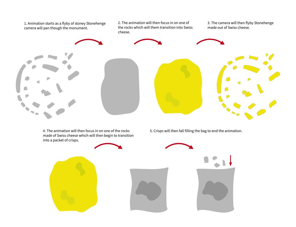
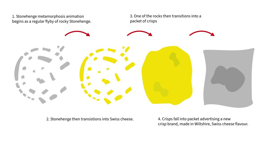
Introduction This design portfolio blog post aims to develop a conceptual metamorphosis 3D animation idea that fits the design brief, (Create a flyby of Stonehenge that is made of Swiss cheese). Secondary research will provide me with inspiration to design a purposeful 3D animation, gathering different imagery of Stonehenge and Swiss cheese will provide me with an understanding of how to layout my 3D designs and give me an insight into different lighting techniques and textures. Following secondary research development of a specific animation purpose will be determined along with the metamorphosis element. Stonehenge Research Stonehenge is a prehistoric monument located on Salisbury Plain, Wiltshire, England. The monument is an archaeological site, made up of large stones, with no definite evidence of its purpose. The site has many assumed purposes such as a calendar, religious worship site, cemetery and many more. It is believed that Stonehenge was built in six different stages between 3000 and 1520 BCE, which adds to the overall concept of the metamorphosis animation. As Stonehenge grew and changed over the years. (Pearson, M.P. 2023). Swiss Cheese Research Swiss cheese is inspired by Emmental cheese, originating in Switzerland. Emmental cheese can be distinguished by its pale-yellow colour and holey appearance. The cheese is noted to be slightly hard which holds its shape at high temperatures well. This will bode well when remodelling the cheese in Maya to form Stonehenge. (Hallal, F. 2022). Developing Animation Purpose When developing an animation purpose for the metamorphosis of Stonehenge and Swiss cheese, the mind map below provides evidence of potential and initial ideas. The chosen purpose is to advertise a new crisp brand inspired by Swiss cheese, made in the Salisbury Plain, Wiltshire. This concept combines Stonehenge and Swiss cheese and opens new possibilities for the metamorphosis animation. Stonehenge will be used to represent the origin of the crisp brand and Swiss cheese will communicate the inspired flavour. The overall brand will have a mature and elegant appearance, complementing the mature flavours of the cheese. Below are some images which inspired the animation idea. Conceptual Metamorphosis Idea As seen in the diagram below a conceptual metamorphosis idea surrounding the Stonehenge and Swiss cheese crisp brand has been developed to form what will be a captivating 3D animation. The concept follows regular Stonehenge at the beginning, which transforms into Swiss cheese. The Swiss cheese Stonehenge concept will then transform into a packet of crisps where Stonehenge-shaped crisps will fall, filling the bag. The camera angle will follow the animation transformations in a flyby manner, zooming into certain aspects to help communicate the overall concept. Following on from this post, an animation storyboard will be developed to communicate each keyframe and camera position to help form the basis of the flyby animation. Reference list  Barton, A.-L. (n.d.). Picnic time at Stonehenge with #Guinness – Want more could you want?! Original 1954 advert. | Picnic time, Vintage beer, Guinness. [online] Pinterest. Available at: https://www.pinterest.co.uk/pin/297870962849083406/ [Accessed 28 Mar. 2023]. Hallal, F. (2022) Swiss cheese: Nutrients, benefits, downsides, and more, Healthline. Available at: https://www.healthline.com/nutrition/is-swiss-cheese-healthy (Accessed: 13 May 2023). HeritageDaily – Archaeology News. (n.d.). New study on how Stonehenge may have served as an ancient solar calendar. [online] Available at: https://www.heritagedaily.com/2022/03/new-study-on-how-stonehenge-may-have-served-as-an-ancient-solar-calendar/142954 [Accessed 28 Mar. 2023]. Kestler-D’Amours, J. (2015) How did swiss cheese get its holes? scientists know, thestar.com. Toronto Star. Available at: https://www.thestar.com/news/world/2015/05/29/how-did-swiss-cheese-get-its-holes-scientists-know.html (Accessed: April 23, 2023). Meier, J. (2019) Why does swiss cheese have holes?, The Spruce Eats. The Spruce Eats. Available at: https://www.thespruceeats.com/why-does-swiss-cheese-have-holes-591200 (Accessed: April 23, 2023). Newsroom (2021). TYRRELLS ‘TYRRELLBLY TYRRELLBLY TASTY’ Campaign Back On TV At Easter With £1M Investment – FAB News. [online] FAB News. Available at: https://fabnews.live/tyrrells-tyrrellbly-tyrrellbly-tasty-campaign-back-on-tv-at-easter-with-1m-investment/ [Accessed 28 Mar. 2023].‌ Novak, S. (2022). Stonehenge May Be an Ancient Solar Calendar. [online] Discover Magazine. Available at: https://www.discovermagazine.com/planet-earth/stonehenge-may-be-an-ancient-solar-calendar [Accessed 28 Mar. 2023]. Pearson, M.P. (2023) Stonehenge, Encyclopædia Britannica. Available at: https://www.britannica.com/topic/Stonehenge (Accessed: 13 May 2023). sueism1 (n.d.). Kraft Swiss Cheese Ad 1957 | Vintage food posters, Vintage sweets, Vintage advertising art. [online] Pinterest. Available at: https://www.pinterest.co.uk/pin/310537336790234153/ [Accessed 28 Mar. 2023]. Trex, E. (2016) How 8 famous cheeses got their names, Mental Floss. Mental Floss. Available at: https://www.mentalfloss.com/article/26792/how-8-famous-cheeses-got-their-names (Accessed: April 23, 2023). Unsplash (2020). Photo by Hulki Okan Tabak on Unsplash. [online] unsplash.com. Available at: https://unsplash.com/photos/gcTYKP1UVcw [Accessed 28 Mar. 2023]. Unsplash (2021). Photo by Robert Anderson on Unsplash. [online] unsplash.com. Available at: https://unsplash.com/photos/Rt6GY40Ll64 [Accessed 28 Mar. 2023].‌

Conceptual Design Idea (Metamorphosis) and Research Read More »

Scroll to Top