Website Prototype
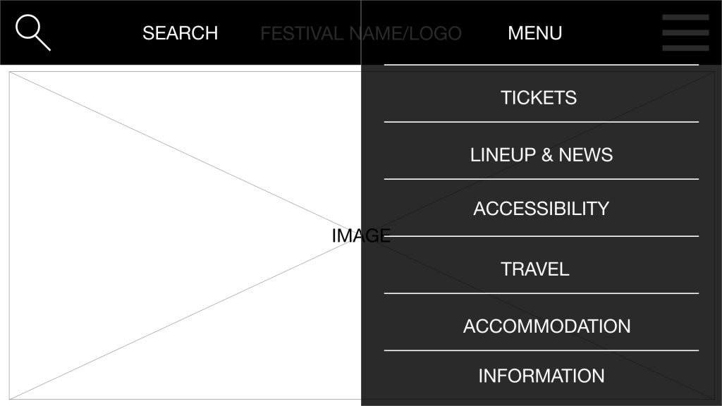
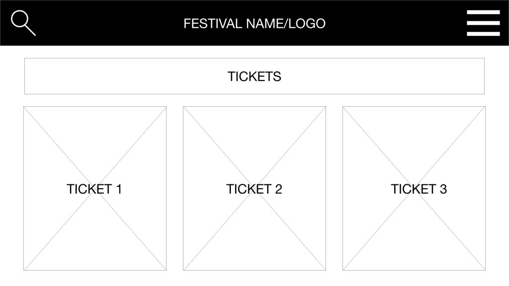
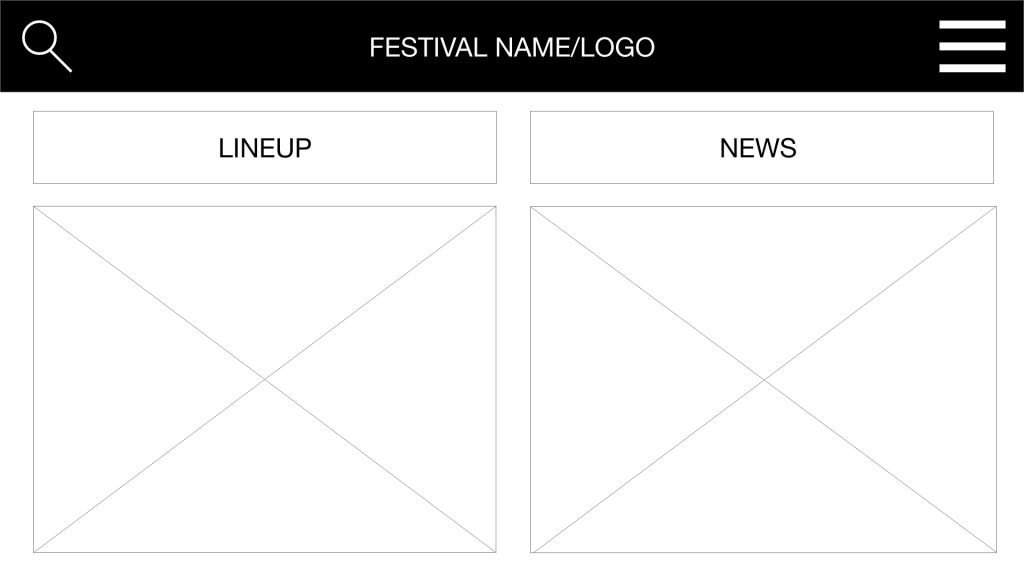
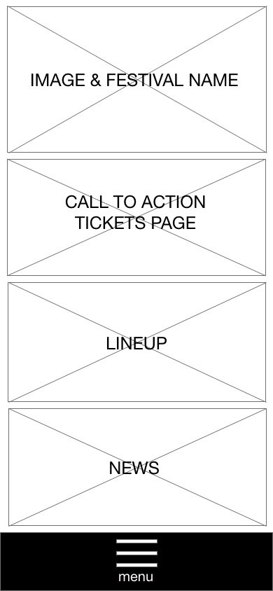
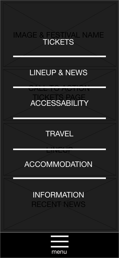
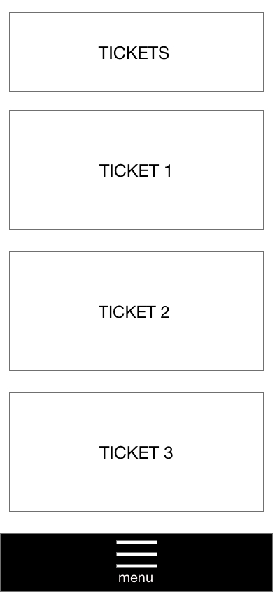
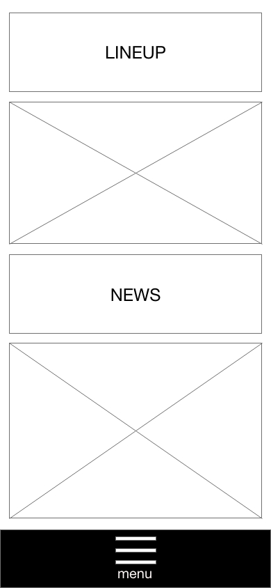
The rejected website prototype demonstrates the use of Hicks Law, limiting the choices the user can make through menus and pages. Though this law has been applied, the website lacks general information on a larger scale. Displaying only festival information and missing out on sign-up, basket and purchase forms, which together form vital parts of a website looking to profit through sales. The website prototype is also inconsistent when it comes to page layout. Moreover, the line-up page also displays news which takes away from the original purpose of the page, distracting the user from the line-up. The website has, however, met the expectations of Jakobs Law. It sits consistently within the design methods used in similar websites such as the Park Life website mentioned in earlier requirements gathering analysis. The website also lacks call to action points, which are helpful when directing the user to a specific page, such as purchasing tickets or filling out forms.
Companion App Prototype
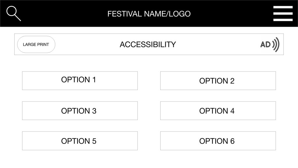
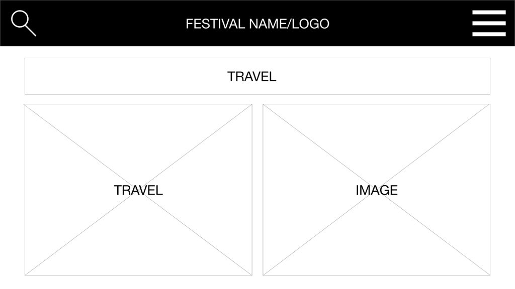
The rejected companion app also demonstrates the use of Hicks Law, limiting the choices available to the user through menus and pages. Although Hicks Law is present, there are still too many options relating to the website. Therefore, the app isn’t a constrained version, only displaying relevant festival information for use on the day. This then confuses the user when locating event-specific information. The companion app page layout is inconsistent and shows two or more subjects on a page, taking up space and distracting the user.
Conclusion
In conclusion, the website and app lack vital forms and information such as account login, basket and purchase forms. The companion app doesn’t limit the user in a usable way and shows too much website information to a point there is no purpose to a second platform. The final design will consider the mishaps from the trial prototypes and meet the usability goals discussed throughout defining the user experience and requirements analysis.
