Keho Lake Farm is a family-owned business based in Canada, they provide organic fruit and vegetables to nearby supermarkets.
‘Composition in art is the way in which different elements of an artwork are combined. In general, this refers to the key subjects of the artwork and how they are arranged in relation to each other.’ (Rise Art, 2021).
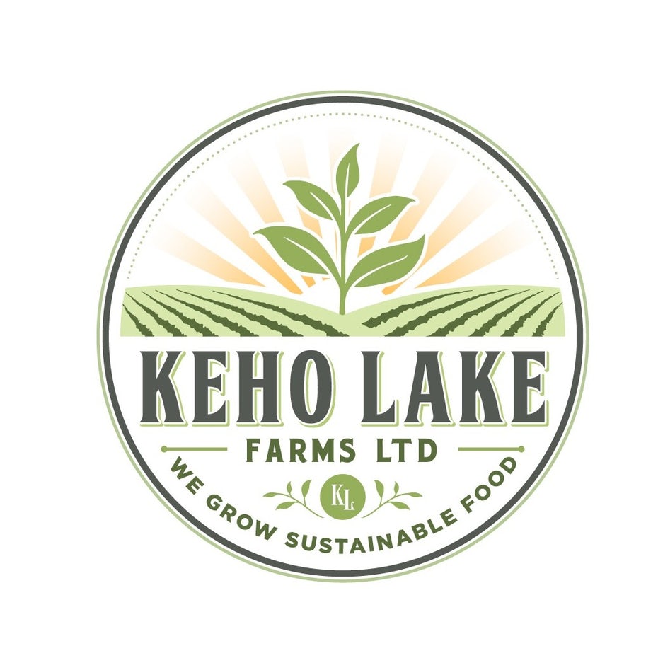
The Keho Farms logo shows good composition through text and image arrangement, and the use of colour and shapes. The key elements in place create a consistent flow of information, through graphic design, clearly displaying the purpose of the family-owned business. The readers eyes are immediately drawn to the flourishing centre piece plant, surrounded by two toned fields and sunrise acting as a curtain opening to the rest of the logo. The different tones of green used make the fields appear longer and more vast pointing out to the circular border in which the logo sits. The clever combination of the sunrise pointing upwards and the fields pointing out to the sides give the illusion of more space within the logo making it feel less cramped and over powering. The complimentary colours used throughout the logo are subtle but make a big impact on the reader, being consistent makes it easier to follow therefore making it more appealing. The typography has been arranged in different ways in which creates more shape and dimension to the overall logo. The brand name is bold making it standout to the audience whilst also acting as a separator between the imagery and typography making it look more professional and straight to the point. Overall the composition throughout the logo creates a more spacious feel to a small circular emblem.

The Lambing Shed Farmshop and Cafe is located on a farm in Cheshire. The organisation aims to provide the public with the freshest produce and meat. The lambing Shed is firmly committed to the ethos of ‘farm to table’; all produce and meat come from the farm.
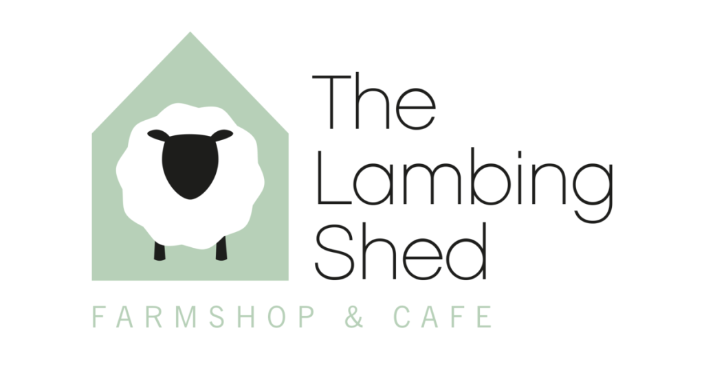
The Lambing Sheds logo is an example of bad composition. The out of place typography makes the whole logo appear awkward and unprofessional. Moreover, the logo doesn’t stand out as the colours are too subtle, and the typography is unnoticeable, especially on a white background.

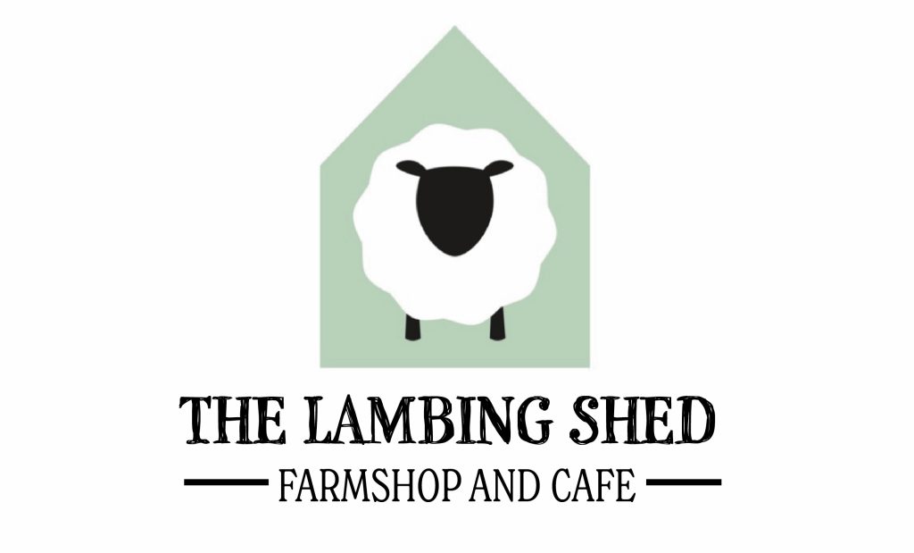
The Lambing Sheds redesigned logo is simple but makes an impact on the audience. The original imagery works well within the new design and provides a subtle colour pop, bringing the whole logo together. In addition, the redesigned composition of the typography helps the viewer’s eyes flow naturally from one word to the other. Finally, the change in the colour of the typography makes it more noticeable; the bold black is clear with a youthful appearance; this relates to the cafe’s name and conveys the shop as family-friendly.
In conclusion, the correct arrangement of elements such as typography and imagery is essential for making the composition of a piece work well. The accurate composition can create space and tell a clear story through elements such as colour, shape, typography and imagery. Finally, the new design is consistent, making it highly legible and easy to follow, getting the message across to the audience in a bold and striking way whilst not being too overpowering and crowded with lots of images.
References
Keho Lake Farms. 2021. Home – Keho Lake Farms. [online] Available at: <https://klfarms.ca/> [Accessed 30 October 2021].
Rise Art. 2021. What is Composition in Art? | Rise Art. [online] Available at: <https://www.riseart.com/guide/2412/what-is-composition-in-art> [Accessed 31 October 2021].
The Lambing Shed. 2021. About Us. [online] Available at: <https://the-lambing-shed.myshopify.com/pages/our-story> [Accessed 31 October 2021].