The Participant
The first task was to provide a designer with clear feedback on the usability of their WordPress website, using the live broadcasting software OBS.
Designer Evaluation
To complete the second task, we were instructed to create a list of eight website interactions to be carried out by a user to ensure a smooth user experience on our WordPress websites. I gave Ellie Ward the list of interactions below and asked her to test and evaluate my site.
- Locate my Elementor website on the importance of becoming carbon neutral.
- Play a video embedded in my interactive elements development blog post (Adv. Web).
- Locate and access my Pinterest board.
- Return to the landing page from a post.
- Locate and open my Rooted in Hull merchandise post.
- Expand an image on any Adv. Web development blog post.
- Locate and open my Year 3 menu option.
- Find the about the designer section.
The overall outcome of the user evaluation was a success. The user didn’t run into any major user experience issues and navigated the whole site well with no assistance. The points below are recommendations from the user to improve some aspects of the user experience.
- Add a search bar to the menu section so that others can find posts without going through the whole website to find what they’re looking for.
- Add a home button to the menu section or change the hover style of the site name to provide the user with positive feedback when wanting to return to the home page.
- Make sure all images are clickable and expandable
Below are images and videos of changes I made to my WordPress website after the feedback from the user.
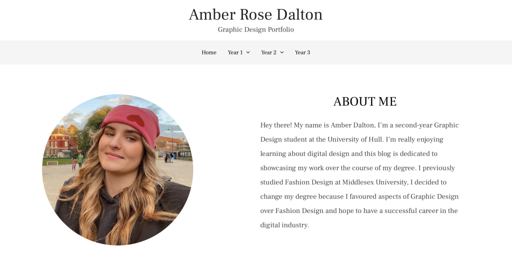
The first change I made to the site is the addition of a home button to the menu section, this change was made to make locating specific posts easier for the user. Although after consideration, I decided to remove the home button and instead insert a hover mode to the site title. Changing the hover colour of the site title prompts the user to click it, which I felt made the website look sleeker and more professional.
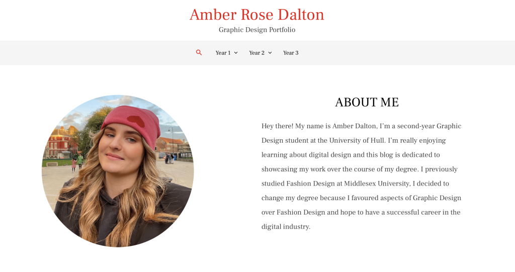
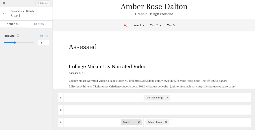
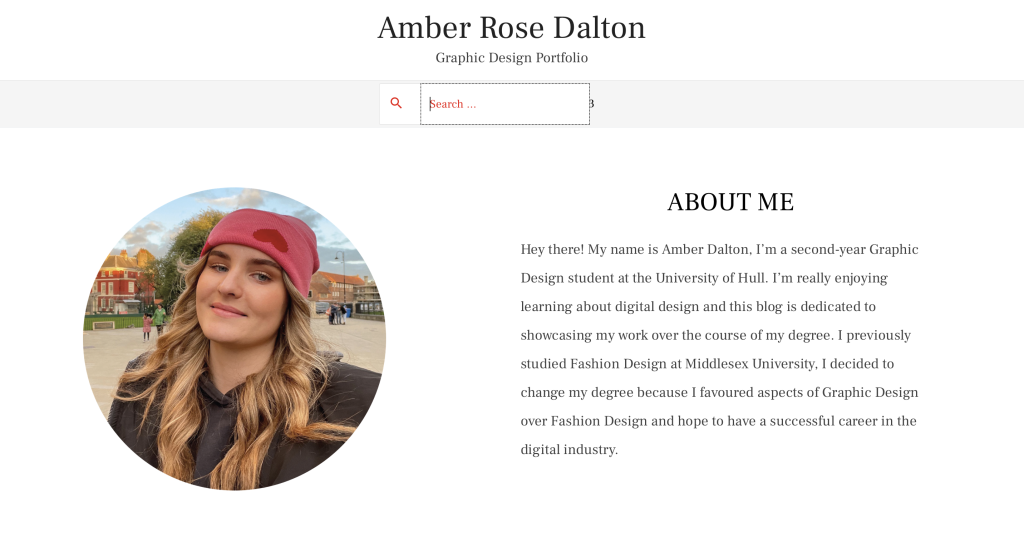
The second change I made to the site is the addition of a search bar located in the menu section. The addition of the search bar makes it much easier for the user to locate specific posts. The addition also makes it quicker for the user to navigate the website.

The final change I made to the site was ensuring that all images on every post are clickable and enlargeable. This ensures the user can see each image better without having to use the mouse or keyboard to manually zoom into each image, which can be particularly frustrating when the manual way of zooming takes the user out of the webpage.
Overall, I feel the user feedback helped me make my website a lot more user-friendly with the addition of these important features.