Introduction
The brief for the group activity was to design a campaign in two hours that aims to persuade preschool children between the ages of 3 – 5 to drink water over sugary drinks.
Group Reflection
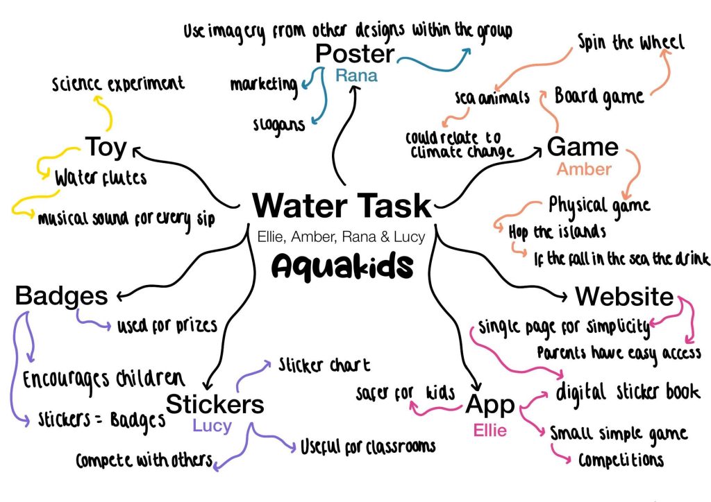
Initially, we composed our group of four and discussed who should take the lead position of creative director; we concluded that Ellie and I would take joint responsibility for leading the team and ensuring everybody’s voice was heard. Next, we evaluated the concept and brainstormed as many ideas as possible to ensure we had a broad range of topics to explore that contributed towards the campaigning brief. The group was proactive throughout brainstorming, reinforcing our previous personality tests’ results and suggesting that we are all team workers, helping us function well without anyone feeling left out of the conversation.
After the brainstorming portion of the activity was over, we decided as a group to delegate the most fitting task to each teammate, ensuring that the work was evenly spread, considering everyone’s strengths and weaknesses. I was given the task of designing a board game.
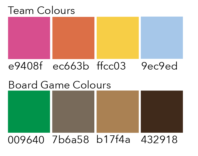
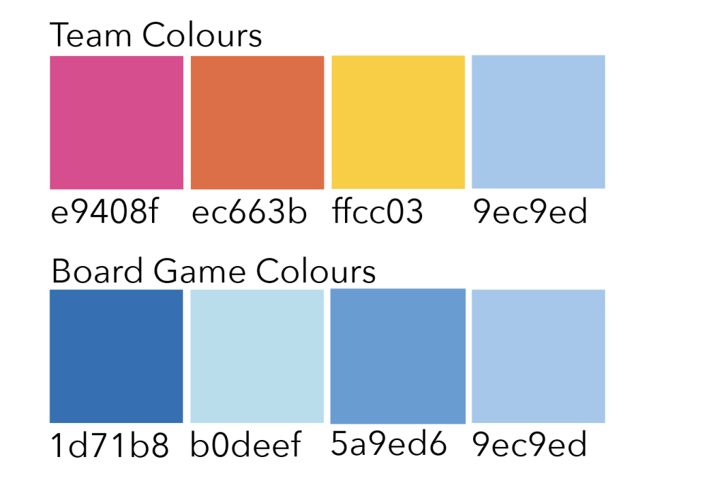
We then decided on a target audience and brand identity, considering colours and typography to ensure the branding of all our designs was consistent throughout. We struggled when deciding on a name for our concept but ended up deciding on ‘Aquakids’. The name clearly communicates the branding, persuading preschool children to drink more water.
Upon reflection, I feel the group worked well together without any significant setbacks; we all had an equal voice and communicated well, ensuring there were no inconsistencies throughout the time working together.
Logo Design
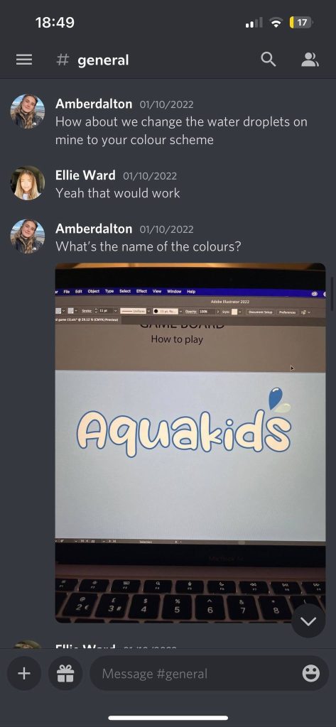
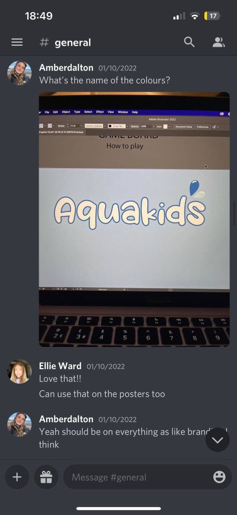
Figures 3 to 9 show the evolution of how the Aquakids logo developed over time; as a team, we discussed the different logos designed by Ellie and me. We concluded by combining elements from both designs to create a well-rounded logo which clearly represents the brand identity.
Individual Design Process
My contribution to the campaign brief was to design a board game children could play to make drinking water more fun. I used illustrator to communicate the design, ensuring the branding was consistent with the group’s choices. Throughout the design process, I asked for feedback from the group to ensure we were all on the same page about the design and so I could get constructive feedback following design choices.
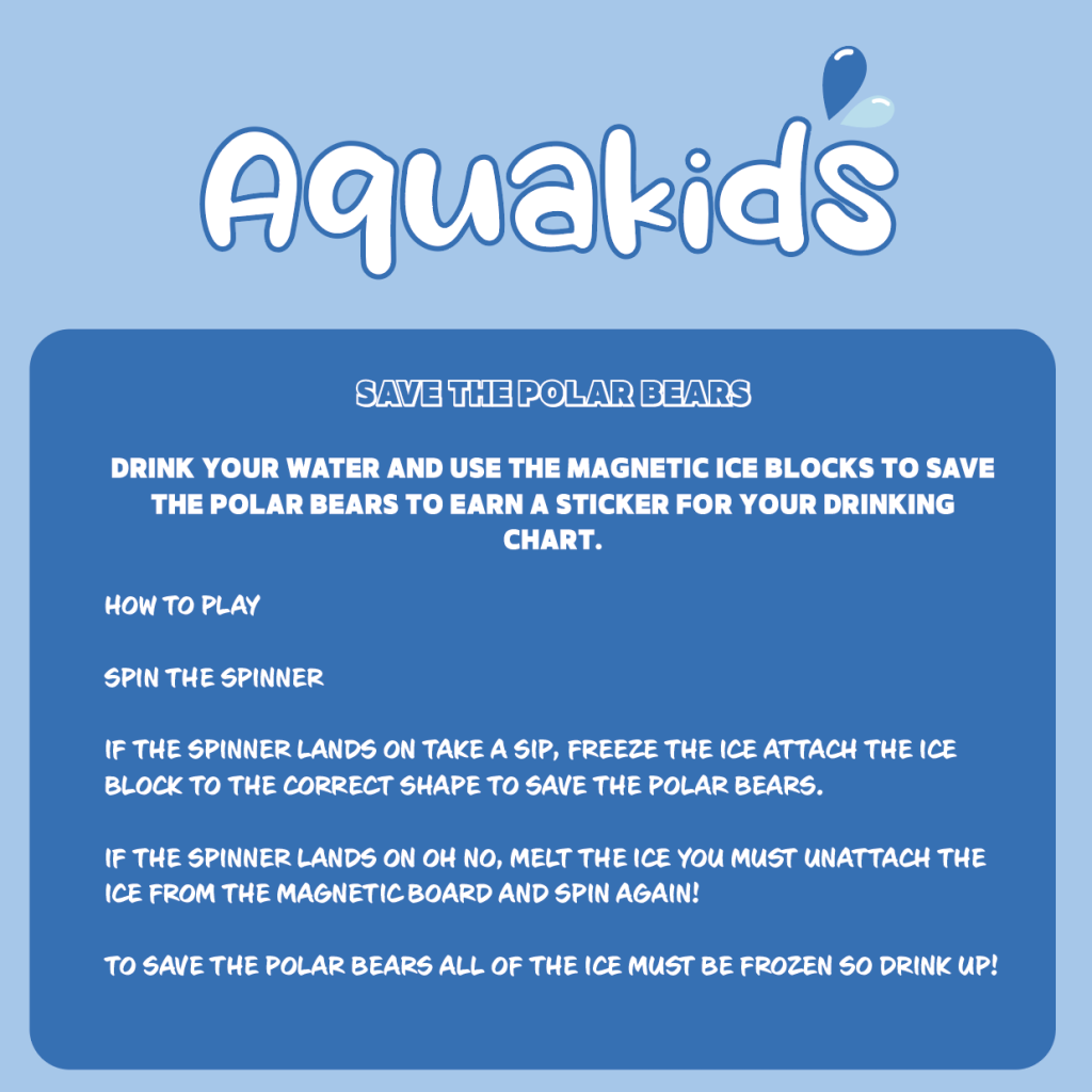
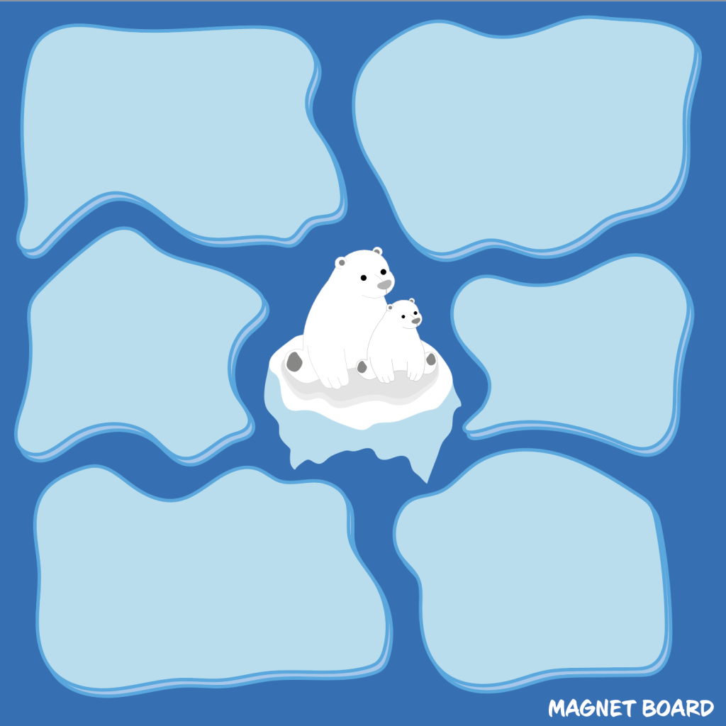
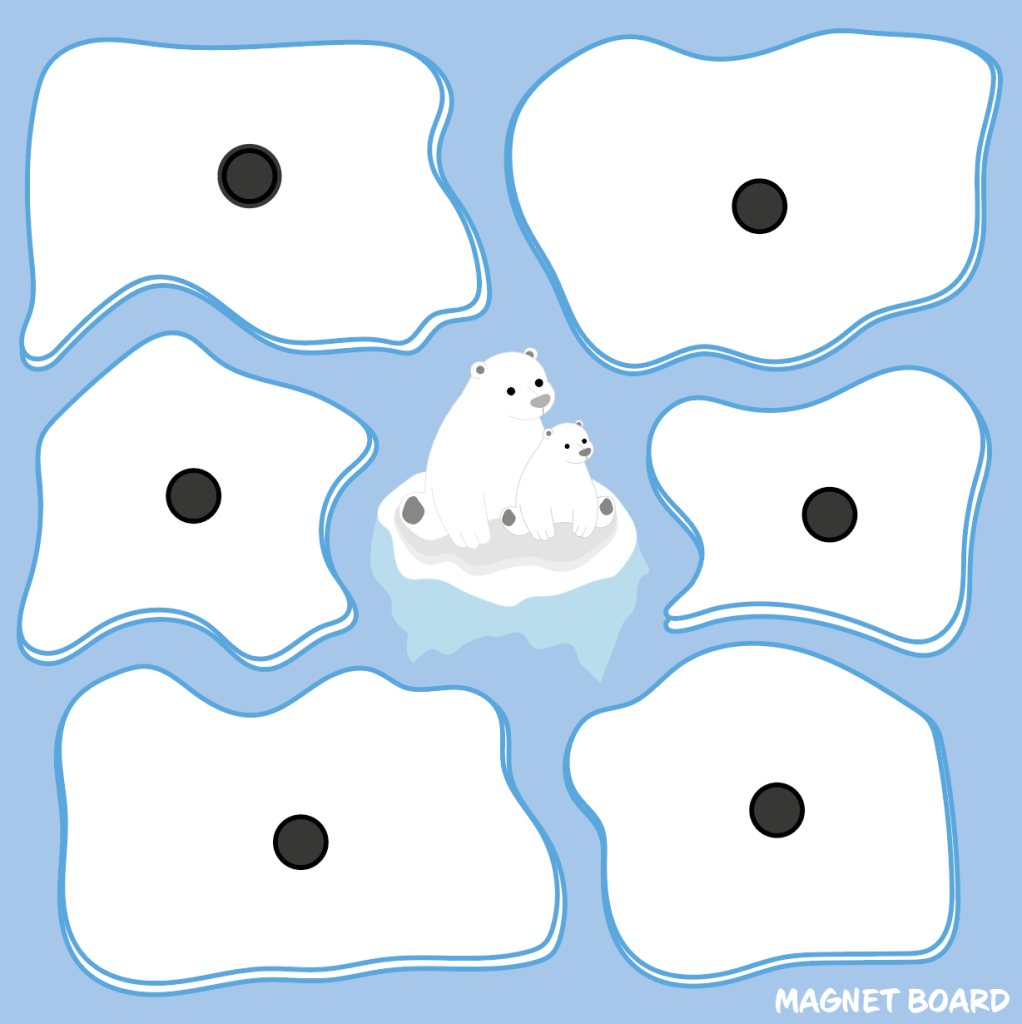
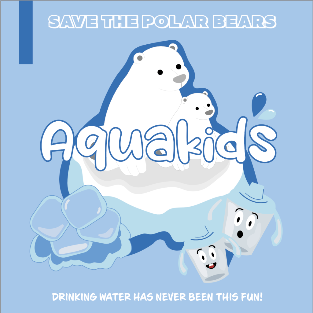
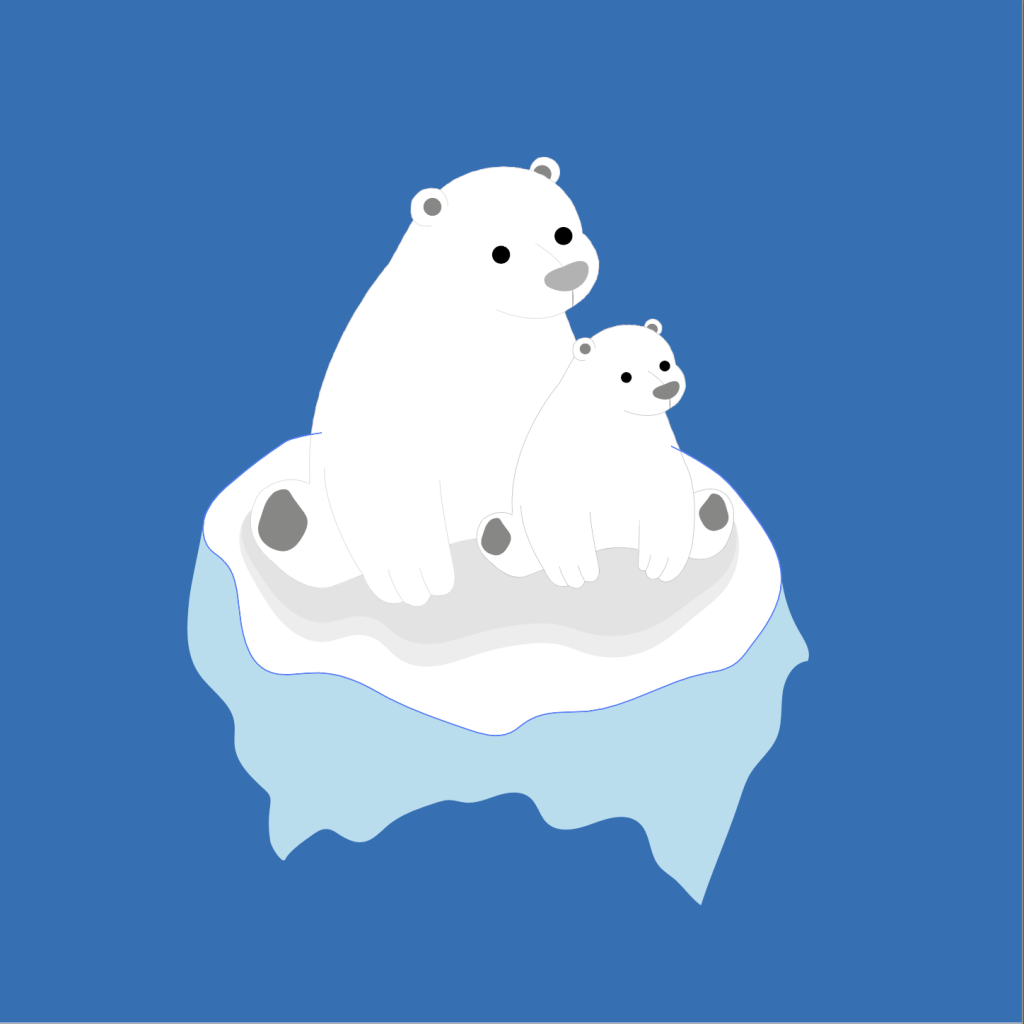
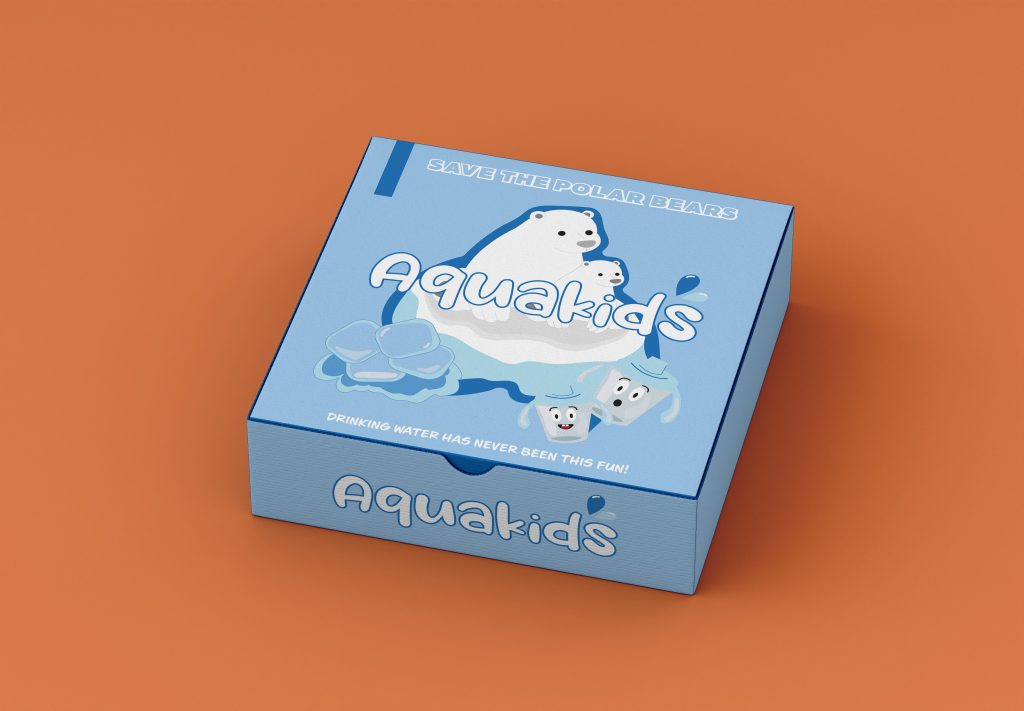
Figures 10 to 19 are images of the board game ‘Save the Polar Bears by Aquakids’.
The thought process behind the Save the Polar Bears board game was to inspire children to drink more water while briefly educating them on the climate crisis; this brings more educational depth to the game and links well with the water theme.The rules of the game are simple; the children spin the wheel, and depending on which direction the spinner lands on, they either ‘freeze’ the ice by drinking water and connecting a magnet to the game board or they melt the ice by removing a magnet from the game board and spinning again. The game will continue until all the ice is ‘frozen’, and the polar bears are saved. Upon completion of the board game, the children will be awarded a sticker for drinking their water. Moreover, this encourages them to earn stickers for their charts, gaining them prizes once they have completed their charts for the week.
Rejected Design
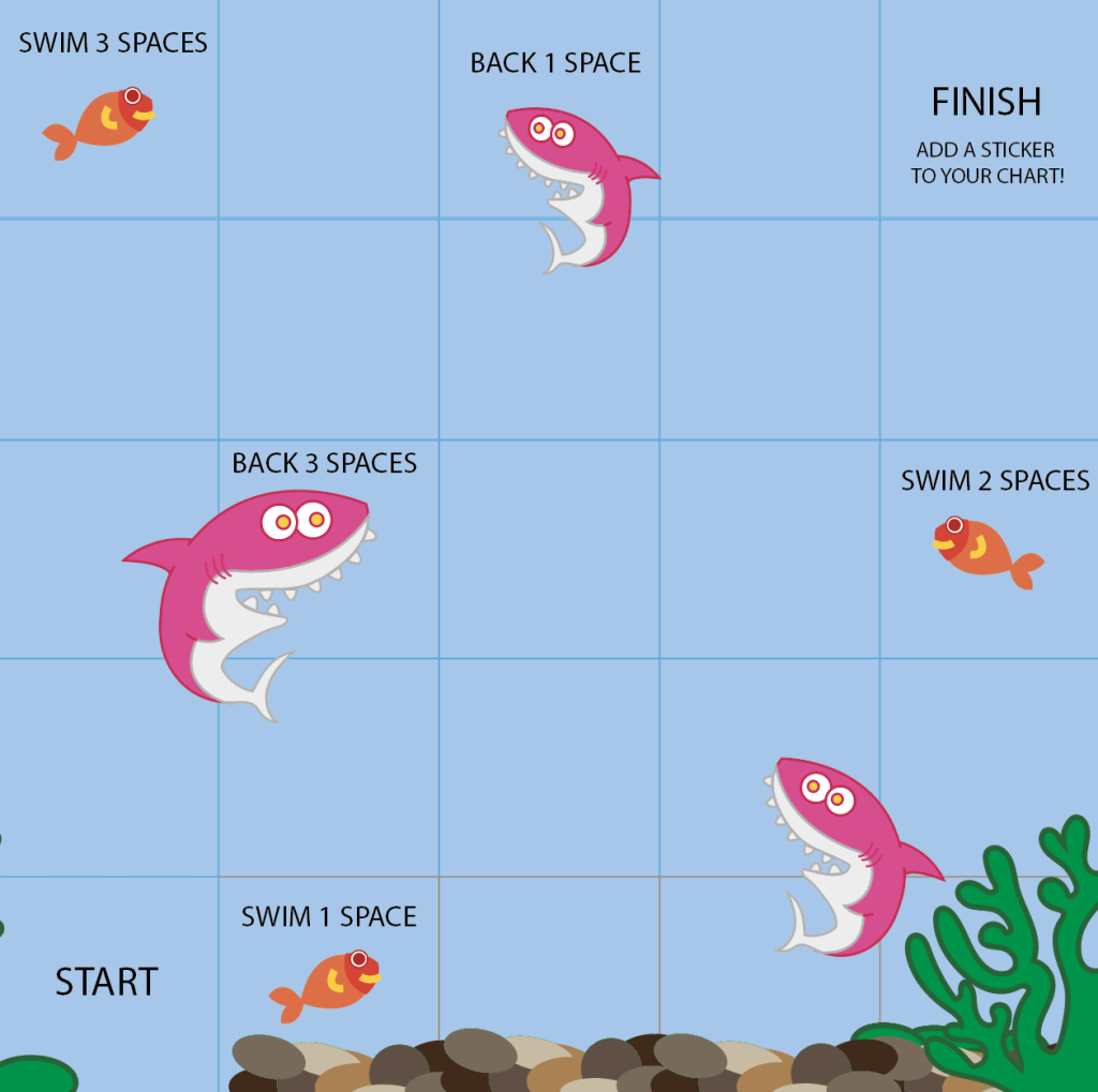
The snakes and ladders inspired board game ended up becoming a rejected design through a group re-evaluation after hearing feedback from the class. The original game idea was scrapped due to it not communicating the whole purpose of the campaign efficiently and potentially being too tricky for younger children to understand. However, as discussed above, the concept led to new ideas of including an educational factor in the new board game design.
