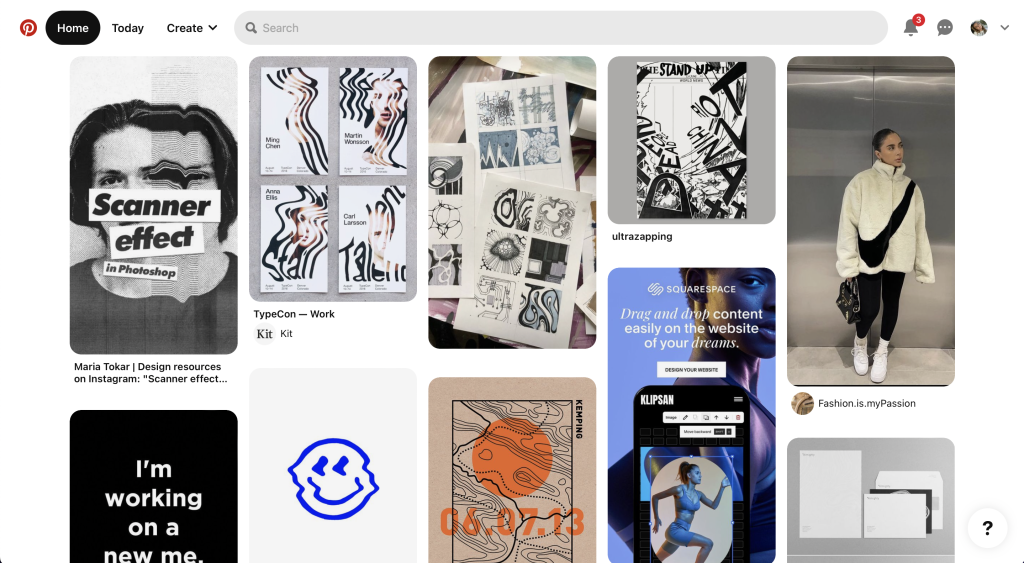
The first responsive website I decided to explore is Pinterest, the comparison between the website and app is similar but the two layout breaks have some differences. The website on a desktop is visually pleasing as it shows aesthetically attractive imagery tailored towards the viewer. The website has a simple but effective layout providing the viewer with a familiar display, which contrasts with a considerable number of grids and frames. The menu is a lengthy bar situated across the top of the screen, easily located by the viewer. It clearly displays aspects of the menu such as a search bar, home page, and other useful options. The rest of the website is a continuous flow of creativity and visual imagery.
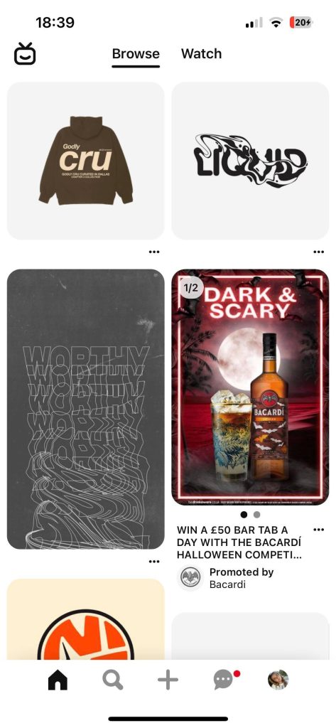
The responsive app/website layout on mobile is slightly different from the website on a desktop. The menu has changed significantly from the way it is communicated on the desktop version of the website, this is condensed into smaller menus that are situated at the top and bottom of the screen. The overall menu situation has changed coming from a desktop to a mobile, these changes are seen by examining the menu options, not only have the menu icons changed but the layout and text configuration has too. This is apparent when looking at the menu options available on the desktop such as Home, Today, and Create and comparing them to the mobile options Browse and Watch. This differential menu configuration may be confusing through the layout break to viewers going from the website on a desktop to the website/app on a mobile. The rest of the mobile layout is similar to the desktop website as the imagery flows in the same way, it has just been resized to fit on the differing layout break losing out on viewing multiple imageries in one swipe.
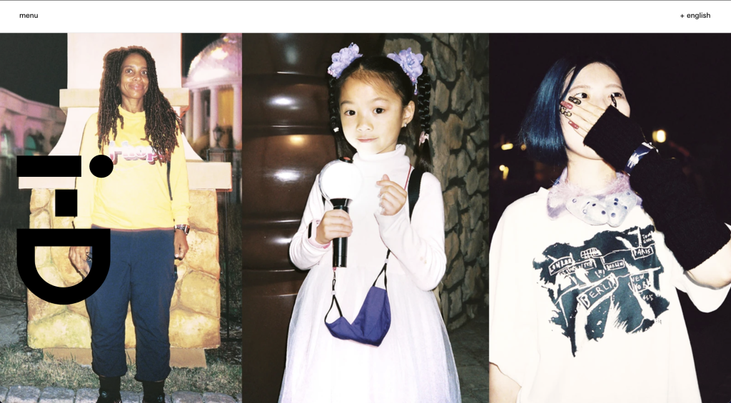
The second responsive website I decided to explore is the fashion and lifestyle magazine i-D, the desktop website differs slightly from the mobile website. The desktop website makes use of a simple layout, with a dropdown menu in the top left and an option to change the language in the top right-hand corner. The rest of the website on arrival displays imagery from the newest article. The desktop website is simple but communicates stories to the viewer in a creative way.
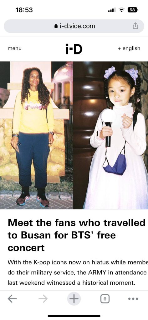
The responsive website changes slightly when visited from a mobile device. The layout is only slightly disrupted from the desktop, with the rearrangement of the magazine logo which is now situated between the menu options at the top of the page. The layout break slightly improves the use of space as the article imagery doesn’t take up the whole screen when resized to fit the mobile. Viewing the website on mobile, the viewer is greeted with imagery and part of the article below, this communicates to the reader they must scroll down to read more. The imagery has slightly changed from the original desktop version by cropping one of the images out completely.
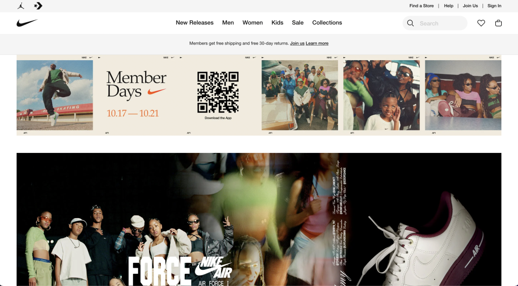
The final responsive website I decided to explore is Nike. The desktop website and mobile layout break differ significantly. Upon arrival, at the desktop website, the viewer is greeted with a jampacked vision of what Nike have to offer. There is a clear menu at the top with directly linked icons of other brands Nike have partnered with such as Jordans and Converse. There are also clear ways of how to find nearby shops and navigational menus for the website itself.

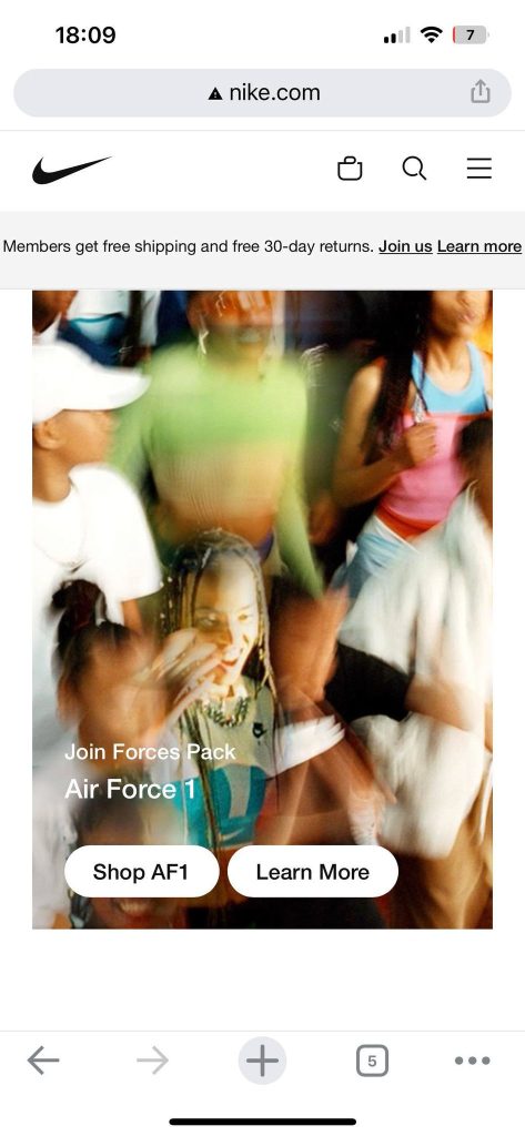
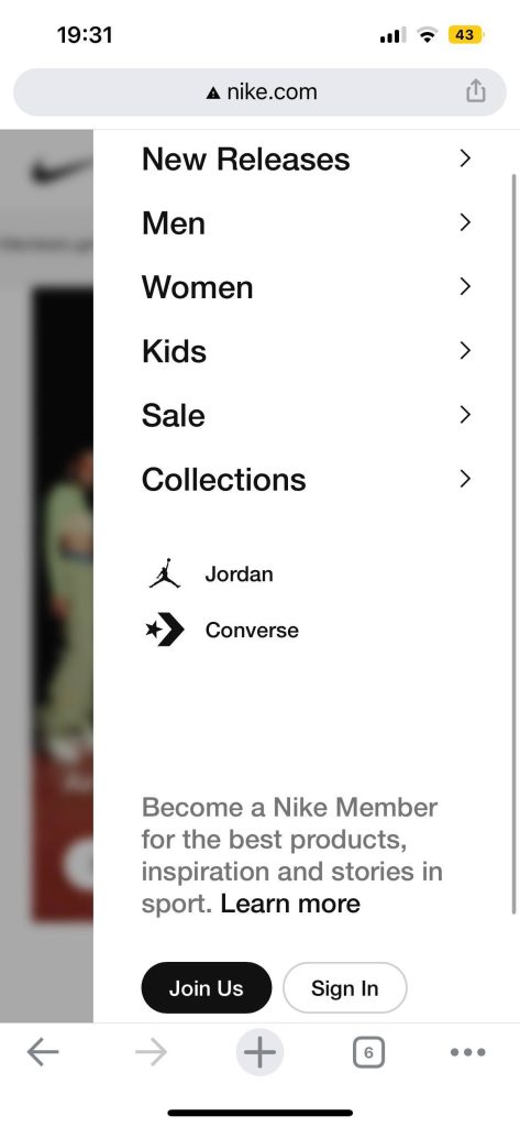
The responsive website changed when visiting the website on mobile. The large and in charge menu option at the top of the desktop version is condensed down significantly into an orderly hamburger drop-down menu. The layout break also involves the depletion of links to other partnering brands above the Nike branding as seen on the desktop version. Instead, they’re incorporated into the drop-down menu. Another difference in the layout break that stands out is that the imagery position has changed, instead of having an image carousel dedicated to the promotion of their app, there is only the Air Force 1 promotion. The original branding imagery promotion for the Air Force 1 has also lost a lot of imagery when resized to fit the mobile site. The resized image doesn’t show the Air Force 1 which takes away from their promotion.
The layout break from desktop to mobile could be enhanced by incorporating the app promotion on the mobile version, this is because more people will be inclined to download the app on their phones rather than on their desktops.
References
i-d.vice.com. (n.d.). i-D. [online] Available at: https://i-d.vice.com/en.
Nike (2019). Nike. Just Do It. [online] Nike.com. Available at: https://www.nike.com/gb/.
Pinterest (2019). Pinterest (United Kingdom). [online] Pinterest. Available at: https://www.pinterest.co.uk.
