Introduction
This design portfolio blog post will explore how Edward Tufte’s five theories were implemented into the final 3D metamorphosis animation. A series of screenshots will communicate each stage of the design development process across Autodesk Maya, Photoshop, Illustrator and Premier Pro.
3D Design Development in Autodesk Maya
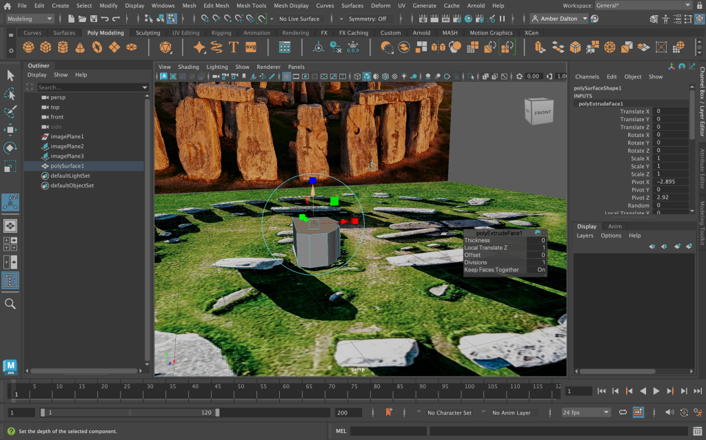
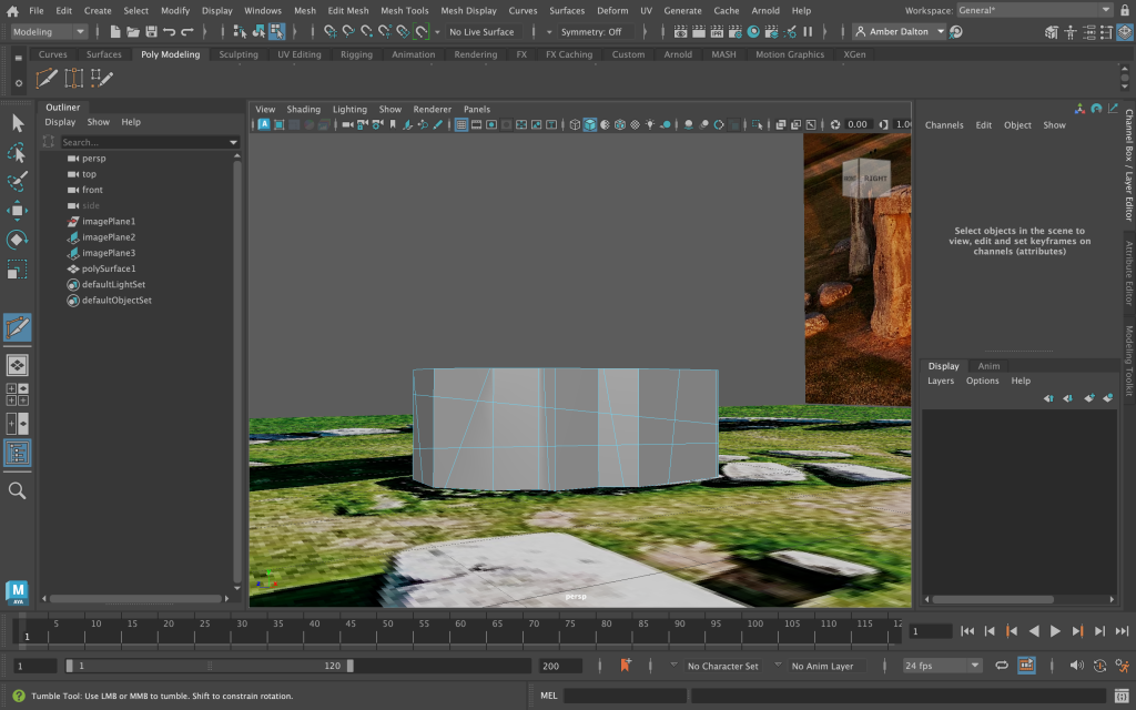
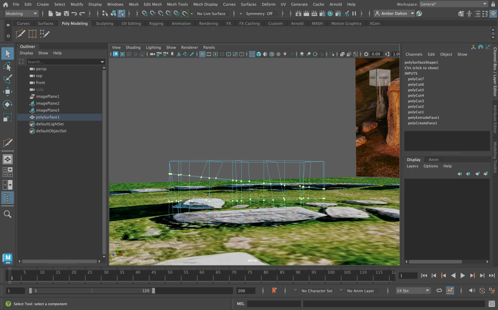
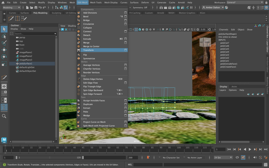
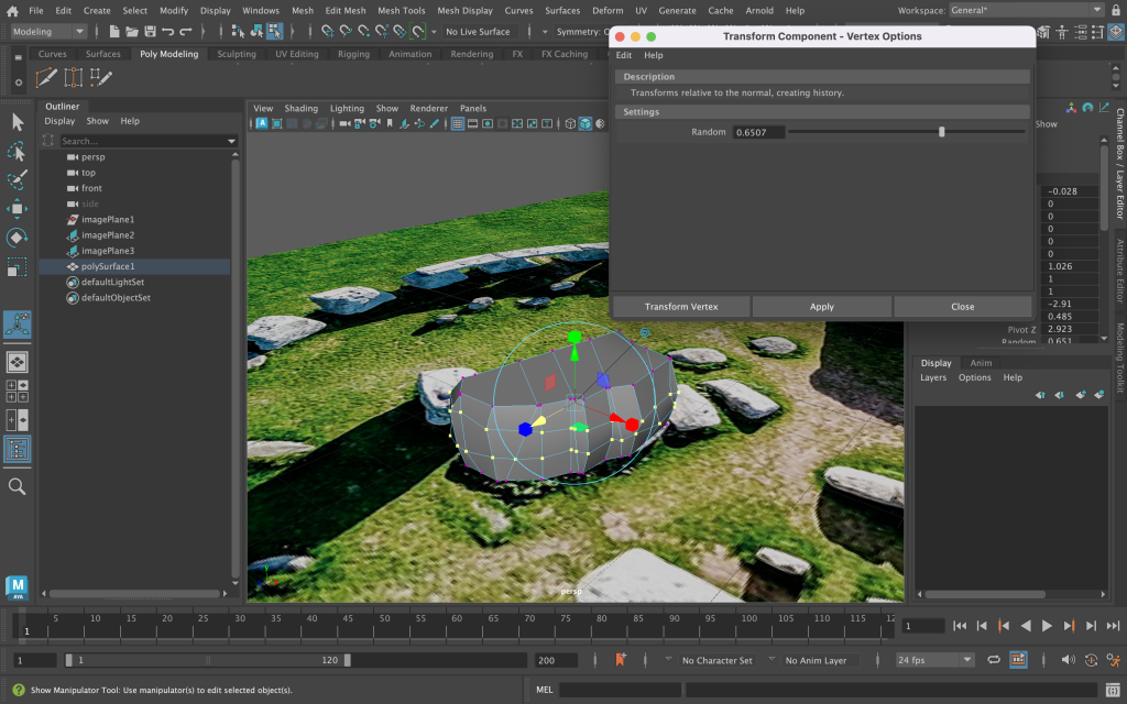
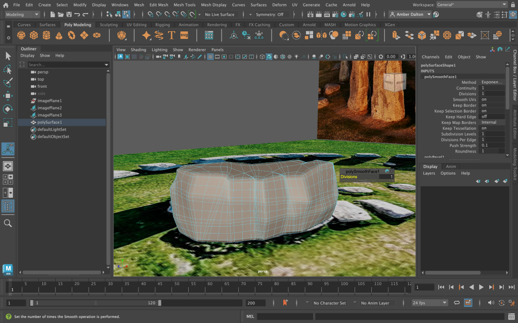
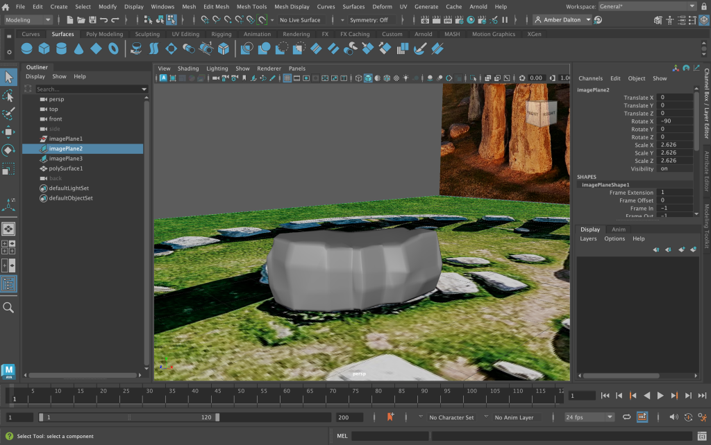
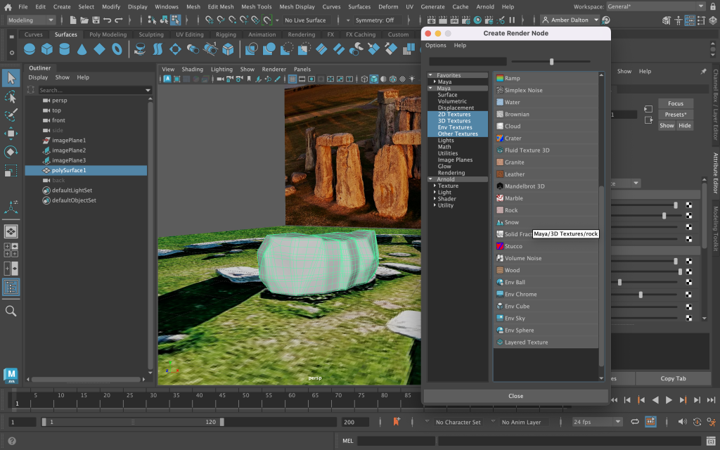
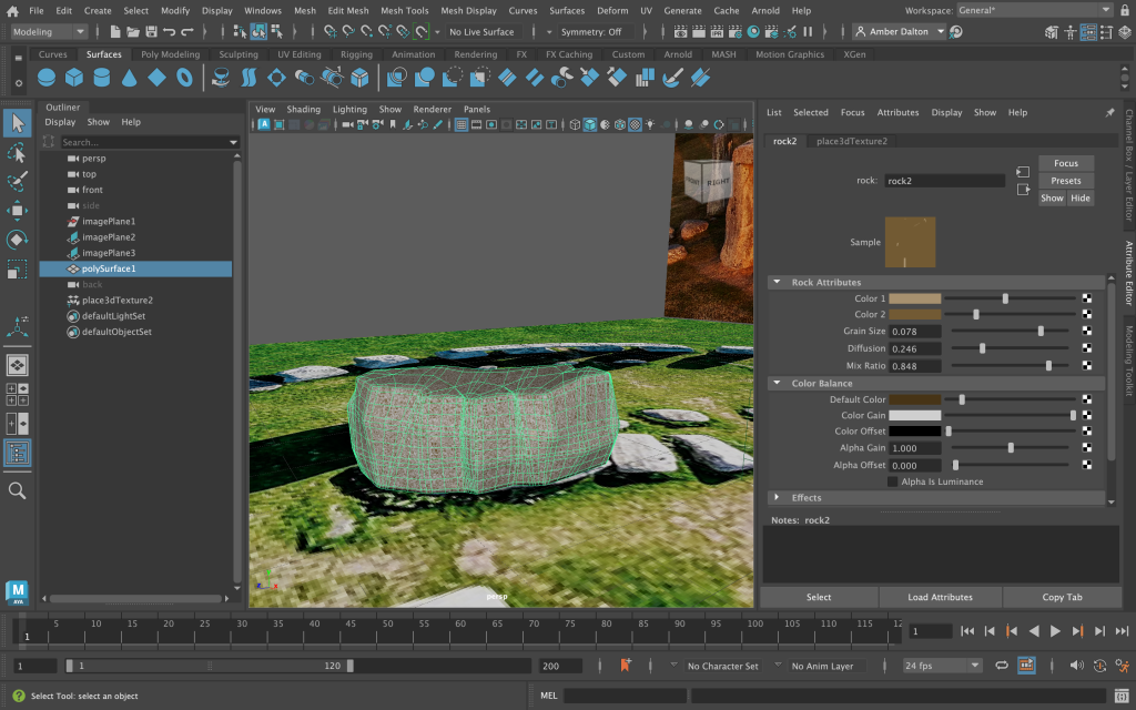
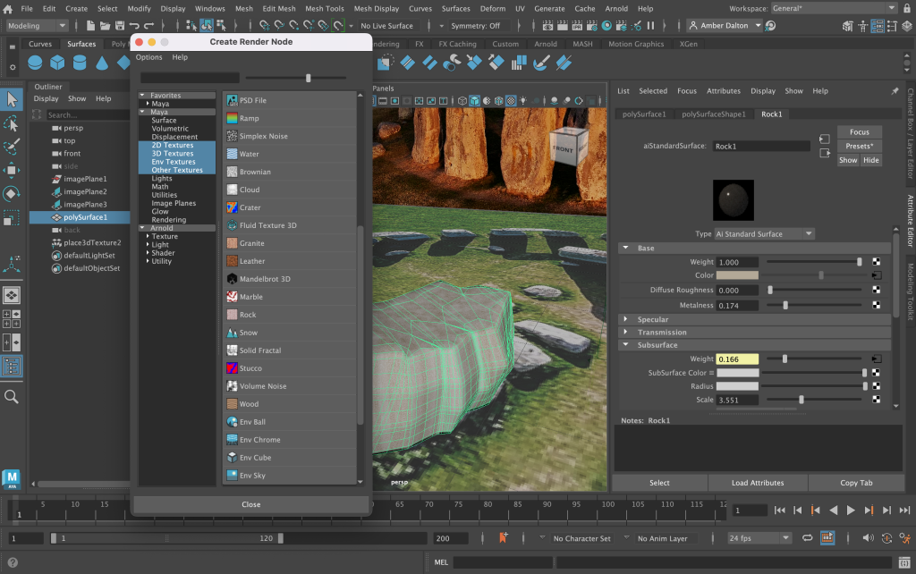
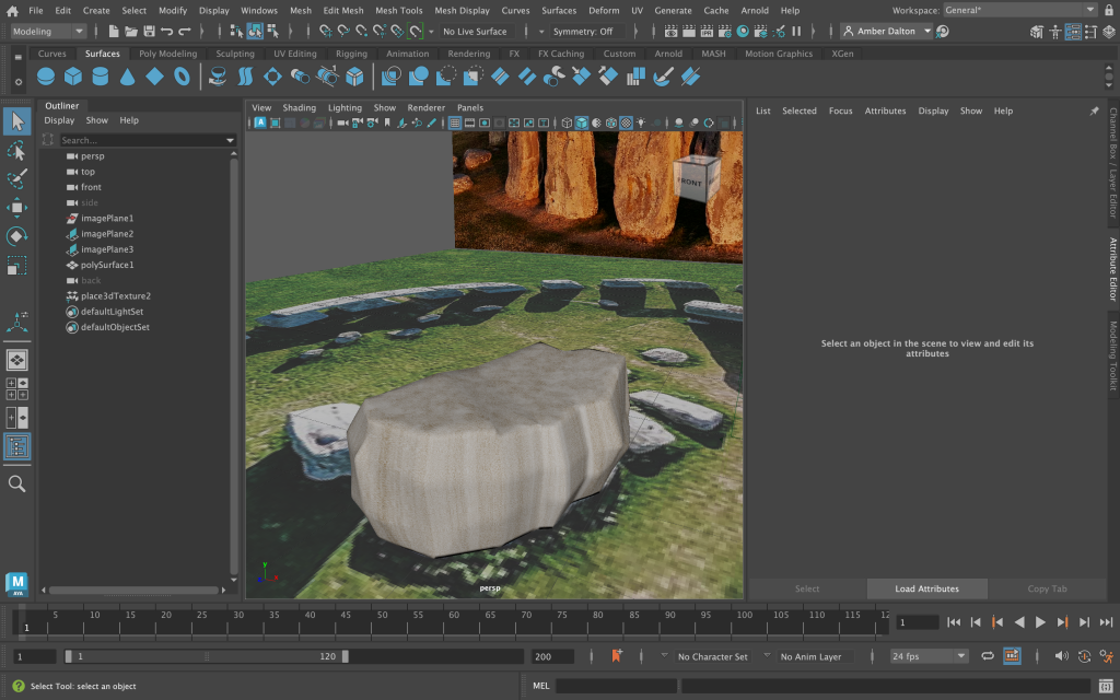
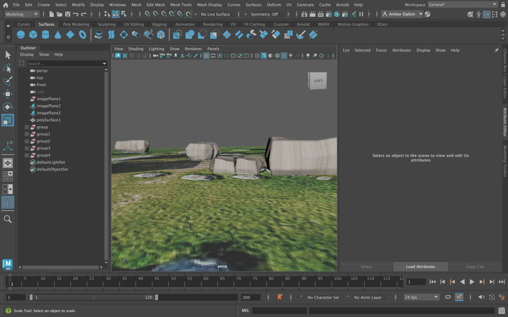
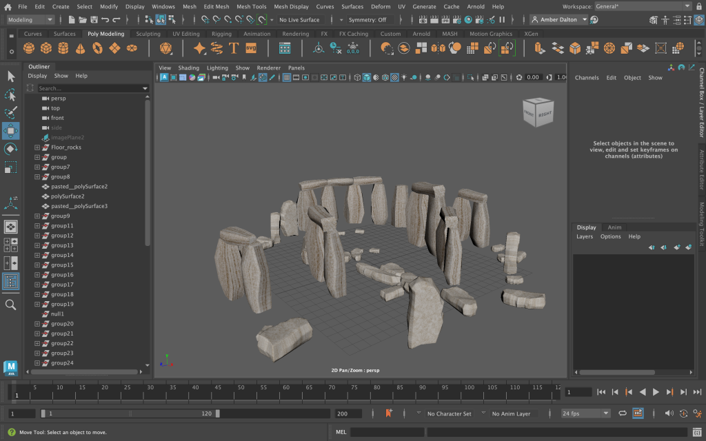
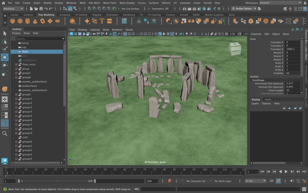
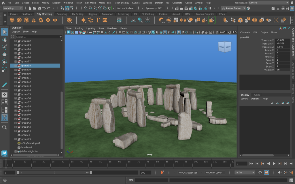
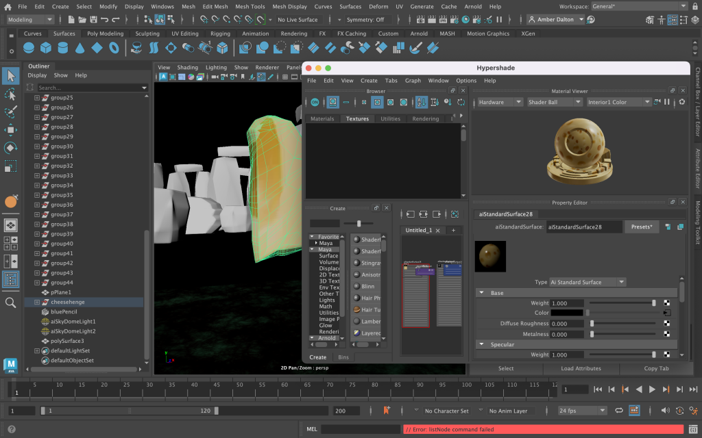
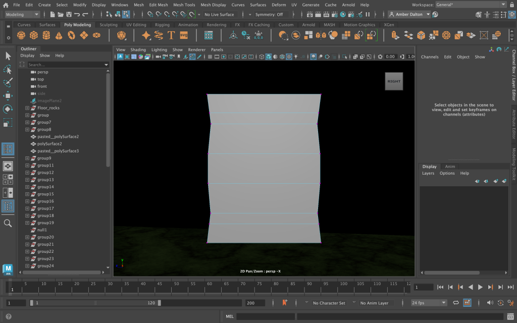
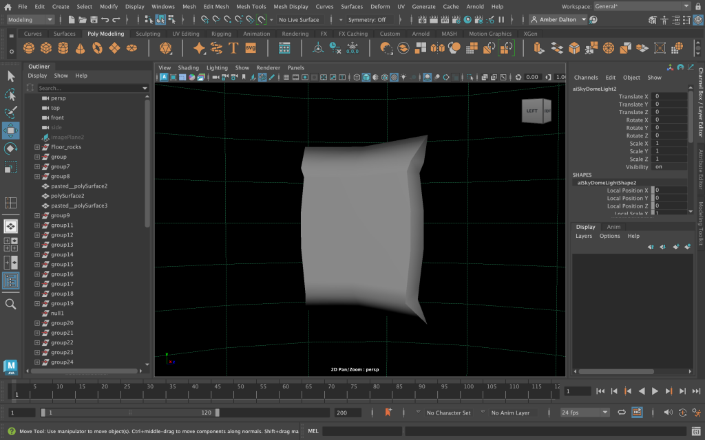
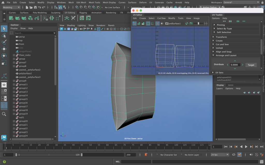
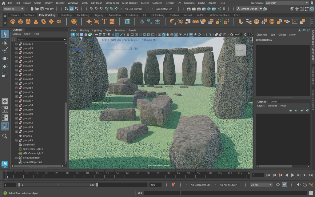
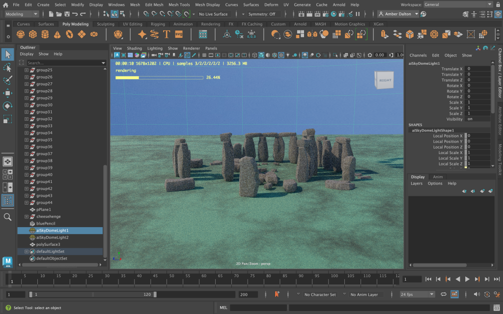
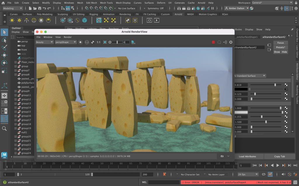
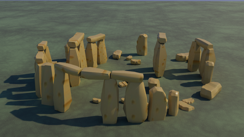
The final design development process can be seen below and consists of a series of screenshots, communicating the overall final animation construction. Image planes were used as references to the original Stonehenge, this aided with the placement and shapes of the rocks.
Henge Brand Design in Adobe Illustrator and Adobe Photoshop
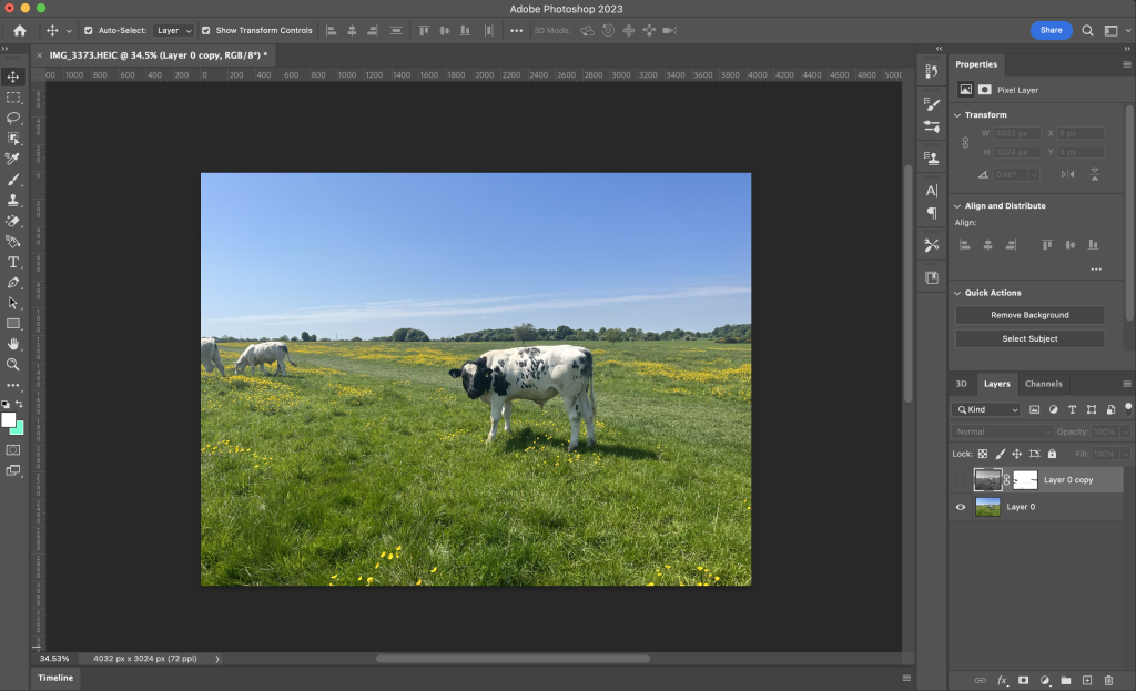
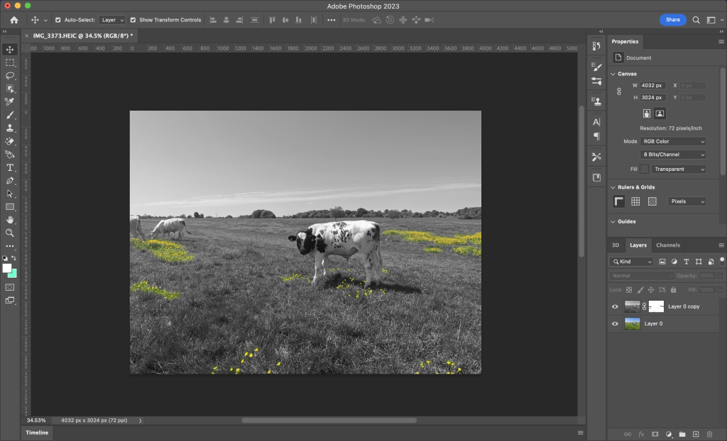
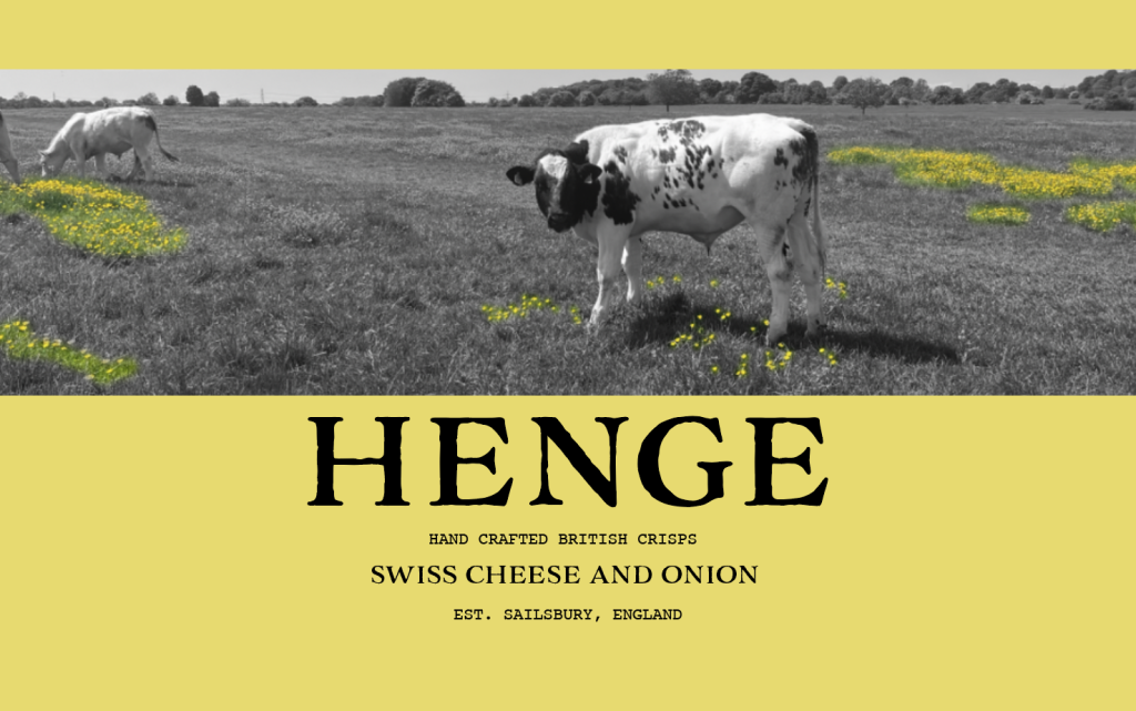
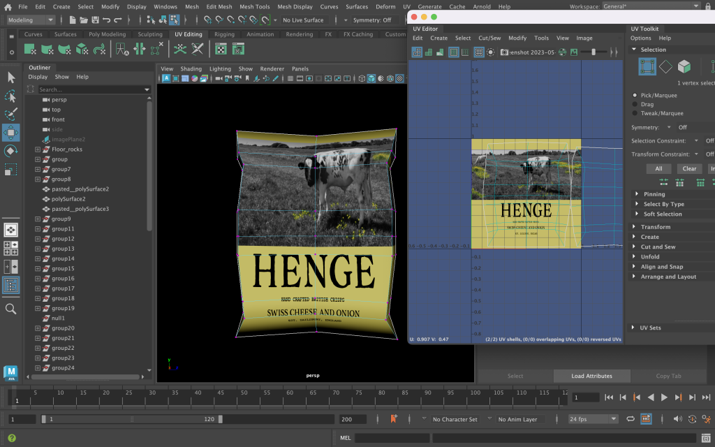
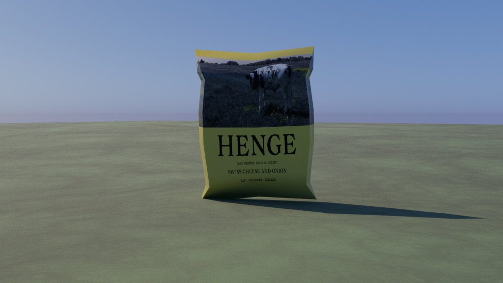
The below screenshots show the development of the animation purpose. A new crisp brand, handcrafted in Salisbury, with the flavour of Swiss cheese.
Arnold Rendering and Lighting
Implementation of Edward Tufte’s Theories
The theories that have been put into practice throughout the final design include,
Use of Colour
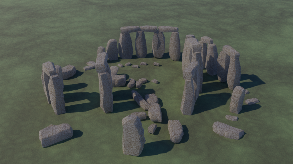
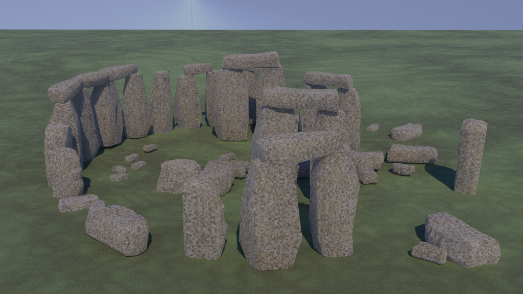
Edward Tufte’s colour theory has been applied to the final animation of Stonehenge and relates to his statement that ‘Nature’s colours are familiar and coherent, possessing a widely accepted harmony to the human eye.’ (Tufte. E.R, 1990). This theory applies to the animation as it projects all aspects of natural colours and nature throughout, which provides familiarity to all viewers. The colours chosen for the animation also convey logical information, using realistic colours close to the real Stonehenge.
Comparison of Small Multiples
Edward Tufte’s comparison of small multiples can be seen throughout Stonehenge’s rocks and throughout the final animation. The rocks are all different shapes and vary in size, although similar none are the same. This adds depth and realism to the overall design.
Narrative over Space and Time
Narrative over space and time is demonstrated throughout the Stonehenge animation. The overall animation purpose is revealed as time goes on, the camera flyby reveals the narrative of the new crisp brand and where it is made.
Layering and Separation
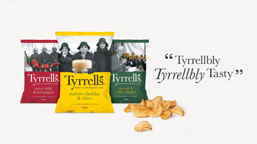
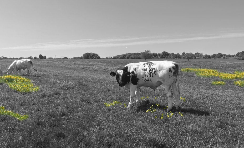
Edward Tufte’s layering and separation theory is demonstrated throughout the animation but is heavily seen in the final packaging design inspired by the existing brand, Tyrrells. Saturated spots of the yellow flowers in the photograph not only make use of his colour theory but also help communicate the flavour of the crisps whilst the rest of the image is in greyscale.
Animation Reflection
The Stonehenge animation can be viewed in the final Design Portfolio blog post. Reflecting on the final metamorphosis animation, changes were made to the original narrative plan. The ending scene was changed from crisps falling to a zoom-out to frame the crisp packet, advertising the brand and packaging. Moreover, when animating the animation through keyframes I came across a design fault, which can be seen when Stonehenge transitions into Swiss cheese. One of the rocks disappears and I couldn’t find an explanation as to why this was happening. I tried multiple times to restore the rock through keyframing although couldn’t find a solution, this is something I would focus on fixing if I were to do it again and had more time. I would also change the texture settings of the Swiss cheese to have a rougher appearance as it is too shiny. If I were to redo the animation in the future I believe the skills I have learnt creating this piece would aid me in creating smoother transitions as the animation transforms.
References
Atchabao, N. (2015) Download free cheese seamless vector for free, Vecteezy. Available at: https://www.vecteezy.com/vector-art/94524-free-cheese-seamless-vector (Accessed: 21 May 2023).
Newsroom. (2021). TYRRELLS ‘TYRRELLBLY TYRRELLBLY TASTY’ Campaign Back On TV At Easter With £1M Investment – FAB News. [online] FAB News. Available at: https://fabnews.live/tyrrells-tyrrellbly-tyrrellbly-tasty-campaign-back-on-tv-at-easter-with-1m-investment/ [Accessed 28 Mar. 2023].
Tufte. E.R. 1990. Envisioning Information. Cheshire, Connecticut: Graphics Press. (p. 91).
