Introduction
The aim of this development blog brief is to undertake a design analysis of the Spellzone onboarding sequence and pre-login page. Analysing the site will establish any improvements that could be made to make the overall site more inclusive and user-friendly.
Spellzone Website Exploration
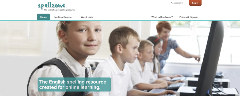
The first website investigation was conducted on the home page and pre-login structure. Upon first entering the website the user is greeted with an image of children which immediately communicates that the website is assumed to be designed for children at school. Layered on top of the image there is a clear heading reinforcing the initial presumption, stating that the website is an online learning resource. As the user scrolls the page there is a brief explanation of what the website is used for and who can use it, from reading the insert it is apparent that the resource is aimed at attracting the teachers’ attention more than the children themselves.
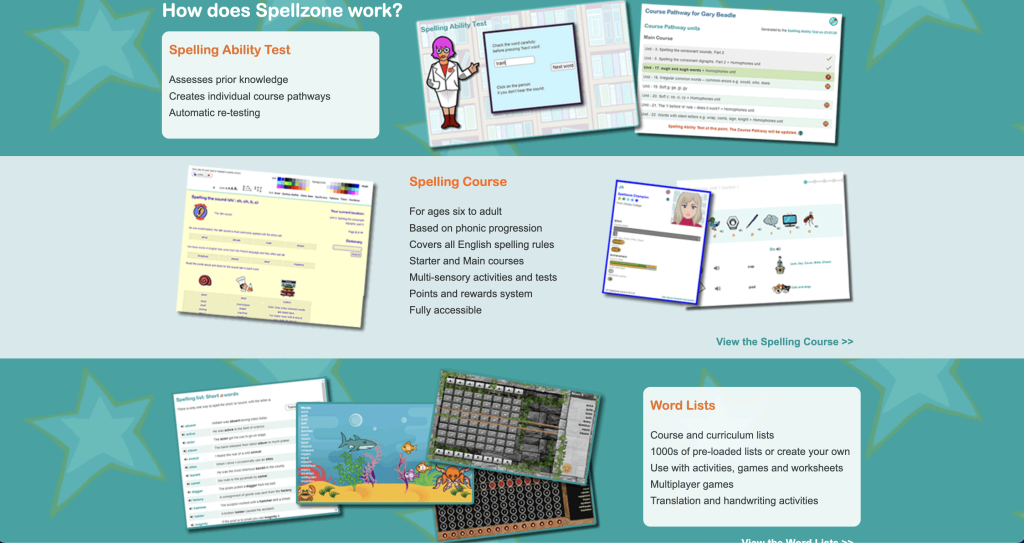
The second investigation was conducted on the onboarding sequence. The sequence is made up of part text and part imagery. The images are quite small and hard to see, these images may be especially difficult to see if the user requires glasses. The sequence explains the reasoning behind the website, what it does and who can use it. Reading the inserts, the sequence explains that people from the age of 6 to adults can use the website to improve their spelling abilities. I feel the images used to promote the resource are childish and may come across as patronising to an adult wanting to use the website.
Target Audience
The Spellzone website appears to be aimed at schools and teachers striving to improve their pupils’ spelling abilities. There is no obvious promotion supporting parents or students themselves wanting to sign up for the resource.



Spellzone Website Improvements
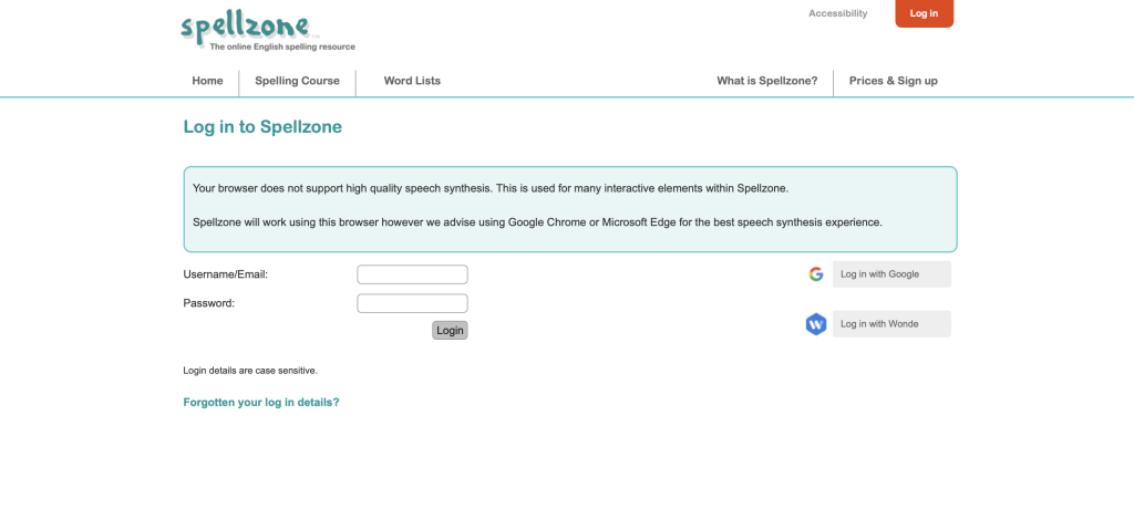
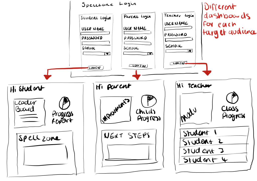
The first improvement that could be made to the Spellzone website is the addition of separate logins for students, parents, and teachers. The student login should be simple and take the child straight to their own dashboard with clear progress reports and leader board motivating the children to push themselves and progress through the spelling activities. The parent’s login should take them straight to an overview of how their child is progressing and show them any next steps they should take to help improve their child’s learning. Finally, teachers should have their own login which shows them each student’s individual progress report, modules, and class progression. The overall user experience for the different audiences would be improved by providing the individuals with tailored and specific information.
Login mock-up
The second improvement that could be made to the Spellzone website is the addition of a fun onboarding sequence that would explain the aim of the website in a concise manner. The below video is an exploration of a potential onboarding sequence. This would improve the user experience by clearly demonstrating the point of the website as soon as the individual reaches the site.
Visual onboarding mock-ups
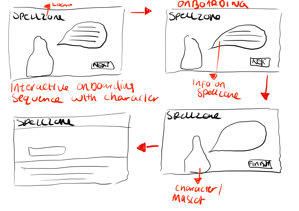
Adobe XD link to visual onboarding mock-up
https://xd.adobe.com/view/e0682f8c-048e-441b-98f5-2744e6386967-b53b/
Conclusion
Due to being absent during the Spellzone analysis, I missed out on being part of a group. This led to having no feedback from fellow group members which I feel led to underachievement in this activity. Improving on this activity next time, I will ensure to work as part of a group to gain others’ knowledge and input to ensure a good result. I believe I came up with good improvements that would improve the overall user experience, but these could have been criticised and improved more within a group.
References
What is spellzone? (no date) Spellzone. Available at: https://www.spellzone.com/ (Accessed: December 18, 2022).