Introduction
The tasks below involve exploring break points in web design using the Elementor plug-in on WordPress.
Individual Task 1
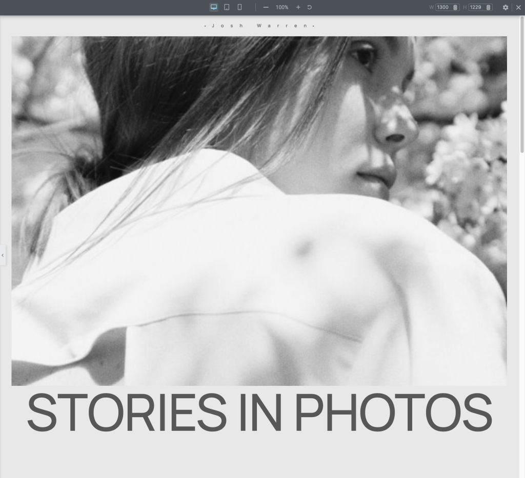
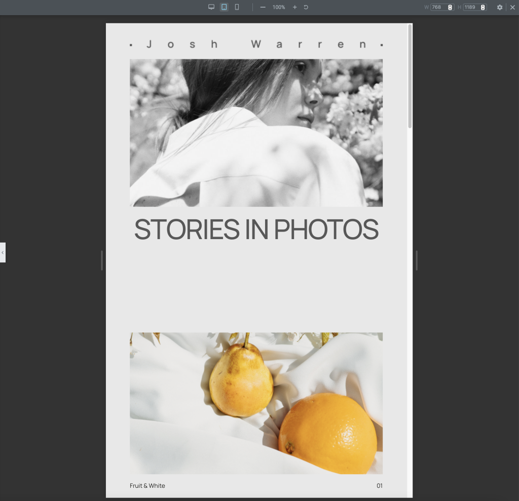
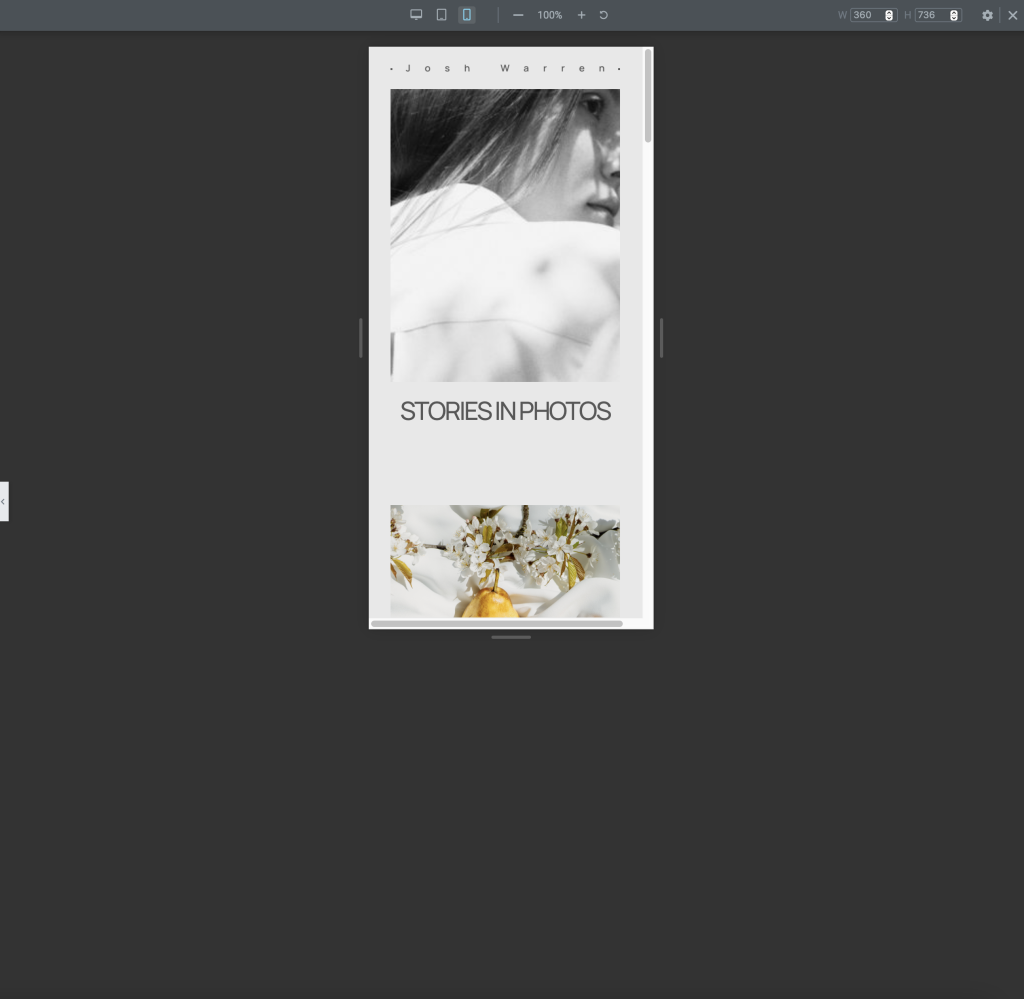
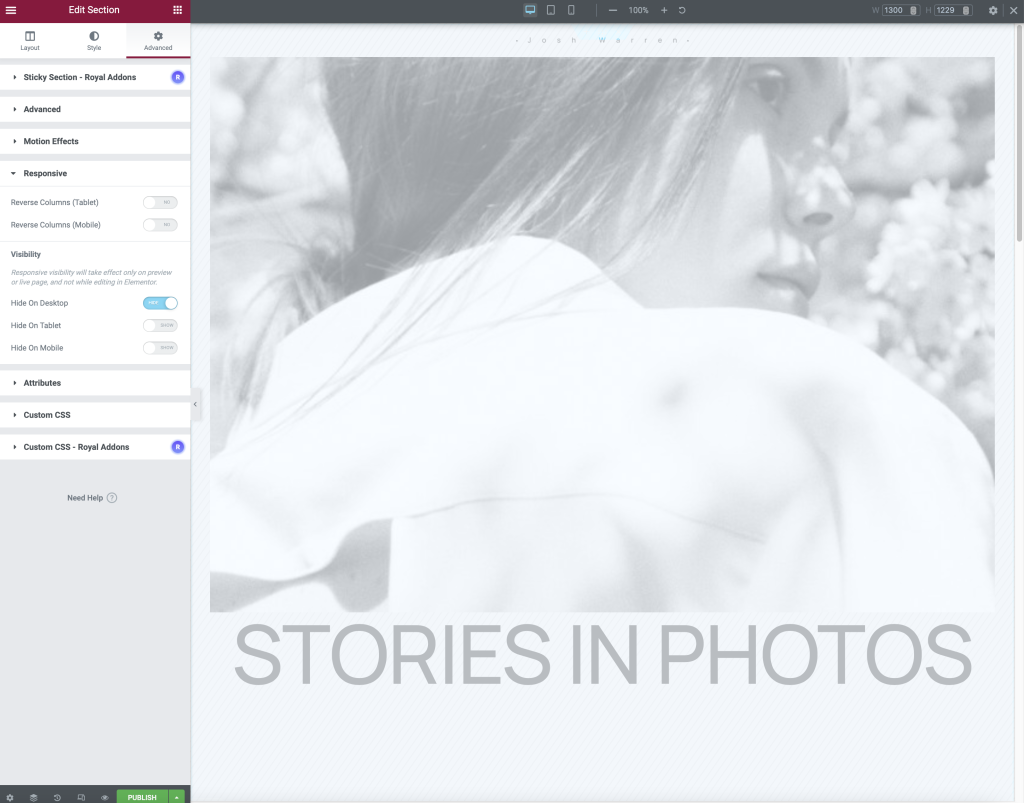
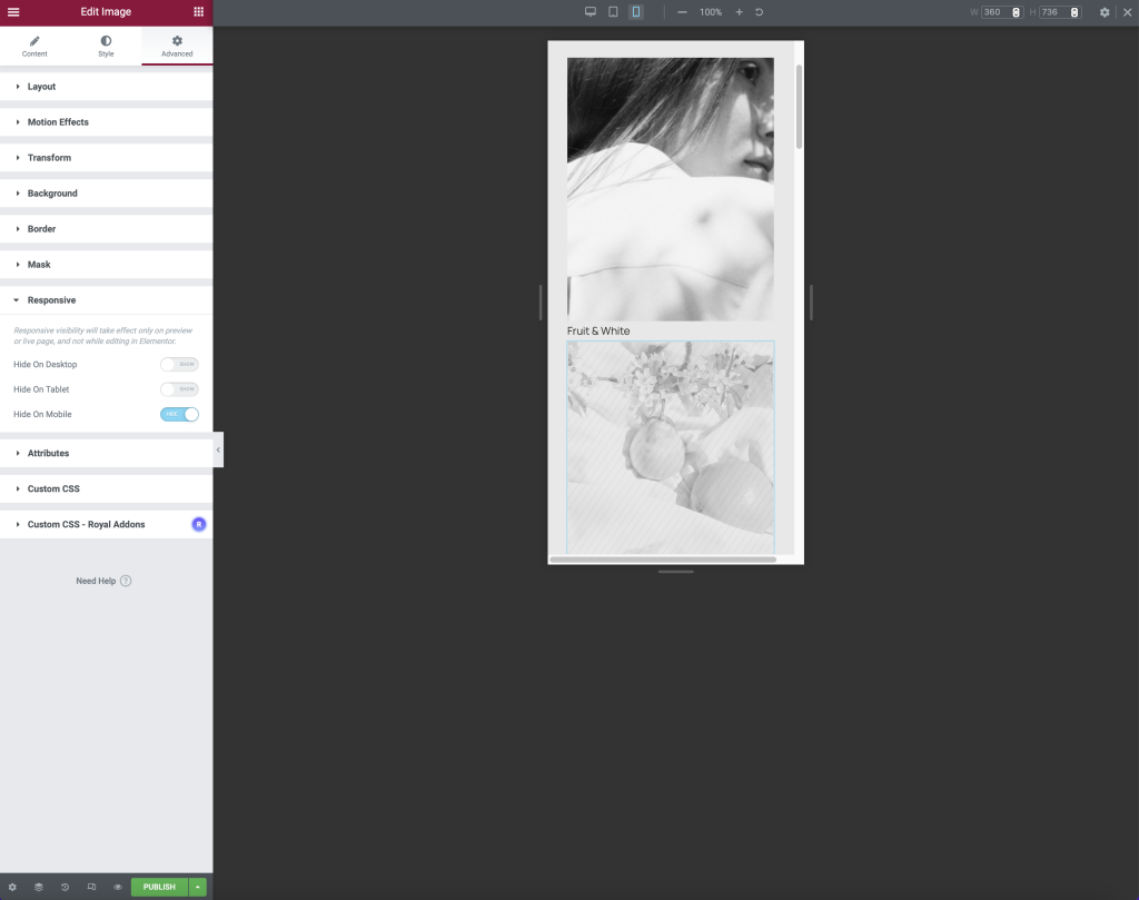
The responsive mode on Elementor helps showcase web design on multiple screen sizes, aiding in responsive web design. Moreover, by exploring the widget options on Elementor I was able to practice adjusting the breakpoints of each device’s screen size. The plug-in offers a range of options for adjusting designs for each separate device, as seen in the images I was able to turn on/off certain design choices for each device. The option of hiding design aspects makes engaging different audiences on multiple devices easier. The option may come in useful when making a condensed website version for app design, ensuring the app only shows the most relevant information.
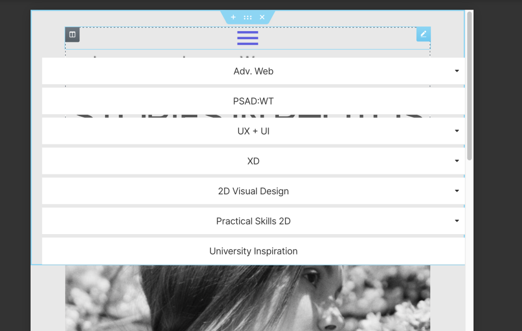
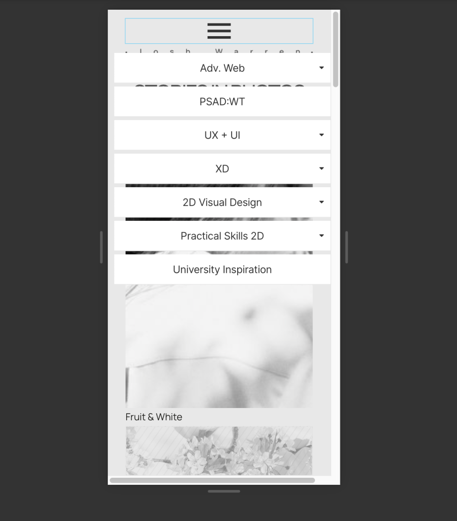
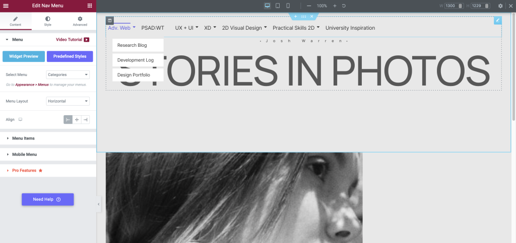
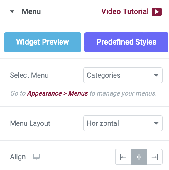
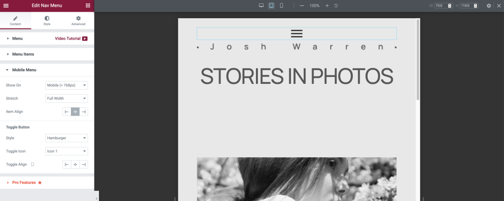
Adding a navigation menu through the Royal Add-on plugin I was able to adjust the style and arrangement of the menu options, as seen in the screenshots I could change the menu alignment and add a hamburger menu to the mobile and tablet screen size designs. The option to change aspects of the navigation menu is useful when making websites responsive on all devices. Furthermore, changing a full menu to a hamburger menu on a mobile/tablet screen saves space for important content, resulting in higher audience engagement.

Individual Task 2
The next task is to design a responsive website for multiple screen sizes outlining the importance of becoming carbon-neutral, considering different UX at each breakpoint.
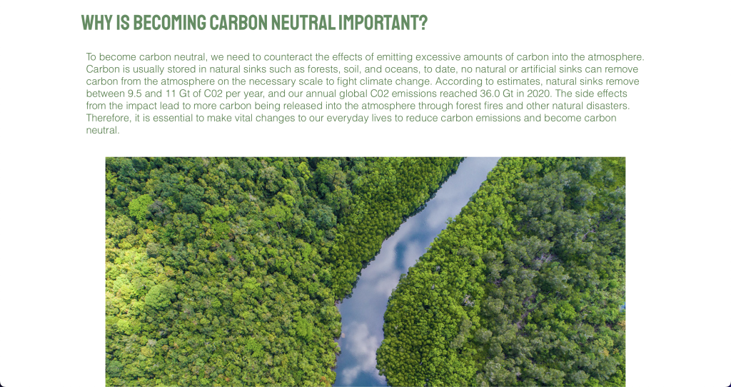
Carbon Neutral Website Design for Desktop
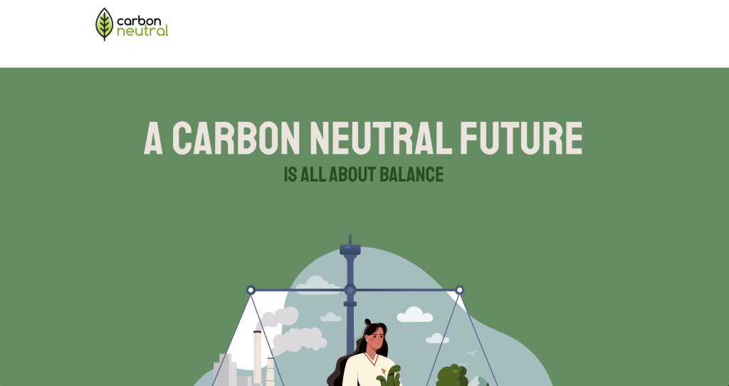
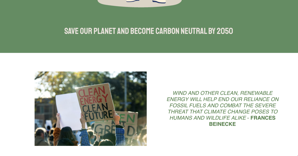
The first design is for desktops, the aim of the desktop design is to spread awareness and educate users on why we should become carbon-neutral.
Carbon Neutral Website Design for Tablet
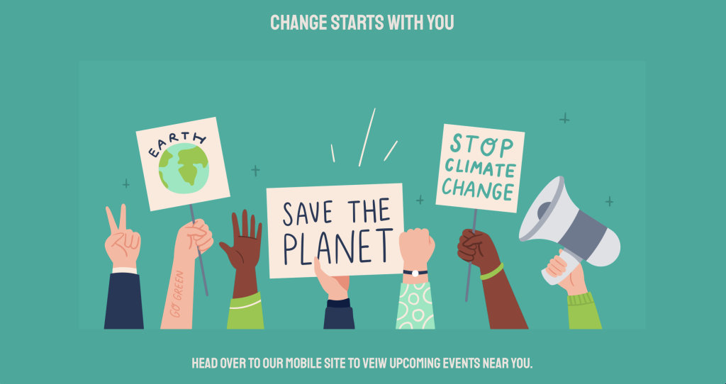
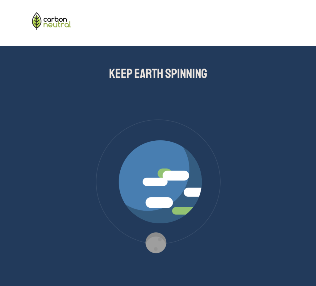
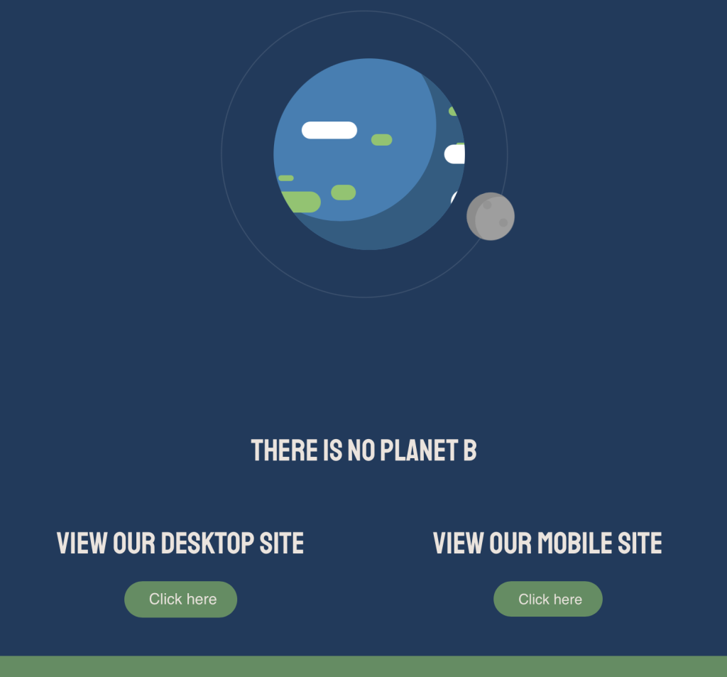
The second design is for tablets, the aim of the tablet design is to spread awareness and redirect people to the desktop or mobile site where they can find more information on the cause.
Carbon Neutral Website Design for Mobile
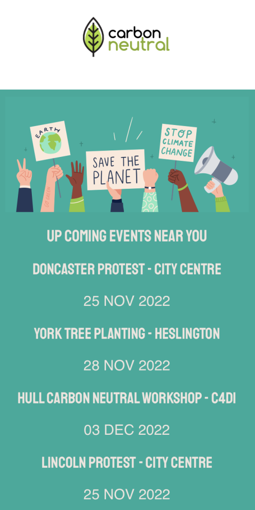
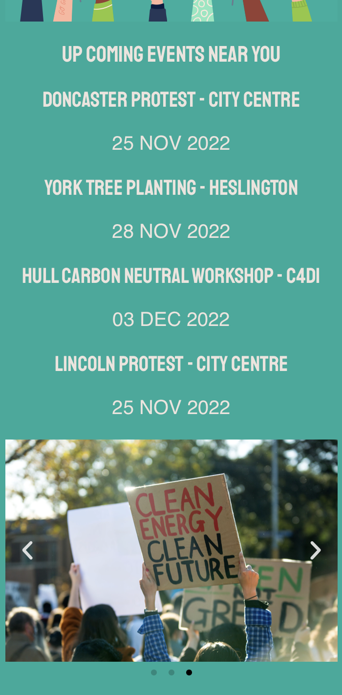
The third design is for mobile, the aim of the mobile site is to promote different carbon-neutral promotional and educational events.
Individual Reflection
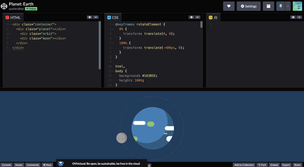
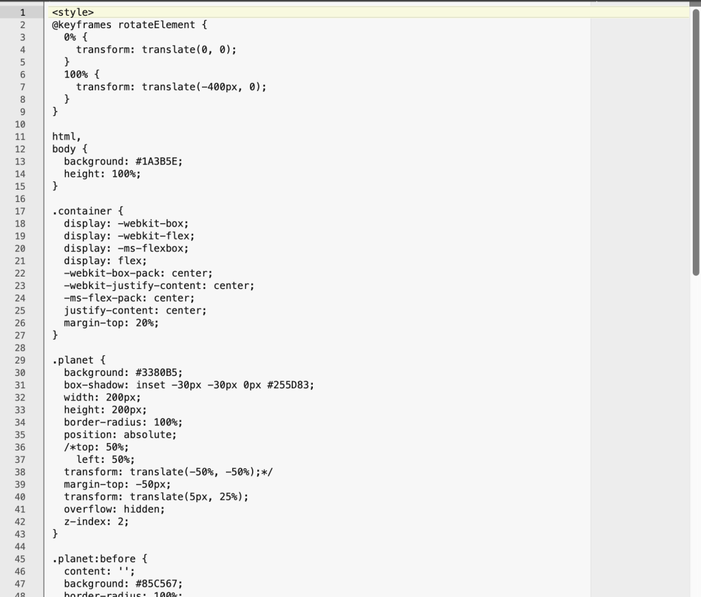
When designing the responsive website on the importance of becoming carbon neutral, I wanted each breakpoint to do something different. I decided the desktop website should be the main point of contact and the tablet and mobile app should be secondary to this. The website displays information on the importance of making a change and some statistics. The tablet app shows nothing more than a graphic animation of the earth spinning with a redirection purpose, directing the user to either view the mobile site or the desktop site. The mobile site design was intended for updates and news platforms where the user could find information on upcoming events such as meet-ups and protests.
Reflecting on this task I feel the importance of becoming carbon-neutral was clearly and simply communicated to the audience through a range of different design outcomes. If I was to complete this task again I would work within a team to generate more ideas and broaden the scope of the project. If I was to be the art director I would delegate tasks to individuals and ensure each person designed something for each breakpoint, therefore sharing the workload and resulting in a larger outcome.
References
Planet: Earth – codepen.io (no date). Available at: https://codepen.io/sumitridhal/pen/QyoKrq (Accessed: October 27, 2022).
What is carbon neutrality and how can it be achieved by 2050? | News | European Parliament. 2022. What is carbon neutrality and how can it be achieved by 2050? | News | European Parliament. [ONLINE] Available at: https://www.europarl.europa.eu/news/en/headlines/society/20190926STO62270/what-is-carbon-neutrality-and-how-can-it-be-achieved-by-2050. [Accessed 10 November 2022].
Shutterstock. 2022. Home. [ONLINE] Available at: https://www.shutterstock.com. [Accessed 10 November 2022].
