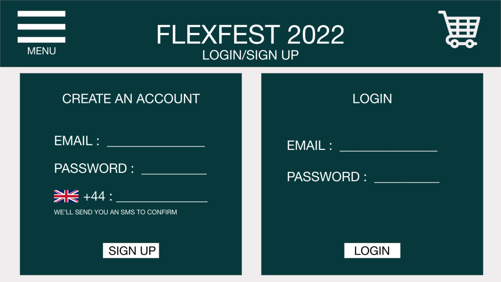
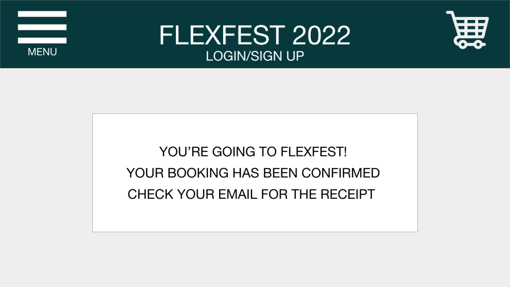
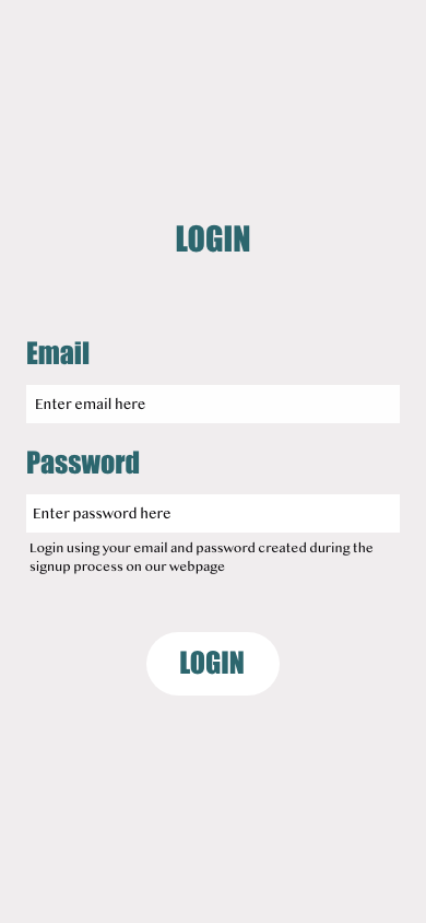
Recap of Mid-fidelity Website and App Design
Final Colour Palette


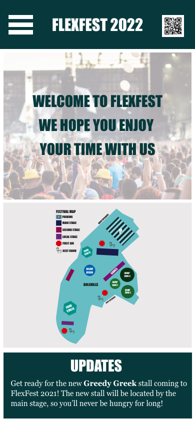
The final colour palette produced for the FlexFest website and app consists of neutral shades such as black and grey and a mix of blues and greens. The colour palette is used consistently throughout the website and companion app. The chosen colours make the interfaces look professional and clean whilst providing the user with a sense of what the festival is about. The colours tie in with the music genre’s aesthetics; darker colours were required when creating the right atmosphere throughout the interfaces. The colours provide the users with an urban atmosphere that aligns with the rap artists performing at the event.
Variations of Colour palette
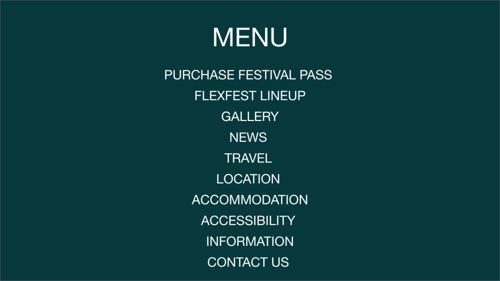
The colour palette was trialled using different variations of the same colours to ensure the correct impression was made on the user. The lighter versions of the colour variations didn’t impact the user as much as the darker final colour palette. The contrast between the blue menu and the text made the text less readable, whilst the grey menu was too light and didn’t give off the right atmosphere.
Menu and Navigation Bar Exploration
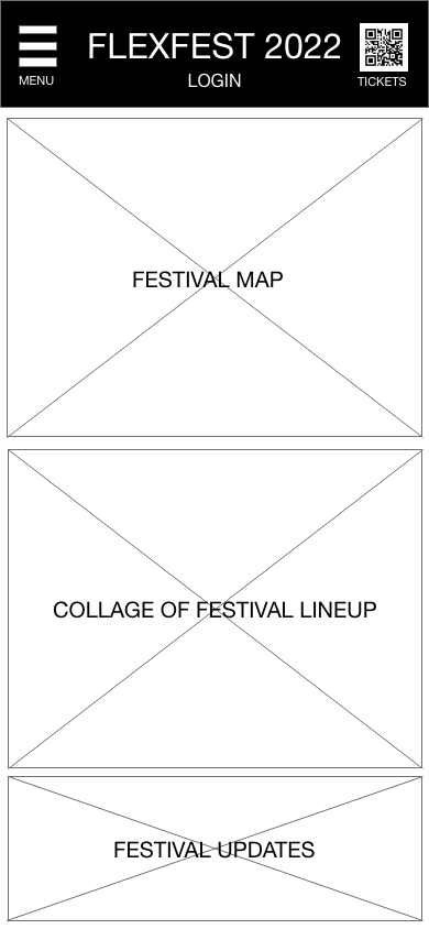
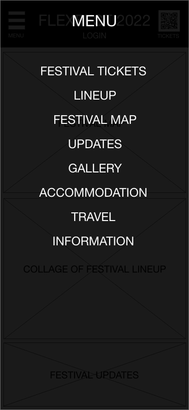
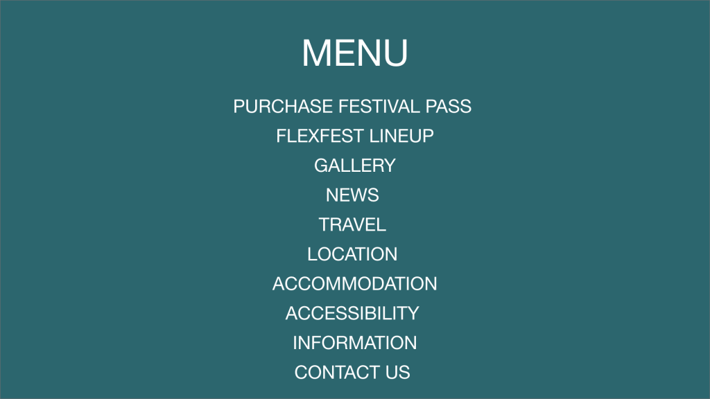
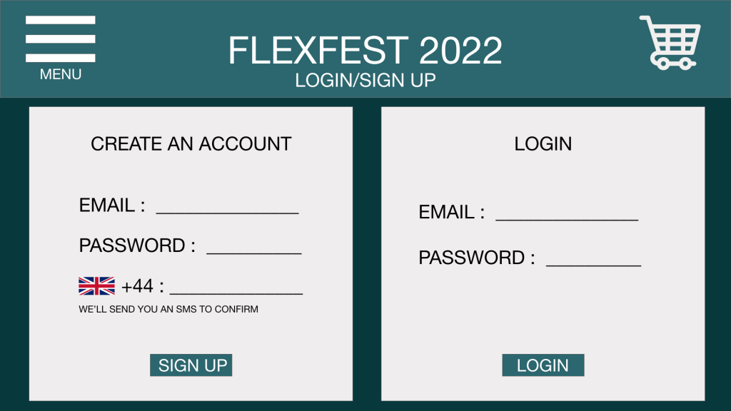
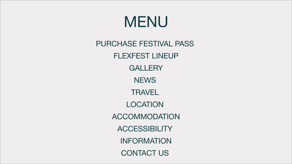
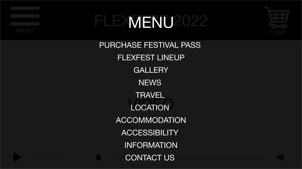
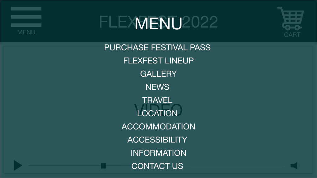
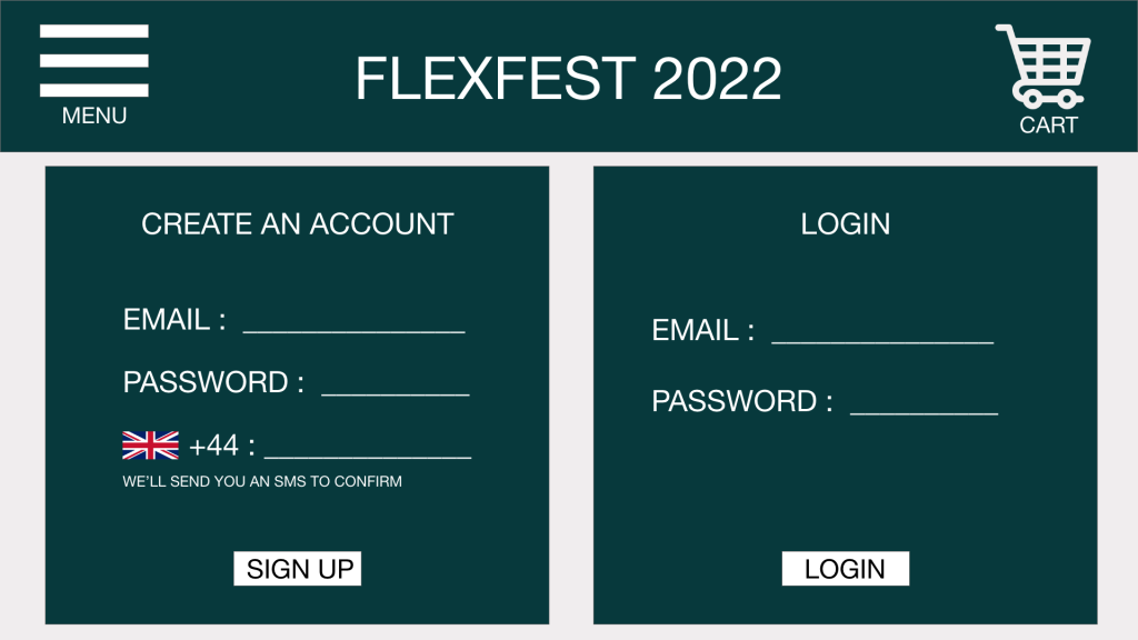
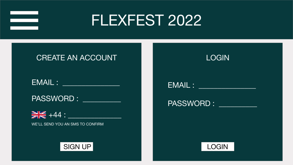
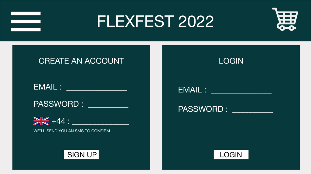
The menu and navigation bar are essential assets of the FlexFest website and companion app; they provide the user with a solid routine in navigation. The user can find all information for the festival through menu options. When designing the navigation bar, universal icons and emblems were a high priority to ensure the interface stays memorable and easily learnable.
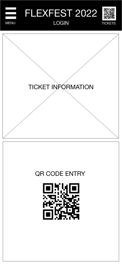
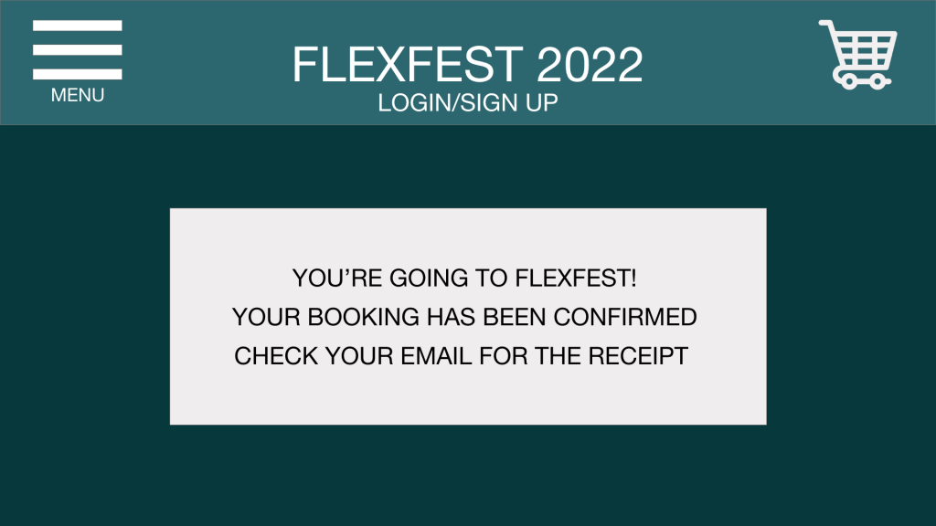
Above are variations of development stages throughout the navigation bar and menu, from rejected to the final designs. The rejected menu designs are transparent; the menu options sink into the screen, preventing them from standing out to the audience. The final menu is opaque, making it easier for all users to read. The navigation bar icons were initially labelled to ensure the user could understand what the icons meant. This design looked cramped, and the labels became unnecessary when using universally recognised icons. The final design is less cramped and only displays the necessary icons, presenting a seamless navigation bar.
Companion App Onboarding
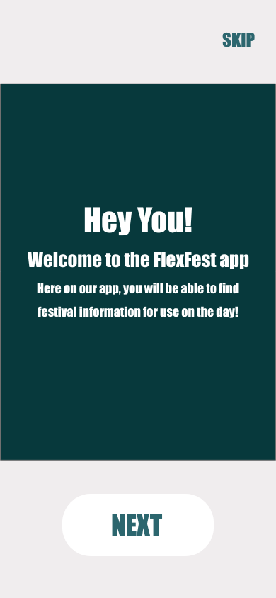
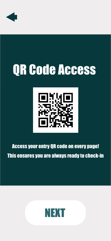
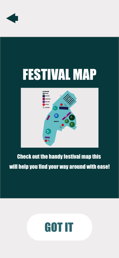
Onboarding is an integral part of website and app design. It ensures the user is familiar with how the interface functions. Onboarding can be a series of instructions, tips or animations.
The companion app required an onboarding sequence to explain and familiarise the user with the interface and its use. The three-screen sequence is simple but effective at providing the user with the necessary information, such as where to find their entry QR code and the festival map. The onboarding design follows the same interface design as the rest of the website and app to ensure it stays within the brand identity.
