FlexFest Website and Companion App Feedback
Feedback from clients is crucial in interactive design; it provides the designer with valuable insights into how their user experience is received and practised in real-life circumstances. It also gives the client a chance to change the interface or offer any advice and clearance on where they want the design to go. Communication from both ends of the spectrum is essential to developing suitable user interfaces providing the audience with a seamless user experience.
Throughout the development of the FlexFest website and companion app, there was an opportunity to receive feedback on the user experience from peers and people interested in UX and UI design. This valuable feedback was fundamental in really enhancing the user experience of the FlexFest website and companion app. Moreover, all the received feedback was considered when making changes to the UX and UI design of the FlexFest interfaces.
Below are examples of what has changed throughout the website and companion app development and how it has made for a seamless and intuitive user experience.

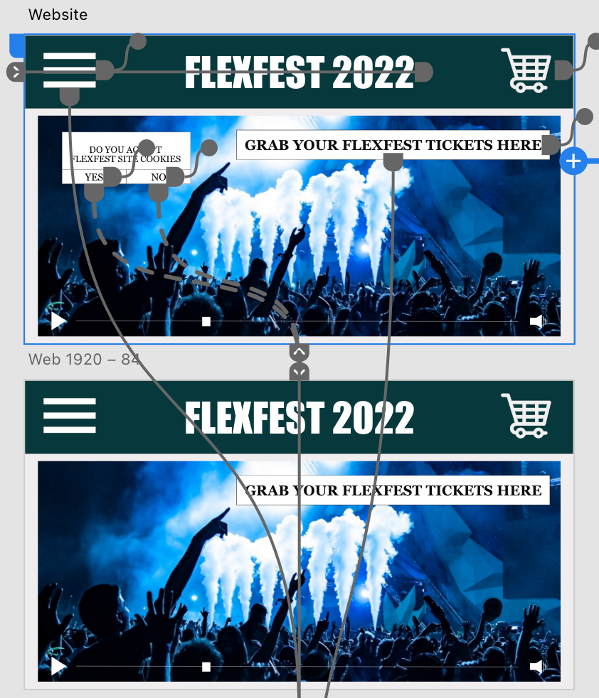
The first design alteration made to the website involved finding a way to remove the cookies pop-up from the home page once the user has accepted or denied cookies; before the feedback, the cookies pop-up did not disappear, which caused frustration. The cookies now disappear once the user presses yes or no after changing the design. This design alteration was made possible by duplicating the home page but removing the pop-up from one of the screens and linking the yes and no buttons to the new screen.




The third design alteration was made to the companion app; after the user completes the onboarding sequence, they’re greeted with a welcome/loading page with the FlexFest logo symbol. Before receiving feedback from the user, the emblem had a call to action placed in the centre; this gave instructions to the user on how to enter the site. The feedback suggested that the call to action be removed as the user would understand how to enter the site without it. By eliminating the centre instruction, the design looks more professional.
Navigation Feedback
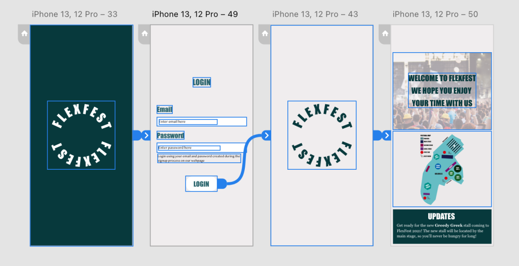
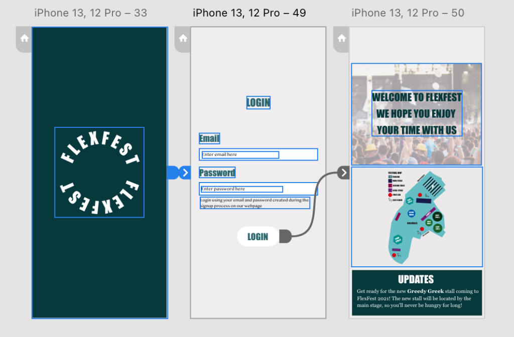
The final design alteration made to the interface was a way of navigating the companion app. Before the feedback, the companion app had an extra loading/welcome screen after the user signed into their account. The feedback suggested that this added an extra step with no real meaning before the user could get to the primary information. Removing the second loading/welcome screen provides the user with faster entry to the site, making it easier to get their ticket ready at speed on the day of the event.