Website and Companion App Goals
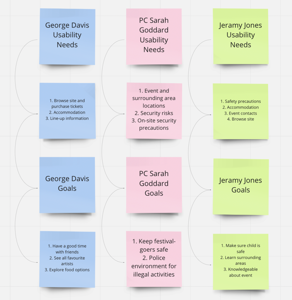
Above is a reminder of the usability goals and persona needs discussed when requirements gathering. This ensures their overall usability needs are addressed when designing the website and companion app.
Website Prototype
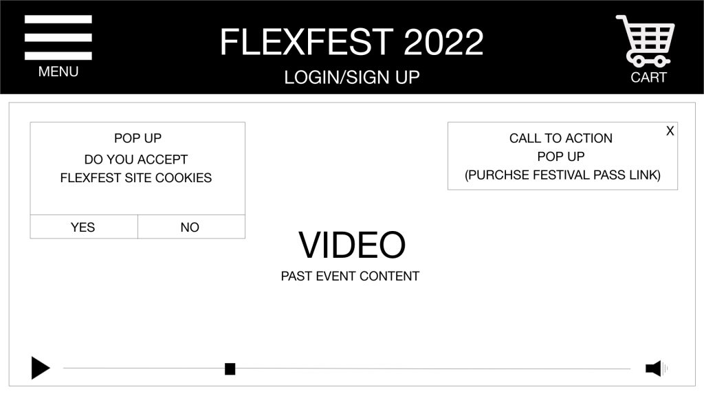
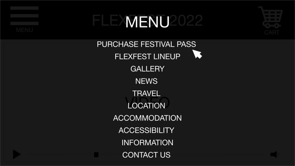
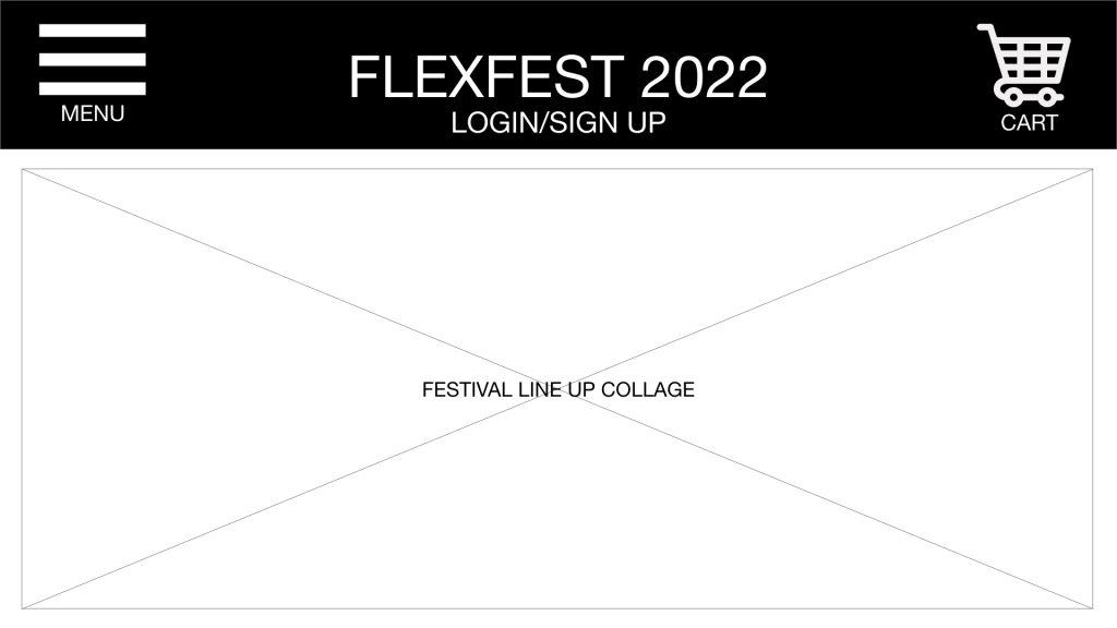
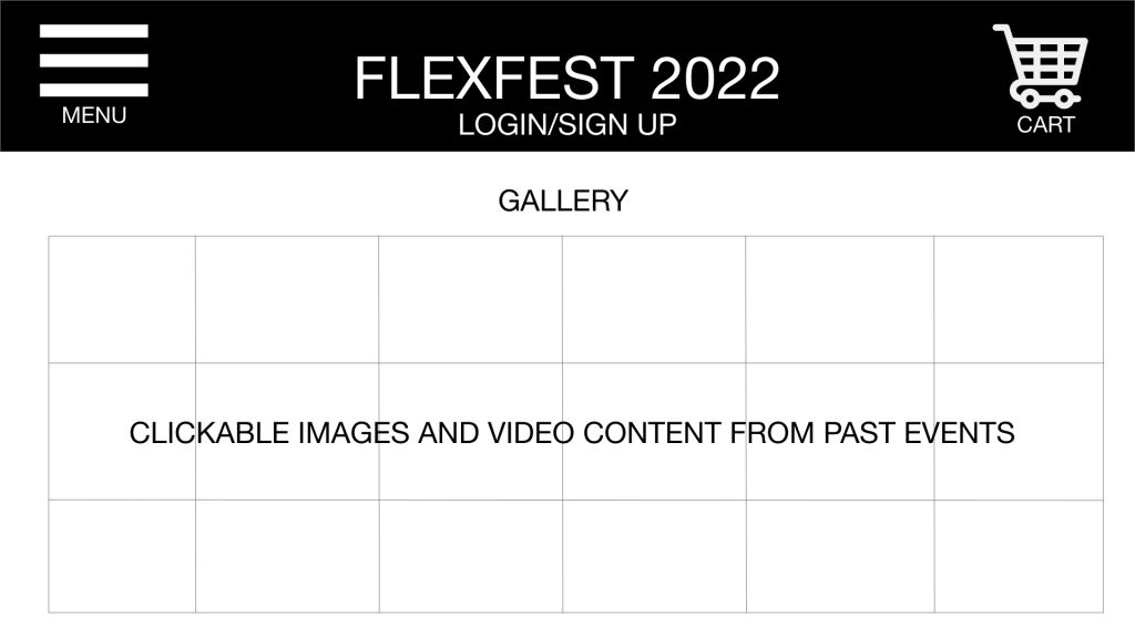
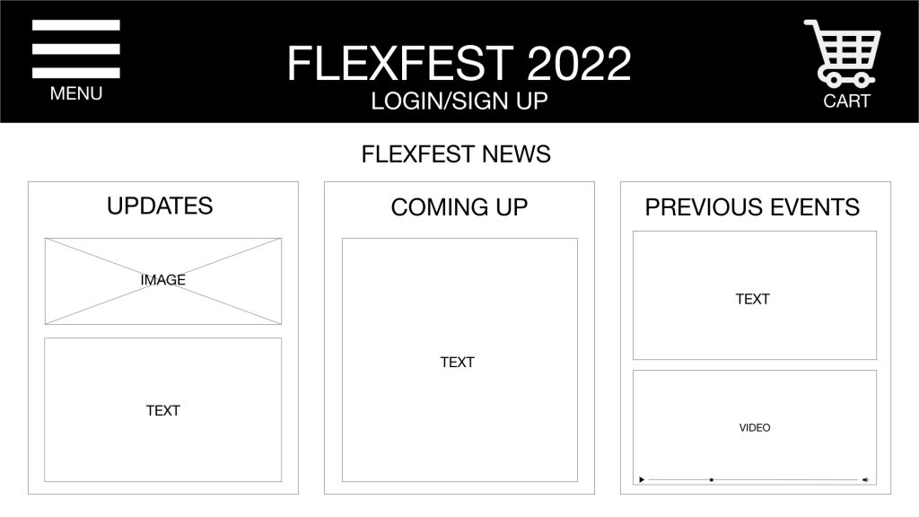
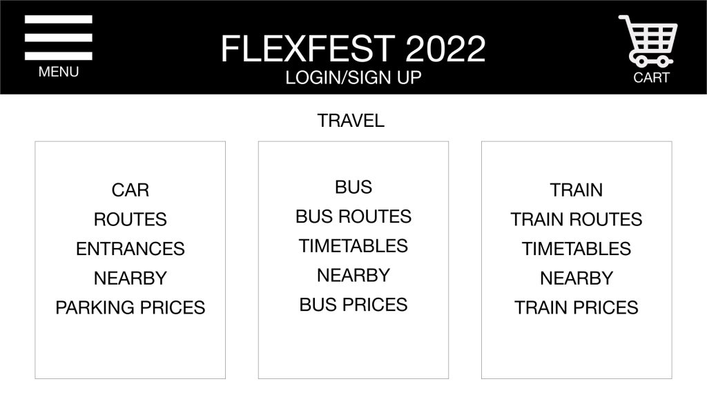
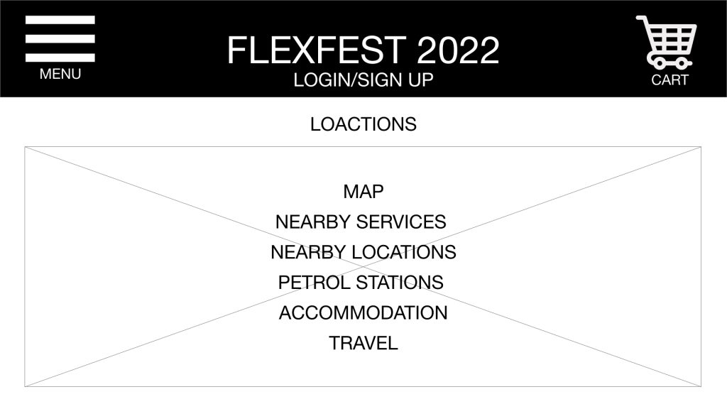
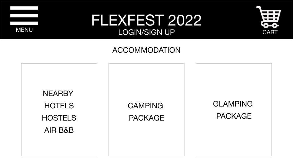
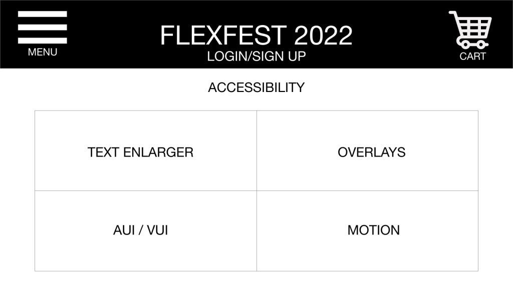
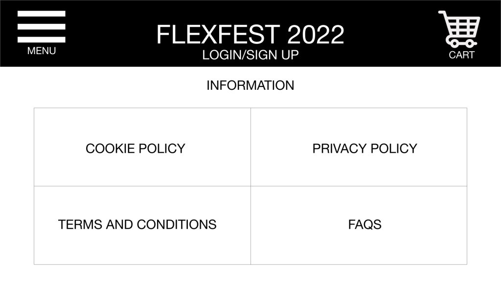
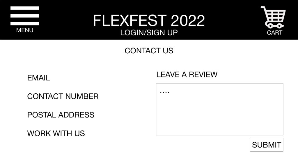
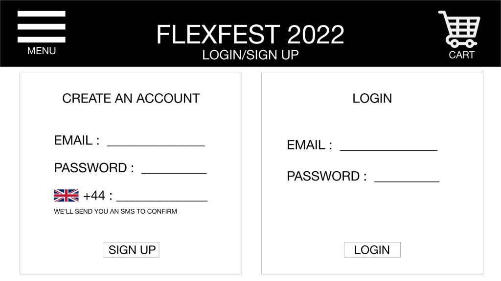
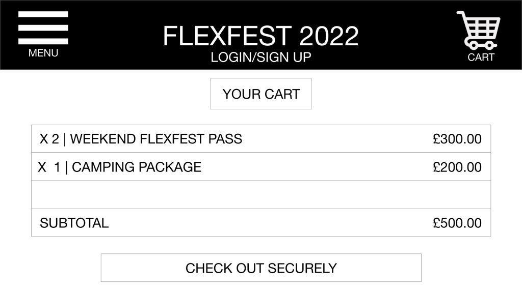
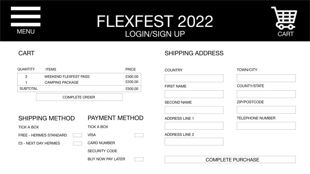
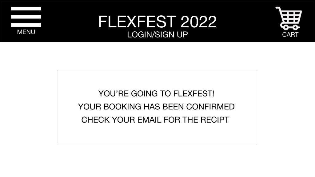
The final FlexFest website prototype demonstrates the use of Hicks Law and Jakobs Law by limiting the information available to the user, making decisions easier. Whilst also presenting a site consistent to similar sites users utilise daily. The site layout is efficient and displays information relevant to its menu label. This ensures the user gains the correct knowledge pertinent to the menu link they have pressed on. Although the menu displays many options, they remain accessible, showing appropriate and reliable options. Upon arrival to the site, the user is shown a pop-up call to action, which takes the user straight to the ticket purchasing page. Moreover, this helps create a shortcut for users solely wanting to purchase tickets.

App Prototype
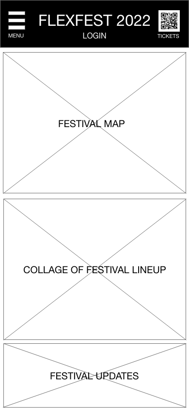
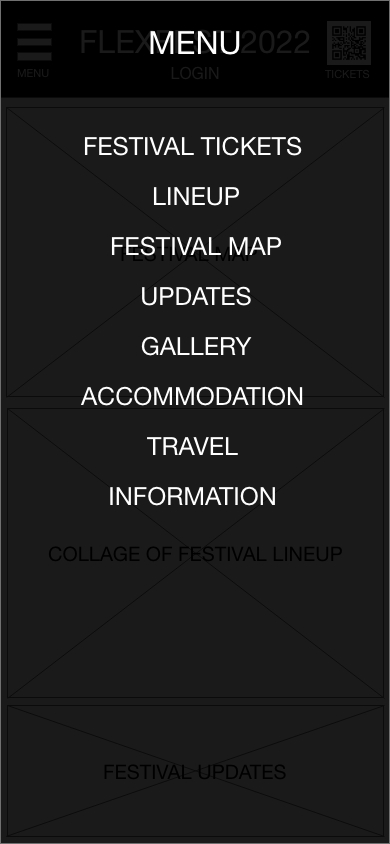
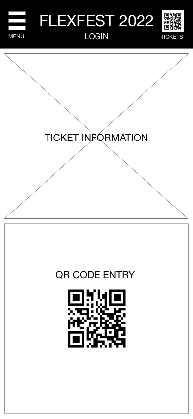
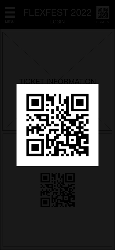
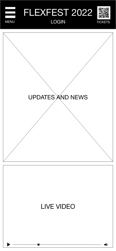
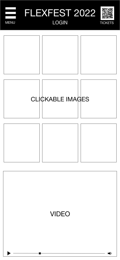
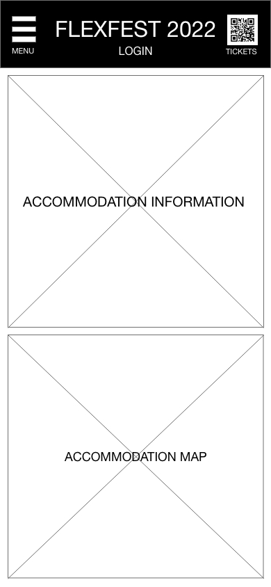
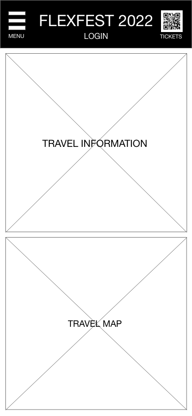
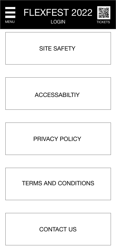
The final FlexFest companion app prototype demonstrates the use of Hicks Law by limiting and restraining the user from viewing irrelevant website information such as past news and events, tailoring the app for use on the day of the event. The main benefit of the app is to provide the user with a safe and reliable entry pass, one they will never lose. The app also shows users multiple maps, including site, line-up, travel and accommodation map. Constraining the website options in a more efficient and accessible way for use on the day. All accessibility options will be displayed through a menu link in the information section of the app; the same website options will be utilised through the link.
Conclusion
The overall usability of both the website and companion app is closely related to the usability goals of the personas created through gathering requirements and figuring out solutions to form a practical user experience. Overall, the interfaces meet the usability goals discussed in defining the user experience. However, they lack differing interfaces for different users, such as separating the event staff login with the festivalgoers. This creates barriers when accessing sensitive festival information such as security measures. The problem space for both the website and app have been addressed in an informative manner, restricting the users to display only relevant information, making for a better learnable and memorable experience. The website and companion app prototype is shown without colour to ensure it is communicated professionally, enhancing the user experience and interface. Upon designing a working site, colours and accessories to the site will be displayed.